(Originally posted 2011-09-14.)
It’s been an awfully long time since I wrote When Good Work Doesn’t Go To zIIP / zAAP Heaven. And too long since I posted anything at all. 😦 In fact I had a bunch of posts in my brain until this morning when a customer asked me a question which turned into this blog post. (Those posts are still in my brain and will probably see the light of day eventually, including one based on a customer question.)
They wanted to know whether there was an In-And-Ready count for zIIP or zAAP. I don’t see such a thing. But what I do see is, in my opinion, much better. I’ve also presented a chart in my "Much Ado About CPU" presentation on the subject for some time now. I’m surprised I haven’t blogged about it already. So here it is, while it’s still useful:
Take a look at this graph:
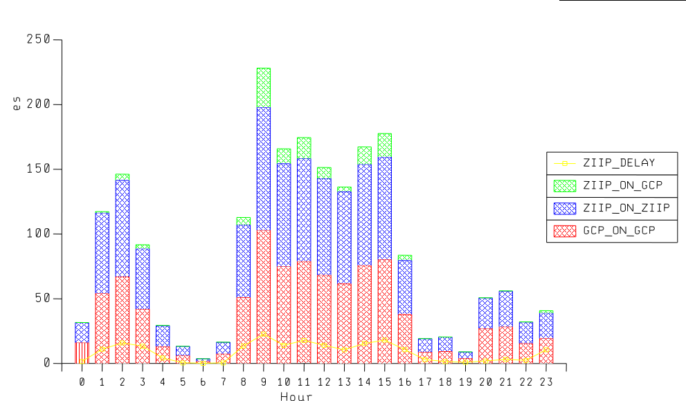
It’s for a single WLM Service Class period across a 24 hour period. On the vertical axis we have a couple of mixed types:
- A stack of the CPU components for the service class period, as a percent of an engine. These are the bars.
- A yellow line representing the percentage of WLM samples that represent zIIP delays.
In this example it’s a relatively benign case. Here’s how I read it:
- The red bar values are "GCP on GCP" – the work that was never eligible for zIIP. It’s normal for it to run this way.
- The blue bar values are "zIIP on zIIP" – the work that was eligible for zIIP that actually ran on zIIPs. This is goodness.
- The green bar values are "zIIP on GCP" – the work that while eligible for zIIP ran on GCPs. This is what you’d like to minimise.
- Because almost half ran on GCP I conclude this is DDF work. (In fact it running on a zIIP before zAAP-on-zIIP and the name of the service class confirm this. The regularity of the pattern and split also corroborate it.)
- At times when the delay samples tick up so does the "zIIP on GCP". This is the key correlation.
- In fact the "zIIP on GCP" portion isn’t all that bad. I’ve seen worse and I’ve seen a little better.
This is a standard part of my reporting. Hence I’m in a position to say "I’ve seen worse and I’ve seen a little better." I have experience these days. 🙂
Some observations:
- It’s probably fair to use normalised CPU – particularly as there are many machines where the specialty engines run at full speed and the general purpose ones don’t.
- It’s probably a good idea to add in the "Delay for GCP" sample percentage. I was sensitised to this by a customer both of whose pools were – for the service class period in question – showing serious delay samples.
- In general this chart has both zIIP and zAAP on it for the same service class period. The technique works for zAAPs, zIIPs and zIIP on zAAP just the same.
- Talking of zAAP on zIIP: I expect the numbers to all look like zIIP: There are no specific zAAP on zIIP metrics.
- This technique allows you to evaluate things like IFAHONORPRIORITY and IFACROSSOVER as they work out at the service class period level.
- The PROJECTCPU mechanism only works for workloads that are already running. For example, turning on IPSEC is a fresh workload: It won’t show up until you run it (whether on a GCP or a specialty engine).
- If an exploiter changes how it behaves (for example DB2 DDF with PM12256) you’ll see some clues in this chart. I say "some" because in that particular APAR the variability in outcome at the thread instance level is not going to show up here. It might show up in DB2 Accounting Trace (SMF 101) if you go looking for variability at the individual SMF record level.
I think the graph works well (even if the colours etc don’t) and I think it’s a chart you can replicate and build on (including the customer who asked the original question).
One final (meta) point: I hope that if you ask me a question that’s of wider interest you won’t mind me posting the answer (perhaps extended) as a blog post like this. Of course I’ll shoot you the link. And, as you’ve seen in the past, of course I’ll avoid posting your data – unless you OK me doing so.

2 thoughts on “zAAP and zIIP Revisited (At Last)”