(Originally posted 2012-03-23.)
You’d think it would be pretty simple to draw a line. Right?
This post discusses an enhancement I’d like to make to my current reporting – and I’m pretty sure that technically I can do it. The question is whether I should.
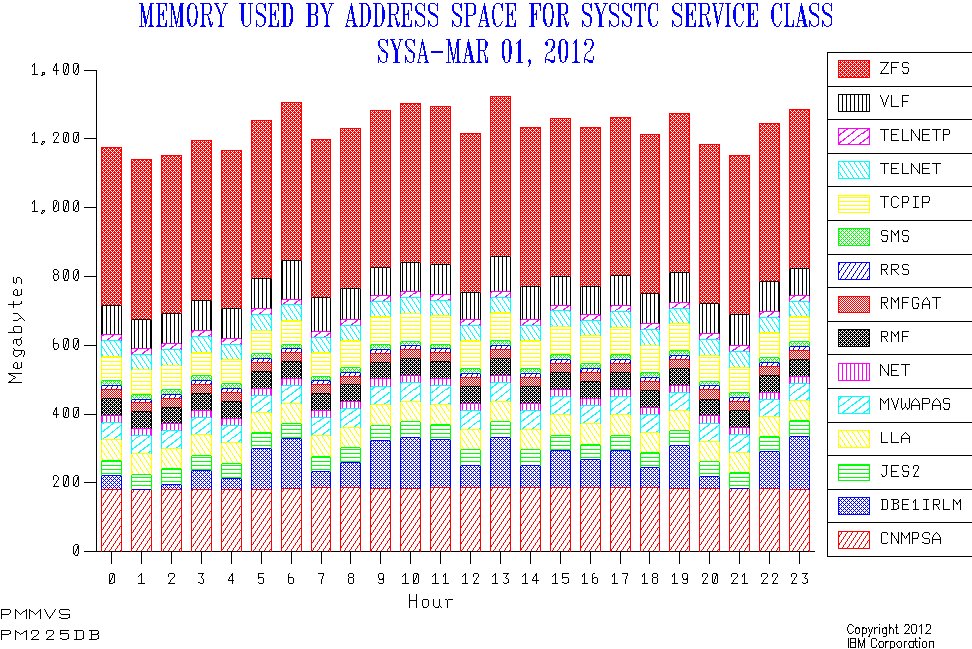
Consider my current "Memory by address space within Service Class" graph. Here’s a sample:
And here’s what I think I might like it to look like:
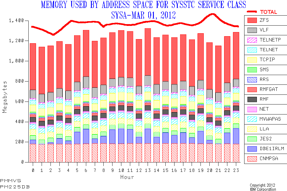
Obviously the line’s been drawn on by hand. I haven’t written any code to achieve the enhancement. And, yes, the data’s real – apart from the drawn-on line. I feel pretty safe (on behalf of the customer) in showing you this as it’s VERY generic. But, no, I can’t promise the drawn-on line’s in the right place.
Let’s talk about:
- Motivation and Usage
- Mechanics
Motivation and Usage
When I throw graphs at you I see myself as "story telling". Hopefully an accurate story, certainly one I believe in. So, when working on my code I ask the question "how does this affect the story telling?"
Here’s how I normally tell the (e.g) CPU story:
- Talk about CPU usage by processor pool by LPAR1 and stacked up to give the machine view.
- Break down CPU usage by WLM Workload and the Service Class2 – again by pool.
- Likewise by address space within a Service Class.
- Possibly break down address space CPU to e.g. Transaction – assuming CICS or DB2 are "in play".
When you’ve done that you certainly know where the CPU is going. You do the same thing for memory – right until you get to Step 4.
The concept of "capture ratio" is well known and bridges the gap between Step 1 and Step 2 – for CPU3. It doesn’t make sense to draw the proposed line for this case.
To bridge between the Service Class level and the Address Space level (Step 2 to Step 3) I think a different treatment is required. There are a number of reasons for this:
- Some service classes have no address spaces. And hence no memory. "Capture Ratio" may be 100% but unlikely to be computed that way. 🙂
- The chart I’m proposing has up to 15 address spaces on it. (We could make it more but then it becomes markedly less readable.) So, for a Service Class with more than 15 address spaces we miss some – as in this particular example. I’d like to show we had good (or bad) coverage of the "headline" Service Class number in these 15 address spaces. This works fine for CPU, memory and EXCPs.
- Type 30 memory numbers behave badly and it would be nice to see how badly compared to the Service Class total. (Type 30 CPU numbers don’t behave badly.)
So I think the line that says what the total "should" be is ideal for this. Hence my proposal4.
Mechanics
Today the data is in two tables: A Service Class (Period) table and an Address Space table – both summarised at an interval level5. The former comes from RMF SMF 72 Subtype 3. The latter comes from SMF 30 Subtypes 2 and 3. It’s always interesting handling two different data sources as if they might magically corroborate each other. How naive. 🙂
I use standard SLR “PRINT CHART” and similar commands against these tables. Not so long ago I learnt how to drive GDDM graphing direct from REXX. Because I can do other things in the REXX (like adjust address space names to add e.g. “CICS”) I might take that route rather than using PRINT CHART. And there are some other cases I would want REXX’s sophistication to take care of – like either the 30’s or the 72’s being missing.
In your case you can probably bring the two together quite neatly. Anyone know if MXG already does this?
Conclusion
So, why am I blogging about this? Two reasons:
- Because you might want to try the same depiction idea.
- Because I’d like to know if you think this is a good idea.
So I’d like your input on this. (Commenting here would be fine or any other way you want.) And maybe next time I crunch your data the story will be told just that little bit better. At least that’s the plan. 🙂
1 Nowadays those pools are: GCP, ICF, zIIP, zAAP, and IFL.
2 I’ve not found much value in breaking CPU usage down by Service Class Period.
3 For memory I handle it differently – because there are reported-on memory usages that are outside of the Workload / Service Class hierarchy. And I explicitly calculate an "Other" category – which has never turned out to be negative.
4 Today I’d be showing you two charts and inviting you to do the comparison. I hope my proposal makes this quicker and smoother.
5 This interval may be different in the SMF 30 and 72 records but it’s summarised to the same interval in the code. This might be 15 minutes, 30 minutes or (most usually) 1 hour. And that’s all summarised at the "shift" level for even broader brush work.
