I just produced a new chart, which I think is worth sharing with you.
I produced it for one specific use case, but I think it has slightly wider applicability.
The Trouble With Outsourcers
Quite often we get performance data from outsourcers, whether IBM or some other organisation. Generally they’re running LPARs from more than one of their customers on the one machine.
We have a nice chart for a machine. It shows all the LPARs’ CPU stacked up – with each LPAR a different series. This is fine in a one-company context. But sometimes we are working with the outsourcer and one of their customers. We wouldn’t want to show them the outsourcer’s other customers’ LPARs. But we would want to show them how busy the machine is.
It’s reasonable to show them how busy the machine is because, of course, it affects the performance they’re seeing. And we might well get into LPAR design issues. (A tricky one is the weights because adjusting them is a “robbing Peter to pay Paul” situation – and with a multi customer machine that’s obviously political.)
So here is a new chart, that neatly solves the problem. It’s a real one, though there has had to be a little obfuscation of the names.
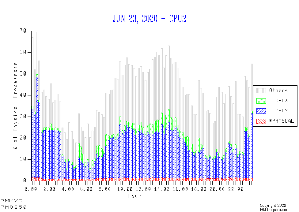
In this case CPU2 is a Production LPAR and CPU3 is a Development LPAR. The grey is all the other LPARs’ use of the GCP pool. It’s clearly substantial.
The pool itself isn’t hugely busy – but then this was not said to be a problem day.
But There’s More
Even in the one-company case this chart is useful. Suppose a customer sends us data from what they consider their biggest LPARs. It would be good to show:
- The LPARs they sent us data for are indeed the bulk of the CPU.
Or
- We’re missing a big trick as the LPARs they sent data for don’t use the bulk of the CPU.
One Final Plea
I’ve said this many times, but probably not written it in a blog post. Always report processor pools separately. Everything in this post has been for a single machine’s GCP pool. To mix GCP’s with, say, zIIPs makes no sense at all.

One thought on “What About The Others?”