They were simpler times back then.
“Back when?” You might ask.
When PR/SM got started – in the mid 1980’s – a machine might have two or three LPARs. Similarly, when Parallel Sysplex got started the number of members was very small.
For reference, a z17 ME1 can have up to 85 LPARs, and a Parallel Sysplex up to 32 members. I rarely see a customer approach 85 on a machine and I’ve never seen a 32-way Parallel Sysplex.
However, I am seeing increasingly complex environments – both from the point of view of machines having more LPARs and Parallel Sysplexes having more members.
And, of course, Db2 was brand new – and now look at how complex many customers’ Db2 estates have become. A dozen or more members in a Datasharing Group is not unheard of, and multiple Datasharing Groups is very common. (And it’s not just Development vs Production.)
So How Do You Handle Such Complexity?
That’s the important question. I’ll admit I’m slowly learning – by doing. I’d like to think I do each study better than the last – especially where the environments are complex.
What I don’t want to do is to say the same thing over and over again for each of the systems or Db2’s. I think I would at the machine level – as that’s relatively few times.
But I want any conversation to flow nicely – for all concerned.
There are a couple of approaches – and I try to do both:
- Establish Commonality
- Discern Differences
So let’s talk about them.
Establish Commonality
If you have 10 systems they might well have things in common. For example, they might have Db2 subsystems in the same Datasharing Group. Or cloned CICS regions.
There might be symmetry between LPARs on a pair of machines. This is very common – though asymmetry tends to creep in, particularly with older systems.
By finding commonality and symmetry it’s possible to tell the tale with economy of effort and reduced repetition.
Discern Differences
But symmetry might be broken and often Parallel Sysplexes are pulled together from disparate systems. This was particularly so in the early days – to take advantage of Parallel Sysplex License Charge, as much as anything.
Nowadays I’m seeing a growth in differentiated systems within a Parallel Sysplex. Thankfully I’m seeing pairs or quartets of such systems. Examples include:
- DDF workloads, with their own Db2 subsystems alongside CICS or IMS systems. (Alongside meaning sharing data.)
- Different CICS applications. Quite common is the “Banking Channel” model.
So “spot the difference” is a good game to play.
The Importance Of Good Tools
Good tools enable me to see, among other things:
- Architectural structure
- Differences in behaviour
This post is not to boast about the quality of my tools – as most of them are in no fit state to sell or give away.
Further, I wouldn’t say my tools are perfect. Which is why I have to maintain a posture of continual improvement. You’ll see an example of that later on.
Architecture
Over the years I’ve taught my tools to produce architectural artefacts, such as which Db2 subsystems on which LPARs are members of which Datasharing Group. Further, a view of each Db2 is accessed by what. Likewise, which LPARs have which Service Classes and Report Classes being used.
Very recently I’ve got interested in the proliferation of TCP/IP stacks – which I see as different address spaces, plus Coupling Facility structures.
Right now my nursery of “interesting address spaces” is growing.
Difference
You probably wondered about the title of this post.
Seeing differences in behaviours between supposedly similar things can be instructive.
Take this graph. It’s brand new – and the only editing is removing system names and the title.
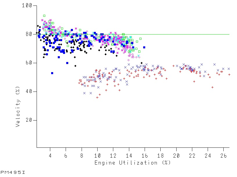
A few notes on how to read the graph:
- Each series is for a different system.
- Each data point is for a different RMF interval.
- It shows how the velocity of a service class period varies with the GCP CPU used.
- The green datum line is the goal velocity for the service class period. (If it varies it’s suppressed.)
You might have seen something like this before – but then each series would’ve been for a different day, not a different system. The question I’m solving with this one is “do all the systems behave the same?” rather than “does this system behave the same way every day?”
(The idea of plotting a three-dimensional graph where the two horizontal axes are GCP CPU used and zIIP CPU used had occurred to me – but I consider it problematic both presentationally and technically. Maybe I’ll experiment one day. And I did try out a 3D column chart in a recent engagement.)
But what does it show?
I see a number of things (and you might see others):
- Two of these systems perform worse than the others. Hence the blog post title.
- These two systems perform worse for the same sized workload.
- These two systems have – much of the time – much more CPU consumption.
- Even the better-performing systems struggle to meet goal.
- You could argue all the systems scale quite nicely – as their velocity doesn’t drop much with increasing load.
With such a systematic difference you have to wonder why. A couple of thoughts occur:
- System conditions might be different for these two systems. They are in fact larger LPARs – with lots of other things going on.
- These two systems might be processing different work in the same service class. (I’m not going to say “period” anymore as these is a single period service class.) This is indeed a “Banking Channel” customer.
I’ve encouraged customers to judiciously reduce the number of service classes. The word “judiciously” is doing a lot of heavy lifting in that sentence. This might be a case where an additional service class is needed.
Still, vive la difference! It certainly shows the value of this graph.
One final point: The graph is for a velocity goal. Doing something similar for response time goals might be a bit more fiddly.
Here we have two subtypes: Average and Percentile variants. Compared to Velocity. So that’s two more graphs to teach my code to construct. If I only want one it’d have to be Performance Index that is plotted – but that’s too abstracted, I feel. Perhaps I’ll experiment with this – probably in early 2026.
Conclusion
It is possible to tell the story of more complex environments in a relatively succinct way – and thus make discussions more consumable. But it takes some thought – and some code.
And my storytelling continues to evolve – which helps me want to keep doing this.
Making Of
This post started out as wanting to show off that graph. While I do like it a lot my thoughts went a lot wider in writing this. And I had the time for them to go wider as I’m on a flight to Istanbul, to meet with a couple of my regular customers.
I was going to try my handwriting out again but somehow I lost the tip of the Apple Pencil on the plane before I got started. I did find it on landing – so all good now.
I still think some automation in my writing tool – Drafts – could help tidy up what I wrote. I’ll have to think about that. That’s probably a good thing to play with on my flight home. Javascript at 35,000 feet.
