(Originally posted 2015-11-22.)
Sometimes a little visual tweak can make all the difference. This post is about one such case.
Actually the code change to achieve it was quite complex but the visual rearrangement is simple.
I have a number of customers with Integrated Coupling Facility (ICF) processor pools with both dedicated and shared Coupling Facility (CF) processors.
For Production most people (sensibly) define their ICF LPARs with dedicated processors. But it’s perfectly legitimate for Test or Development Parallel Sysplexes to use shared processors.
Both the customers whose data I’m looking at right now have such a mixed arrangement. [1]
Existing Depiction
Up until now our code has stacked up ICF LPAR CPU usage by time of day like so:
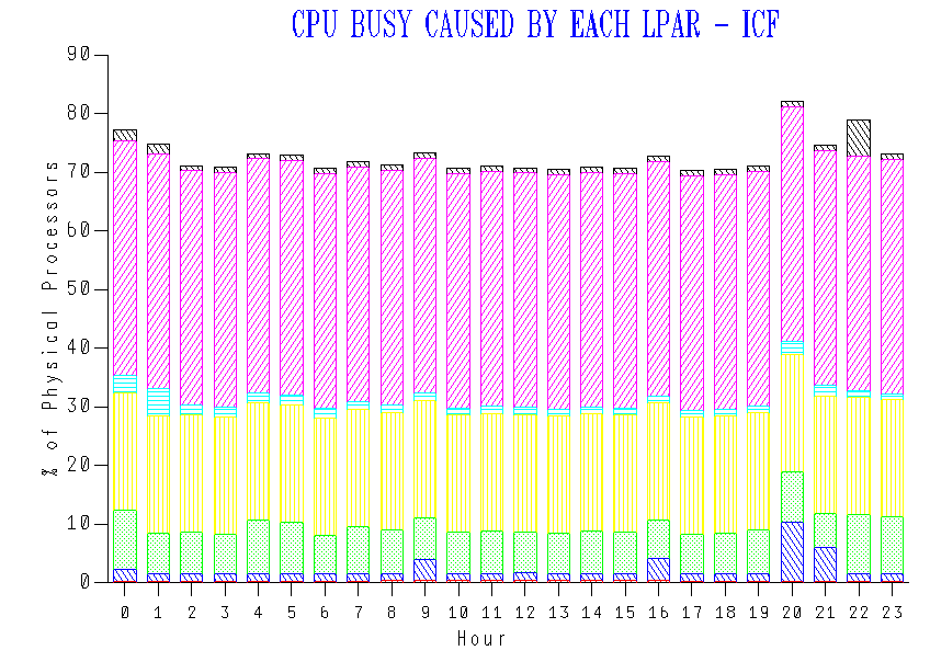
Though you can’t see it (as I’ve cropped the legend off) the LPARs are stacked alphabetically. There’s been no more logic to it than that.
The purple and yellow LPARs turn out to have 2 dedicated processors and 1 dedicated processor, respectively. While you probably could tell that, it’s really not “in your face”.
New Depiction
Consider the following redrawing: [2]
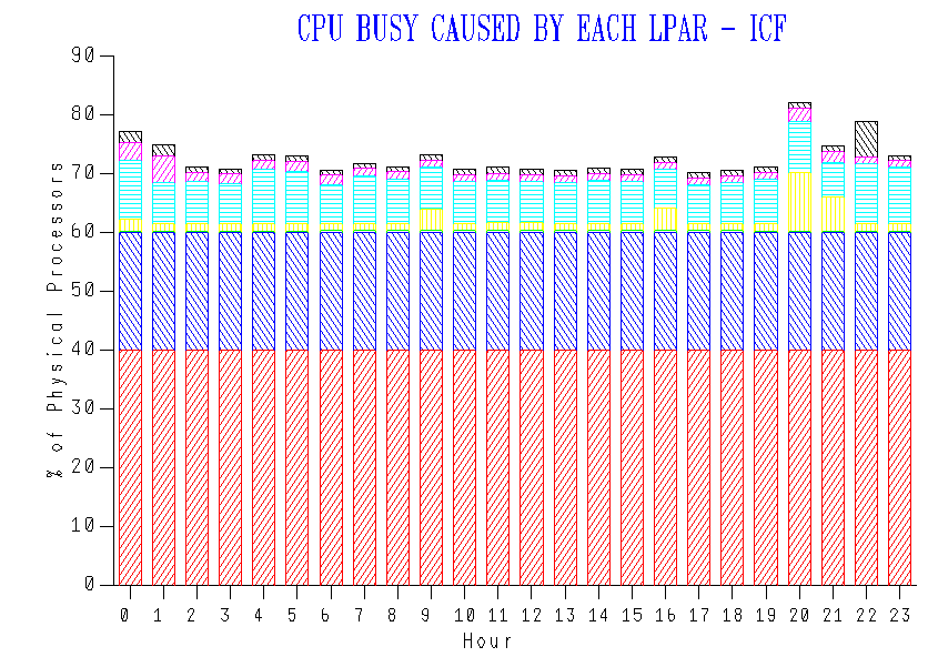
In this redrawing I sorted the LPARs by Number Of Dedicated Processors descending and, within that, alphabetically.
Here we clearly have two LPARs with dedicated processors. This being the ICF pool the ICF LPARs don’t give the processors back.
The remaining LPARs share what’s left of the pool.
You can see the red LPAR uses 40% of the pool and the blue one 20%. We happen to know that the pool has 3 dedicated ICF processors and 2 shared.
We’re much more clearly depicting the 2 LPARs with dedicated processors.
As I said this is a minor tweak, but it’s a much nicer result. If you’re graphing your ICF processor pool you might like to consider this rearrangement of stacking.
There are some further tweaks I could make. For example:
- I could make the y axis the number of processors and make it end at (in this case) 5 processors.
- I could make the series labels show e.g. “2 ded” for an LPAR with 2 dedicated processors.
At the beginning I said the code change was substantial, though the visual change was small. I now have much more control over the construction of this graph, so I can do things with axes I couldn’t before. Similarly I can do things with series labels I couldn’t before.
I mention this re-engineering as I half expect it to enable more creativity in how we depict processor pools. If anything worthy of sharing comes up I’ll share it here. Stay tuned!

2 thoughts on “A Picture Of Dedication”