(Originally posted 2017-02-18.)
In Lost For Words With DDF I wrote about matching up Client DB2 and Server DB2 Accounting Trace (SMF 101) records – for DDF. In this post I'm writing about a more generally relevant technique for DDF.
In fact I've just completed some prototype code for this and, of course :-), thrown it straight into Production. Such is the way tools get sharpened.
This technique enables me to draw the network of machines and applications accessing DB2 using DDF.
Why Worry About What Accesses DB2 Via DDF?
Speaking purely from the Performance perspective 1 understanding what accesses DB2 is important.
I've often spoken about the mythical “person in the expensive corner office whose Excel spreadsheet kicks off a query that trawls through the entire Production transaction table”. Such a query can be very expensive – and it's origin needs detecting. 2
Another aspect is Verification. You'd like to know your DDF “estate” is what you think it is. After all people add connections to mainframes all the time.
Finally, WLM classification rules can include who and where the DDF work comes from. There might be benefit in taking advantage of that.
For my part nosiness leads me to want to draw the diagram anyway. 🙂
How Do You Detect Who Accesses DB2 From Accounting Trace?
DB2 Accounting Trace has – as I probably should have said in Lost For Words With DDF – a very nice section for identifying connectors – QMDA3.
Among other things this section tells you:
- The IP address the client connected via.
- The type of connector – for example “DSN” is DB2 on z/OS, and “JCC” is Java.
- The software level of the connector – for example “11.1.5” for DB2 on z/OS is Version 11 in New Function Mode (NFM).
- The Netid – of which more in a minute.
- The DB2 Authid and End User ID.
- The platform name – for example “Solaris”.
Some of these fields play differently for DSN, SQL and JCC. For example, for JCC the platform name looks much more like an application name in the set of data I'm testing with,4 as you'll see in a minute.
Some Fragments Of Reporting
A quick look at the samples below will demonstrate I've done a lot to obfuscate what is real customer data. What is especially difficult is obfuscating IP addresses and Netids but, apart from that, the data remains consistent.
It is indeed from a single diagram.
Before we look at some examples note that I've used colour coding for different connector types – typically operating system but also guessing what is Websphere Application Server.
Let's start with a simple example.

Here are three simple connectors.
The lines in each box are:
- IP Address
- Authid
- Connector type
- Platform
- End User ID
By “simple” I mean that the connection is direct – not via a gateway.
I haven't shown the Netid but for Distributed connectors it is an encoding of the Client Workstation IP Address. While all bar the first character is a hex digit the first is an encoding to make sure the first digit isn't numeric. So “G” means 0, “H” means 1 and so on.
The reason I haven't shown the Netid is that when you decode it this way it's identical to the IP Address – so there is no gateway.
The three connectors (machines) shown have non-contiguous IP addresses so I show them separately.5
In the above case the JCC level is 3.2.0 but in this data I sometimes see the same machine with two levels:
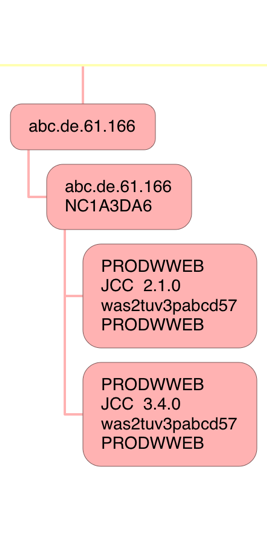
In this case I show both levels – as separate nodes. Mea culpa: You can see in this case consolidation hasn't been as complete as I'd like, again there being no gateway.
The consolidation of contiguous IP addresses is especially helpful in cases like the following:
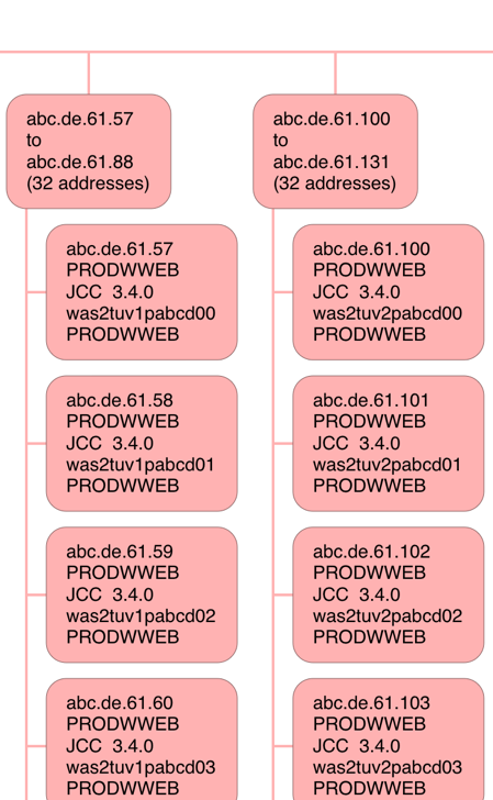
I've cut this off after a few addresses – to save you excessive scrolling. But you can see two blocks of 32 contiguous IP addresses, with a fairly obvious naming convention for the JCC Platform ID. I would surmise these are Websphere Application Server machines front-ending the “tuv”6 DB2 application.
Finally a rather busy one (and you'll want to view this fragment in a new tab):
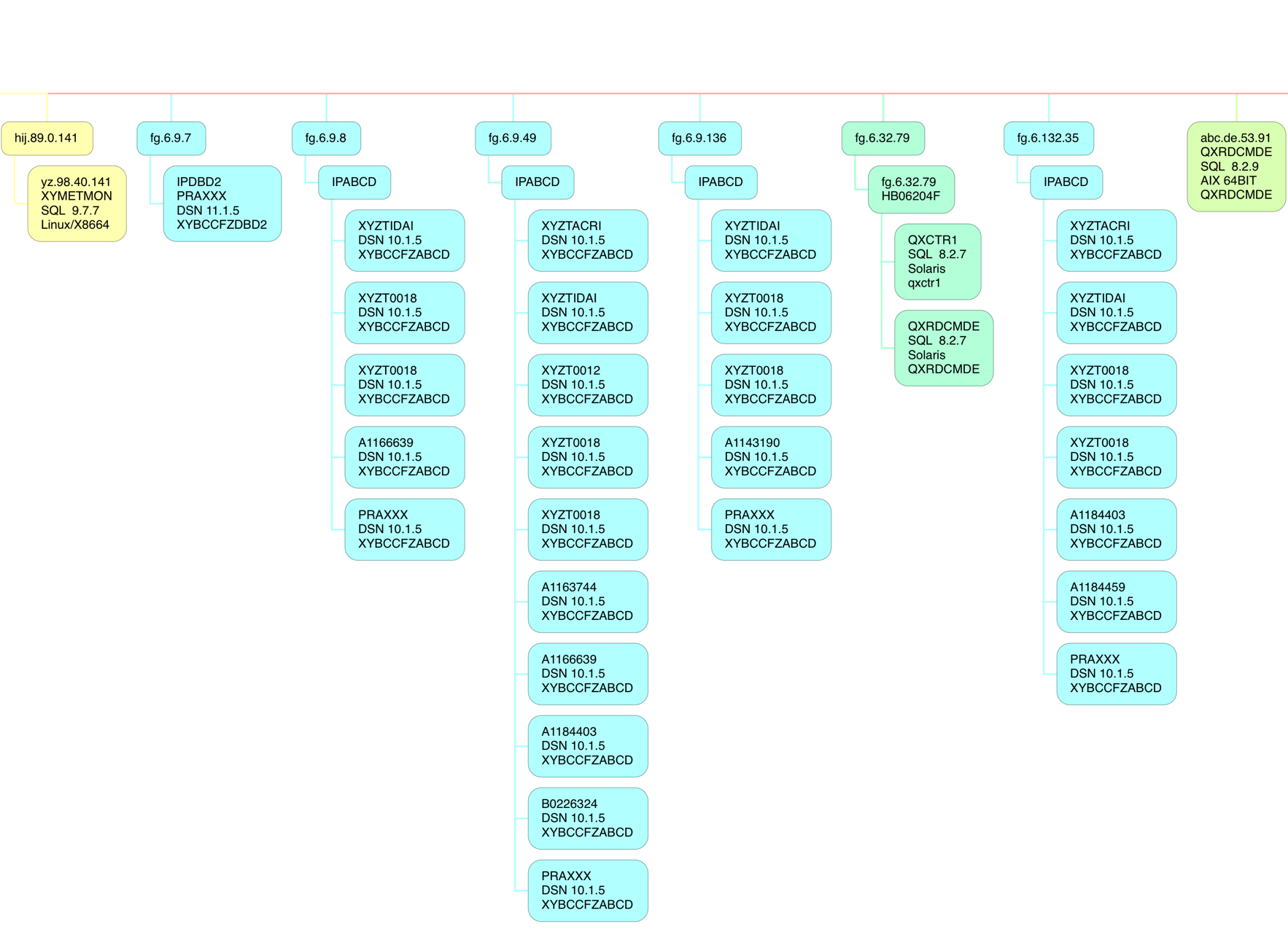
Here there are several different software platforms:
- 64-Bit Linux on Intel
- DB2 on z/OS
- 64-Bit AIX
- Solaris
And within the DB2 on z/OS category notice “10.1.5” and “11.1.5”. This customer was in transition from DB2 Version 10 to Version 11. Also I recognise 4 client DB2 subsystems at 10.1 – which are the 4 that are in a DB2 Data Sharing group talking DDF to this subsystem (and its Data Sharing Group partners). I bet if I asked the customer those IP addresses would be utterly familiar.
Note also the Netid commonality – “IPABCD” – which I will probably see as a common feature, when I get more experience.
How I Made the Diagram
The process for creating the diagram is two-step:
- Crunching the data into a Comma-Separated Value (CSV) file.
- Importing this CSV file into the diagramming application I'm using.
I'll share a few of the specifics with you. If you want to do this you'll need to follow much the same path.
Crunching The Data
Crunching the data, in my case, consists of two batch job steps:
- A DFSORT step that summarises the 101 records, boiling down to unique names, and preserves the fields needed for diagramming.7
- A REXX EXEC that takes this summarised flat file and generates the CSV file.
I may have mentioned this before but I once wrote a REXX exec to convert this CSV file into Freemind format. I've yet to throw this CSV through the exec but it will be something to try soon.
Producing The Diagram
The process for producing the diagram consists of importing the CSV file into a Mac OS app – iThoughtsX – and a small amount of cosmetic tidying up.
The snippets you see above were actually produced by the counterpart iOS app on my iPad Pro – iThoughts.
Conclusion
While fine tuning the diagram was fiddly creating at least a basic version was very easy.
As always, as I gain more experience with this I'll evolve the diagramming. One obvious thing to do is to highlight the “high volume” or “high CPU” connectors; As I have the data in my flat file it'd be simple to colour code the “hotter” connectors.
One of the nice things to note is a modern tool such as iThoughts allows some quite neat navigation and pattern seeking. For example, I can – in both the Mac OS and iOS versions – use filtering. If I were to type in “mobi” – which appears in the unanonymised version of this diagram – a bunch of nodes will show up and the rest will be grey. This example has obvious application.
For me at least the sorts of insights I can draw into a customer's DDF estate are really nice.
The other nice thing about iThoughts is it has some Presenter capabilities for a mind map such as these; I actually haven't played with that much but I think that could prove really handy.
Perhaps this dinosaur is evolving wings. 🙂
-
From other perspectives, such as Security, it matters too. ↩
-
But would you want to be the one showing up at their door, unannounced, to give them some “friendly advice”? 🙂 ↩
-
Mapped by DSNDQMDA. ↩
-
I think this is configurable, though. ↩
-
If they were contiguous I'd try to lump them together – with some appropriate factors defeating that effort. ↩
-
Obviously “tuv” is not its real name. ↩
-
This step, as well as counting records with a unique set of identifiers, sums up things like Class 1 Elapsed Time – but today I make no use of this summation. ↩

3 thoughts on “DDF Networking”