(Originally posted 2014-09-21.)
Back in 2010 I wrote about a graph I’d developed for understanding how a Service Class Period’s velocity behaves. That post is here: WLM Velocity – “Rhetorical Devices Are Us”.
At the time I was concerned not to show up the customer by displaying the graph. I think that was the right decision. But in the presentation I mention here: Workload Manager And DB2 Presentation Abstract I do have an example. And indeed it’s a significant part of my “zIIP Capacity Planning” presentation (you can get from System z Technical University, Budapest 12–16 May 2014, Slides).
I regard that graph as a nice rhetorical device[1] as it has led to many fine discussions with customers (and I’ve tweaked it a little in the process).
But this blog post is about a very new graph I’ve developed on the theme of Velocity. I hope it, too, will lead to lots of interesting discussions with customers.
But the reason for sharing it with you is that you might well want to do something similar.
The primary purpose of the graph is twofold:
- To show the hierarchy of importances and velocities.
- To show when too many WLM service class periods are too similar – both in terms of velocities and importances.
As I write this those two bullets look remarkably similar but they’re not.
The Importance Of Importance
Question: Given two service class periods with equal velocities, which will be served first?
Answer: The one with the higher importance.
It’s a fact that importance is the major distinction in that WLM will try to satisfy the goal of a more important service class period before attempting to satisfy the goal of a less important one.
But note that some goals are unattainable and some velocity calculations are dominated by things WLM can do little about.
So this addresses Bullet 1 – the hierarchy.
The Importance Of Being Earnest
Sorry for the gratuitous section heading but it sort of fits: If you have a goal that’s greatly overachieved it’s not protective. For example, if STCHI has a goal of 40% and it always achieves around 80% it’s not protective: If CPU becomes scarce, as just one scenario, the velocity delivered could easily drop down towards the goal 40%.
So set goals that are “in earnest” and protective, unless you really don’t care if service drops off.
Flight Level Separation
But importance isn’t the only, ahem, important 🙂 thing: The difference in goal velocities is also important: Goals that are too close together aren’t really useful.
If possible keep velocities at least 10 apart, or try to merge the service class periods.[2]
So this addresses Bullet 2 – the separation.
And Now To The Graph Itself
The graph I’m describing in this post is also a nice rhetorical device.
The graph has along the x axis WLM importance. On the y axis is the goal velocity. Each marker is a unique combination of importance and velocity. Next to the marker is a list of service class periods defined with that importance and velocity.
At least that was the first implementation.
Then I refined it (and I’m still fiddling with it):
-
If the service class period consumes significant CPU I bold and enlarge the name. If it doesn’t I draw the name in italics. So there’s a distinction between significant service class periods and insignificant ones – for this shift and this system. “Significant” is a “movable feast” so I expect I’ll tweak this in the future.
-
If there are more than 3 service class periods with the same importance and velocity I don’t list them but the label becomes e.g. “7 SC Periods”. It’s significant if many service class periods share the same importance and velocity.
-
I use colour coding for the service class periods – instead of adding e.g. “.1” to denote first period to the label. (I’m having to get fancy to manage the label “real estate”.)
OK. So enough prose; Let’s see some pictures. 🙂
Here are some example graphs. I’ve scaled them down to fit into the page column so you’ll find them clearer if you open the picture in a new tab or window.
First a straightforward one.

In this example there are four significant service classes: SERVERS, PRDBATHI, STCMD and PRDBATMD. Here SERVERS (assuming it has the right things in it [3]) is sensibly located to the right and above everything else. STCMD and PRDBATHI are together in the middle and PRDBATMD is down and to the right.
This looks like a sensible hierarchy and generally the velocity “flight levels” have good separation.[4].
You’ll also notice a couple of (in black) Period 2 data points. Period 1 for these service classes have response time goals.
Now a case where the flight levels are too close together:

Importance 2 and, even more so, Importances 3 and 4 have lots of crowding – with velocity separations down to 2 in some cases. WLM will have a hard time working with this.
Finally a more extreme case:
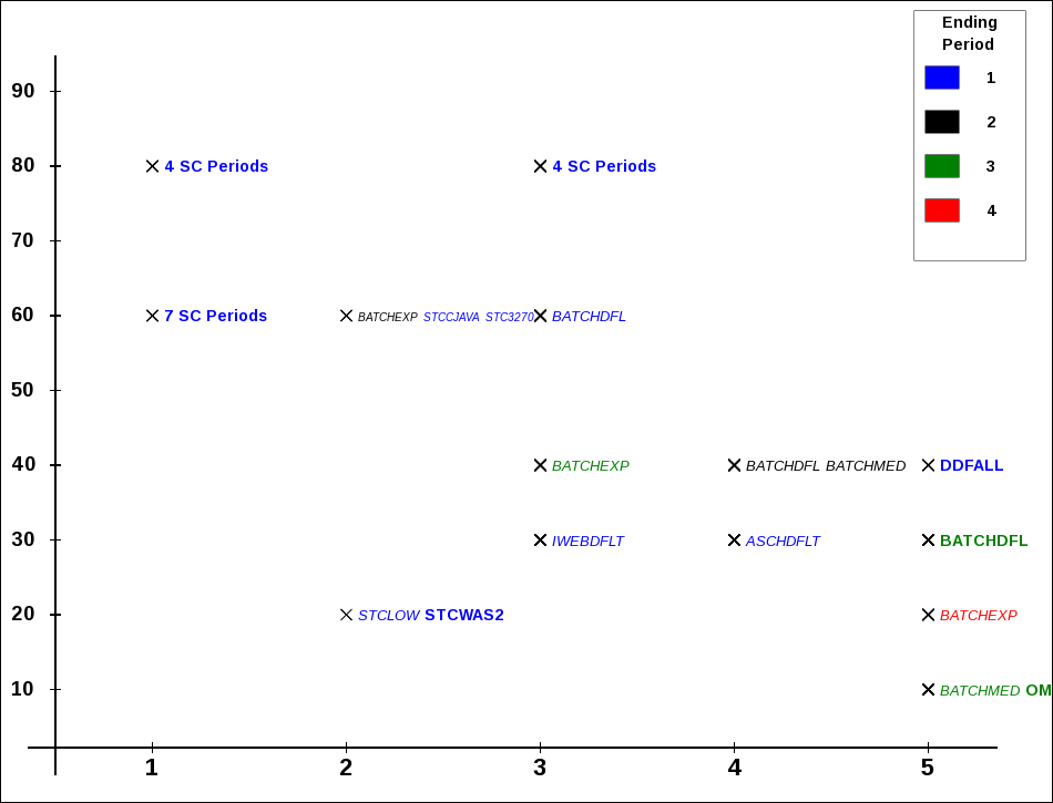
Here we have several cases where 4 or even 7 service class periods share the same importance and velocity.
Limitations Of The Method
The most obvious limitation is that other goal types – SYSTEM, Response Time and Discretionary – can’t be plotted on the same graph. It would be possible to draw SYSTEM / SYSSTC to the left and Discretionary to the right but it doesn’t add anything.
I’m going to have to think about how to plot Response Time goals – on a separate graph. There isn’t an obvious y axis. By the way, in all three examples there are service classes where the first (or first few) periods have Response Time goals and subsequent ones have Velocity goals. This is often observed – and this graph won’t show these early Response Time periods.
Also this is fairly static – being a “shift” summary.
The real question is “what do I do about flight levels that are too close together?” The ones that are identical might be amenable to combination but you can’t really combine PRDBATHI and STCMD (as in the first example) – unless these service class names are misnomers.
So this is why I consider this graphing technique a “rhetorical device”: I really want customers to think about whether it makes sense to combine service classes. And part of the motivation for this is WLM works better when the work in a service class period is sizeable.
This is also a “single system” graph and the constraints of running in a Parallel Sysplex – where there is only one WLM policy in effect for all members – aren’t reflected here. Again, doing the thinking is the important thing.
One, perhaps subtle, issue is the fact RMF records CPU in the Service Class Period where the work ended. You can see this for BATCHMED in the second example:
- Periods 1 and 2 have little CPU in them; The name is italicised.
- Period 3 has CPU in it; The name is in bold. Clearly work accumulates service (which has to include CPU) when it progresses through the periods. But there isn’t a good way to back-calculate the CPU in each period.
Conclusion
So I hope this graph gives you some ideas. Certainly I’ll be using it in customer situations and it’s a very easy graph for me to produce[5]. It will, of course, evolve – in all likelihood. For example you can see cases where the labels are either cut off or overlap something else.
-
When I use the term “rhetorical device” I mean the graph is useful but not to be taken too seriously: It should usefully contribute to the discussion, warts and all. ↩
-
This, as we shall see presently, is easier said than done. ↩
-
You can tell (mostly) what’s in a Service Class using SMF 30: Workload, Service Class and Report Class are fields in the record. ↩
-
The more I use the term “flight level” the more I like it. ↩
-
It’s actually written in PHP which generates javascript. This in turn draws on an HTML5 Canvas element. In most browsers you can readily save the javascript and indeed the drawing as a PNG file. Actually I think browsers have a slightly awkward handling of Canvas elements – but nevermind. (If I, to paraphrase the late great Tony Benn “retire to spend more time doing real computing” 🙂 I fancy I might be working on this.) ↩

2 thoughts on “WLM Velocity – Another Fine Rhetorical Device I’ve Gotten Myself Into”