(Originally posted 2015-10-06.)
I’ve played some more since I wrote Slide Over A Bit, most notably from the perspective of developing a web app that acts as a Slide View widget. This post addresses some of the issues. In particular:
- Offline web apps, a feature of HTML 5.
- Responsive design – writing a web app that works well in Slide View mode while still looking OK in Full Screen mode.
- Remote hosting.
I wrote a better version of my “wrap pasted text in quotes” widget to try things out – and because I want one. It looks like this:

It might not be the prettiest widget in the world but producing it required quite a bit of experimentation. Without the experimentation it would be impossibly small.
Offline Web Apps
To make a web page load quickly and from anywhere is good.
How can you make a web page load without a network connection? Well, it has to have content that doesn’t require a server update. One that is javascript plus a few fields and doesn’t need fresh data from a server is a good candidate. All of that is static and can be loaded from the browser’s cache. A widget is ideal – unless it actually needs data from somewhere.
Plenty of material on the internet exists that describes how to write an offline app, for example Offline Web Applications – Dive Into HTML5. I won’t repeat the material here but it needs your web page to point to a cache manifest file. Every time you change the web page’s contents you need to change the cache manifest file – perhaps by updating a timestamp. Frankly I couldn’t get Safari to recognise the cache manifest file had changed. Perhaps this was because I was developing in Pythonista with the web server code I showed in Slide Over A Bit.
Responsive Design
This is the meat of this post. Consider the case of some very simple HTML:
<html>
  <body>
    <h1>It works!</h1>
  </body>
</html>
If you serve it to Full Screen Mobile Safari it looks like this:
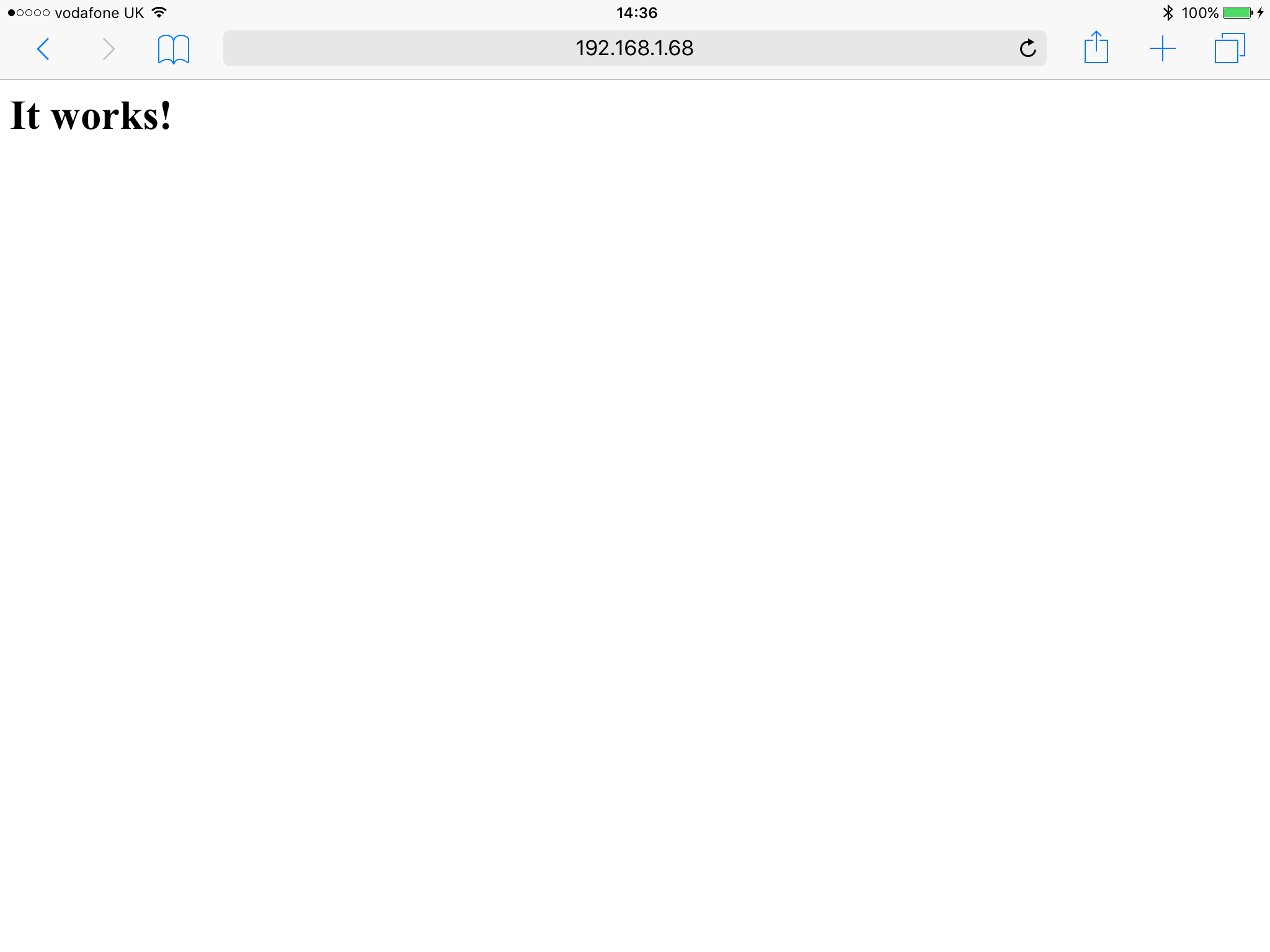
but if you view it in Slide Over Mobile Safari it looks like this:

What has happened is the page is scaled down. My widget is unusable with this scaling down – or it would be if I didn’t do something about it.
There are two main ways to arrange elements on a web page:
- Using Javascript
- Using Cascading Style Sheets (CSS)
In both cases we need a trigger to cause different rendering when in Full Screen and in Slide Over. My first attempts were to use the page width – but this fails as Safari reports the same width in each mode.
The breakthrough came when I realised (and later proved) the height is different in the two modes.
Javascript
On my iPad Air window.innerHeight is 2021 when a page is displayed in Safari in Slide Over and under 700 when Full Screen.
You could use this to lay out the page differently in each case.
CSS
In CSS a simple media query will do the trick. Wrapping the CSS Slide Over mode in the following worked for me:
@media all and (min-height: 2021px){
  ...
}
Actually lower values than 2021 worked. And this was in landscape, on an iPad Air. In portrait, or on a different kind of iPad, it will be different. Experiment with window.innerHeight in Javascript to see what works for the configurations you intend to support.
In my code I specified:
font-size: 40px;
and this made the text big enough (just about).
I also specified:
button {
  width: 300px;
  height: 300px;
  background-color: LightBlue;
  border-radius: 150px;
}
to make those nice round blue buttons.
If you know CSS you’ll get the general idea.
For Full Screen you’d probably use max-height instead of min-height – in the same style sheet.
Remote Hosting
I uploaded my single HTML file to Dropbox. It works fine – but in “cheapo” basic mode the file has to be downloaded before being executed, and I don’t see how to get the page to refer effectively to the cache manifest file needed for offline use.
Here is the HTML:
<!doctype html>
<html manifest="cache.manifest">
<style>
@media all and (min-height: 2021px){
* {
font-size: 40px;
}
textarea {
height: 500px;
width: 800px;
}
button {
width: 300px;
height: 300px;
background-color: LightBlue;
border-radius: 150px;
}
</style>
<br/>
<p>
Paste in text and press a button to format it.
<p>
<textarea rows='5' cols='30' id="myText">
</textarea>
<br/>
<br/>
<button onclick="singleQuotes()">Single Quotes</button>
<span> </span>
<button onclick="doubleQuotes()">Double Quotes</button>
<br/>
<script>
textbox=document.getElementById("myText")
function wrap(prefix,suffix) {
textbox.value=prefix+textbox.value.trim()+suffix
}
function prepareToCut(node){
node.focus()
node.setSelectionRange(0,9999)
}
function singleQuotes() {
wrap("'","'")
prepareToCut(textbox)
}
function doubleQuotes() {
wrap('"','"')
prepareToCut(textbox)
}
</script>
</html>
To a real web developer this is probably basic and incomplete – but I hope it raises and begins to solve one key issue: How to make web pages look good in Mobile Safari in both Slide Over and Full Screen. The former is particularly important to make Slide Over “widgets” easy to write.
Now, I’m not a professional web developer and certainly not a CSS expert. So if you have anything to add please feel free to chip in.
The fun continues. 🙂
 Mainframe, Performance, Topics