I have REXX code that can be called directly by TSO (in DD SYSTSIN data) or else by another REXX function. I want it to behave differently in each case:
If called directly from TSO I want it to print something.
If called from another function I want it to return some values to the calling function.
So I thought about how to do this. The answer’s quite simple: Use the parse source command and examine the second word returned.
Here’s a simple example, the function myfunc.
/* REXX myfunc */
interpret "x=1;y=2"
parse source . envt .
if envt="COMMAND" then do
  /* Called from top level command */
    say x y
end
else do
  /* Called from procedure or function */
  return x y
end
The interpret command is a fancy way of assigning two variables (and really a leftover from another test). It works but you would normally code
x=1
y=2
The parse source command returns a number of words but it’s the second one that is of interest – and is saved in the variable envt.
The following lines test whether envt has the value “COMMAND” or not. If so the function’s been called directly from TSO. If not it hasn’t.
In the one case the variable values are printed. In the other they’re returned to the calling routine.
The calling routine might call have a line similar to
parse value myfunc() with x y
Which would unpack the two variables.
(The original interpret "x=1;y=2" might look silly but interpret "x='1 first';y='2 second'" doesn’t – as a way of passing strings with arbitrary spaces in them back from a routine.)
This is a simplified version of something I want to do in my own code. There might be a few people who will find this useful so why keep it to myself? 🙂
(It’s probably a standard technique nobody taught me.) 🙂
It’s possible I’ve written something about this before:
My blog is so extensive now it’s hard to find out exactly what I’ve written about (and I’m going to have to do something about that).
I say “written something” because I know for sure I haven’t written about the SMF record field I want to introduce you to now.
Previously
If when you send me data you include Type 30 interval records I’ll use them to relate WLM Service Classes to Report Classes:
Workload, Service Class and Report Class are all in there.
But these records are only for address spaces.
Address spaces that actually got created.
And therein lies a problem:
Only some of the Service Class / Report Class relationships can be gleaned this way.
In practice I’ve found this (incomplete but not inaccurate) information handy.
So I’d like to fill in some gaps.
New News
I expect you didn’t know this either – so I call it “new news”:
There’s a handy field in SMF 72 Subtype 3 (Workload Activity Report) called R723PLSC.
It has nothing to do with PSLC.
This is defined as the “Service Class that last contributed to this Report Class period
during this interval.”
I’ve highlighted the word “last” as its quite important but we’ll come back to that in a minute.
This allows you to see some relationships for work that isn’t represented by address spaces, for instance DDF.
(In my test data it’s DDF I’m seeing.)
I’ve spent some time adding this in to my code.
Usually I’d summarise over several hours.
In this case if I do I miss stuff.
The emphasised “last” above means that only one of the (potentially several) Service Classes that correspond to this Report Class shows up in the record.
So I use a set of rows, each representing a short interval, to get the correspondence.
In my test data this approach yields more correspondences – as somehow the last one often isn’t always the same one from interval to interval.
If you use Report Classes to break out a subset of a Service Class the “last Service Class” issue doesn’t arise.
If you use Report Classes for aggregation (or in a hybrid way) it certainly does.
(I’m not all that keen on using Report Classes for aggregation anyway:
Decent reporting tools can do that for you.
But I could be persuaded.
I’m keener on using them for breakouts, such as DDF applications that share a common Service Class, or to break out an address space or several.)
I’m not claiming to have got all the Service Class / Report Class correspondences but I’ve got more of them – and for an important set of cases:
Service Classes and Report Classes that don’t correspond to address spaces.
As you’ll see in Playing Spot The Difference With WLM Service Definitions I prefer to have the WLM Service Definition to work with – and I’ll be asking for it more fervently in the future.
But you have to work with the data you can readily obtain.
And R723PLSC is a handy field to have learnt about.
You might find it useful, too.
A customer asked me to examine two WLM service definition snapshots taken on adjacent days – and discern any differences. This is not a challenge I’ve been set before – and so I expect it’s pretty rare.
But, thinking about it, I reckon it could be quite useful.
So they sent me two service definitions, one day apart, and one from months later.
When I say “a service definition” I mean the ISPF table library (TLIB) in which it’s stored.
TERSEd and sent via FTP BINARY they make the trip just fine.
On my z/OS system I can fire up the WLM Service Definition Editor and read (and even edit) these just fine.
(I could print the policy in a number of different formats – report, CSV file or GML.
But I don’t choose to.)
I could even compare the two TLIBs but I don’t think that’d be a useful or consumable comparison.
Likewise the three kinds of policy prints I just mentioned.
So, I decided to revisit an approach I’ve posted about before:
Processing the XML version of the service definition.
Done right this could be a way to make a meaningful comparison – because it’s cogniscent of the structure of the Service Definitions.
When I last looked at the XML version I think I was on Windows.
Now I’m on Linux.
Unperturbed I downloaded the WLM Service Definition Editor – which is a .exe file.
But it unpacks – with Archive Manager – anyway.
Inside is, amongst other things, a jar file and two REXX execs – ISPF2XML and XML2ISPF.
(You can run the jar file under Linux and the SD Editor works.
But that’s not what I was after.)
The ISPF2XML exec runs under REXX/ISPF and produces a very nice XML file.
In conversation with the author it transpires this isn’t actively maintained anymore and one should
probably use the one from z/OSMF now.
(I’d be interested in seeing some XML from the new editor – if anyone is using it and is willing to send me a file.)
Again, I could compare two XML files but I don’t think a raw textual comparison would be very helpful.
A Byproduct – An XML Formatter For HTML
Because the XML file is well-formed it’s quite easy to parse it.
And it is quite comprehensible, in its own terms.
So, I wrote some PHP code that uses XPATH to process the file.
Why PHP?
Because I’m creating HTML (and serving it from Apache on my laptop to itself) and its XPATH support is very good.
So now I have a nice Formatter for the whole Service Definition:
If you get to send me your XML I get to send you the HTML.
And at the same time I get to understand more about how the classification side of your
WLM policy works.
(RMF has nothing to say about WLM classification rules’ firing:
I use SMF 30 to try to guess this stuff – but that has limitations.
And for DDF work I have to rely on the DB2 Accounting Trace QWACWLME field.)
Comparing Two Service Definitions
I only got part way through writing the comparison code:
I compared the first-level nodes (children of the root node, such as the ClassificationRules element)
by using the saveHTML method and lexically comparing the strings produced.
Correctly this told me the overnight changes were twofold:
A new report class had been added.
A new classification rule had been added, assigning this report class to some DDF work.
I say “correctly” because eyeballing my HTML reports told me the same thing:
Opening the two of them in tabs, scrolling both to the top and then paging each down in turn took about 5 minutes.
Doing it that slowly convinced me I’d spotted all the differences.
(It helps I have built in some navigation aids along the way – which I won’t bore you with.)
Timestamps and Userids
Remember the two service definitions I’m comparing are from adjacent days.
It’s handy they have timestamps for when e.g. A resource group was created.
And always there’s a matching “update” timestamps.
Furthermore each timestamp is accompanied by a userid.
Sometimes these are goofy – “1900–01–01” 🙂 or “N.N” – but it’s nice to see “CLW” 🙂 appear,
indicating the provenance of the service definition.
(Even the goofy ones are, of course, meaningful.)
More seriously a timestamp between one day and the next is helpful.
Conclusion
RMF only gives you so much (but it’s a lot):
Sometimes you need to go much further.
And the XML version, whatever you do with it, fits the bill nicely.
Comparing two Service Definitions helps identify when changes were made.
Picking up the timestamps narrows the doubt even more.
And knowing the userids that authored changes helps drive discussions about who changed what and why.
You could readily save copies of the ISPF TLIB (or the XML) on a daily or weekly basis, and compare generations.
What I’d like to know is if a WLM Service Definition comparison tool would be generally useful for customers.
Well would it?
For a start we’re going to assemble a team of 4 skilled mainframe folks from wherever we can. 🙂
One of them will be me, which leaves 3.
You could be one of those – but only if you throw your hat in the ring.
We’re looking for three distinct roles:
Someone with good scheduling (TWS) and JCL skills.
Someone with experience in writing and tuning COBOL / DB2 programs.
The same but for the pairing of PL/I and VSAM.
Actually there’s some flexibility in these last two roles:
COBOL / VSAM and PL/I / DB2 would work just fine.
But I still haven’t told you what we’ll actually do…
Residency Goal
We aim to teach people how to successfully clone individual batch jobs – through examples and guidance.
How We’ll Do It
The referenced blog posts describe some theory.
This residency will write a Redbook that’ll describe the practice.
We’ll create two test cases that we’ll assert want cloning.
They’ll process a large number of records / rows – in a loop.
This is a very common application pattern:
If you can think of another one we’ll entertain it.
One program will be written in COBOL and the other in PL/I.
Hence the programming skill requirements.
One will access DB2 data primarily, the other mainly VSAM.
Which explains those two skill requirements.
So the first few days will create these baselines – and measure them.
Then we’ll investigate cloning – 2-up, then 4-up, then 8-up, etc..
Why This Is Non-Trivial
If these cases were read-only this might be trivial.
If these cases didn’t write a summary report at the end the same might be true.
But we won’t make it so easy on ourselves:
We’ll update something in each case – a file or a DB2 table.
We’ll read a second file / table (a lookup table, if you will).
We’ll write a report at the end.
All these reflect real life problems people will have.
And if the residents can think of some more pain to inflict on ourselves we will. 🙂
The Report
As I mentioned in
Cloning Fan-In
many programs produce a report.
This is easy before cloning.
With cloning it’s much harder.
So we need to exercise that.
But I posited a modified architecture:
Create data files and merge them in a separate reporting job.
JSON could be involved, and so could XML – as those files should be modern.
I say that because one benefit of cloning a job could be making the reporting data available to other consumers.
If we have time someone could explore this.
Why We Need A Scheduling Person
First, real life would require you to integrate a cloned job into Production:
Scheduling one job, complete with recovery is one thing.
Scheduling cloned jobs is another.
Second, it’s not enough to succeed once in cloning a job:
Installations will want to automate splitting again and maybe even dynamically decide how many clones.
(And maybe where they’ll run.)
The TWS person will not only do scheduling but figure out how best to structure the JCL.
Though not the main thrust of this residency, z/OS 2.1 will have JCL enhancements I guess to be useful here.
We’ll have 2.1 on our LPAR so you can play with this.
If you’ve never played with BatchPipes/MVS I expect you’ll get to try it out, too.
Measurements
While we overtly state this is not a formal benchmark, we’ll take lots of measurements and tune accordingly.
This I’m expecting to play the main role in.
Write Up
The idea of this is to deliver practical guidance through real life case studies.
So there’ll be a book and maybe a presentation.
We’ll document what we did, what issues arose, how we resolved them, and what we learnt.
And this will draw on all our perspectives.
As the application programs aren’t the main deliverable they’ll probably go in appendices.
Tweaks we have to make to the code, JCL and schedule will be highlighted.
Reporting requirements will also be described.
Finally
I think this will be a lot of fun.
I also think the contact with Development will be fruitful.
So I invite you all to consider applying. Nominations close 5 July.
This is the second part, following on from
Part 1.
Importance Versus Velocity
After drawing out the hierarchy you have to set actual goals – whether velocity or some form of response time.
And you have to set importances.
The importances should now be easy as they flow from the hierarchy.
IRLM should be in SYSSTC – which serves as an anchor at the top.
It’s not quite as simple, though, as assigning from 1 downwards – perhaps with gaps.
You might find there are too many hierarchical steps and you have to decide how to conflate some.
It’s important to understand that Importance trumps Velocity: Importance 1 goals are satisfied first, then 2 and so on.
But a low Velocity service class period with Importance 1 might well have its goal satisfied too easily and WLM will then go on to satisfy less important service class periods rather than trying to overachieve the Imp 1 goal.
Further, a velocity goal that is always overachieved provides no protection on those occasions when resources become constrained: The attainment could well be dragged all the way down to the goal.
At the other extreme an overly aggressive velocity goal can lead to WLM giving up on the goal.
It sounds against the spirit of WLM but I’d set a goal at roughly normal attainment – assuming this level provides acceptable performance,
Actually the same things apply to response time goals: Importance overrides and setting the tightness of the goal right is important.
What’s In A Name?
I’ve seen enough WLM policies now to know they fall into three categories:
I know these because of the names therein.
(By the way it’s the third category I see the most problems in.)
The first two contain names which are rhetorically useful such as “STCHI”.
It’s better not to either name them something too specific – in case you have to repurpose them – or to encode the goal values in the name – in case you have to adjust them (as you probably will).
By the way the same applies to the descriptions – which appear in SMF 72–3.
If I ever learn Serbo-Croat it’ll probably be from SMF. 🙂
The Importance Of Instrumentation
Having just mentioned SMF let me talk about instrumentation.
Recall I was asked to look at a WLM policy.
Initially I was sent a WLM policy print.
I then asked for (and swiftly got) appropriate SMF.
The point is it’s both you need:
The policy (in whatever form) gives you the rhetoric.
The SMF gives you the reality of how it performs.
Note the SMF doesn’t give you classification rules but the policy obviously does.
As an aside I’ve posited to Development it would be useful to instrument which classification rules fire with what frequency. Do you agree?
The most obvious use case is figuring out which rules are actually worthwhile, not that that’s a major theme in WLM tuning.
I suspect there are others.
I’d like to thank Dougie Lawson and Colin Paice for their help in thinking about certain subsystems they are more conversant with than I am.
This whole discussion would’ve been a lot worse without their input.
This post started out with the title “Insufficient Nosiness?” I think most of mine do. 🙂 And if they do they should be subtitled “What You Don’t Know Can Still Harm You”. 🙂
Since then its scope’s expanded somewhat and now it’s in two parts, the second part being here.
A lot of things have come together recently…
I’ve just been involved in a discussion with a customer – which stretched me but I believe that was a good thing. Almost all I can tell you about the situation is that it involved some design work around their WLM policy, And that their installation has lots of lovely complexity.
I’ve had “warm up gigs” 🙂 recently in that I’ve been involved in several discussions about how to classify subsystems – for example CICS, DB2 and DDF. But none of these has been as comprehensive as this one. Hence the “stretching”.
If I’m looking for “lessons learned” (and I think I always am) they’d be a heady mix of things I didn’t know, things I did know that got brought into sharp relief, and new ways of structuring my thinking.
I’ll admit to walking in with a little uncertainty that I could think my way through a WLM policy review but I gave it some thought and I emerged from the discussions much happier about it.
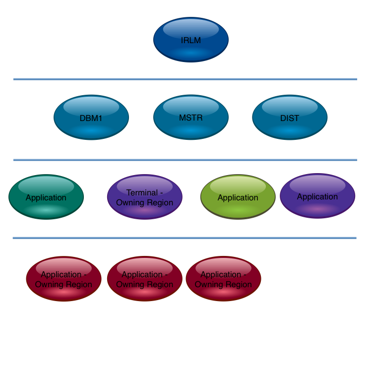
It struck me the first thing to do is to discover what address space serves what. (Generally speaking it is an address space that serves, but it often isn’t an address space that gets served – DDF transactions being a good example.)
The motivation for this – and I think it’s well known – is that work should not be allowed starve address spaces that serve it of CPU. The reason for labouring the point about serving hierarchy is that this structure gets quite complex to follow. Previous customer discussions hadn’t thrown this “real world” complexity into sharp relief: They’d only exposed parts of the hierarchy (such as the previously mentioned DB2 portion). Typically people talk about simplish things like within product relationships.
Here’s a typical CICS one: I’m advocating a more comprehensive approach. (I was going to write a presentation about just that: within product considerations. I now think it’ll be a different presentation if it emerges at all.)
We didn’t actually draw the hierarchy on a piece of paper: I think next time I actually will create a physical drawing.
Discerning The Hierarchy
This directly draws on previously-mentioned information sources, such as SMF 30 Usage data, or DB2 Accounting Trace. The discussions this week laid out the hierarchy by people talking. Perish the thought. 🙂 Actually the Usage information did get a look in, in a supporting role.
I think you can start wherever you like. Perhaps because it’s quite complex you could start with DB2 (if relevant):
By the way the horizontal lines are boundaries between categories. You might find value in using “must be above” arrows between components instead.
The following is the previous two combined.
On reflection this is getting to the limit before arrows are required.
Also notice the TOR is viewed as the anchor point for the CICS application. You could argue the TOR need not be below DBM1. But I’d try and separate them if at all possible.
You wouldn’t put all your eggs in one basket, CICSwise, would you?
A naive reading of the CICS TS 5.1 announcement materials might lead you to suppose you could.
This post is about thinking about your CICS region portfolio in the light of this announcement.
While every CICS release introduces capabilities that makes it worthwhile to review your region portfolio,
5.1 majors on scalability.
So, in the months (hopefully only months) before you install 5.1 and eventually go live,
it would be a good idea to review your CICS region portfolio.
(I properly should say “application” rather than “region” – but for us Performance Folks
we’re more likely to get involved in discussions about regions than applications.
But we should still take a more-than-polite interest in applications.
However, this post is indeed rather more about regions than applications.)
So let’s review why installations split applications up into multiple regions.
There are essentially three:
Architectural
Availability
Performance and scalability
When reviewing your portfolio it’s worth looking at all these categories.
And to me one of the major benefits of 5.1 is that it gives you more choices.
Architecture
You’re probably thinking I protest too much about not being an architect.
I’ve talked about it enough times. 🙂
What I would say is it’s worth understanding the role of each CICS region.
You can begin by using the SMF 30 Usage information – as I discuss in
Another Usage Of Usage Information.
In that post I point out you can get topology information – such as which MQ or DB2 subsystem a region uses – just from SMF 30.
The above trick won’t detect File-Owning Regions (FOR’s).
For that you probably could spot one from the Disk EXCP counts in SMF 30 or, failing that, in SMF 42–6.
You could have some fun with region names – as I discuss in He Picks On CICS.
You could use CICS’ own Performance Trace – and I think CICS Performance Analyzer helps with this – to figure out how transactions flow.
Or you could actually talk to CICS people. 🙂
Actually that’s not an exclusive or.
From the above you can get to knowing which regions are part of which application, can tell FOR’s from AOR’s from DOR’s from QOR’s from TOR’s,
and generally have a crack at figuring out how set up for available it all is.
All before breakfast. 🙂
Hmm. I think I’m going to have to write me some more code… 🙂
And, of course, in 5.1 the architectural choices increase again.
Availability
Personally I recommend having at least four servers for resilience, though that is sometimes unaffordable.
The reason I recommend four rather than two is quite straightforward:
If running out of a resource causes a server to fail only having two means the other one is likely to fail as well.
Having three others makes it much more likely the survivors could handle the load.
Virtual Storage is a good example of this.
Of course there’s a cost to provisioning four rather than two – day in day out.
Consider four way Data Sharing:
Thankfully the difference between non- and two-way- is usually greater than the cost between two-way- and four-way-Data Sharing.
Each installation must make its own decisions on availability versus cost.
Performance and Scalability
There have traditionally been two reasons for limiting the size of CICS region, performancewise:
QR TCB Constraint
Virtual Storage
QR TCB Constraint
I wrote about this in New CPU Information In SMF Type 30 Records,
where I posited the new CPU metrics introduced into SMF Type 30 in APAR OA39629 could help establish
if the QR TCB is large.
In early client data I consistently see the biggest TCB in CICS regions as being “DFHKETCB” so I think this
is the QR TCB.
I decode this string as “DFH for CICS”, followed by “KE for Kernel” and “TCB is TCB”,
so this all makes sense to me.
In any case you could work with the SMF 30 TCB time:
If a significant portion of an engine you might look at the biggest TCB.
Whether that is the QR TCB or not a large % of an engine for Biggest TCB would warrant examination.
If it is the QR TCB then you have work to do before such a region could be combined with others.
For example, a CICS region with 90% of an engine at peak would warrant further investigation:
If the biggest TCB were DFHKETCB and only 20% of an engine you could combine maybe 3 such regions without
concern for QR TCB constraint.
If, however, the QR TCB were larger you’d want to consider the appropriateness of Threadsafe before concluding regions couldn’t be merged.
In 5.1 more commands have been made Threadsafe, as has the Transient Data (TD) Facility.
This follows all the extensions to Threadsafe applicability over prior releases.
(See Threadsafe Considerations for CICS.)
Virtual Storage
Historically CICS has used 24-, 31- and 64-bit virtual storage:
Both 24- and 31-bit virtual storage should be viewed as scarce resources, especially 24-bit.
As a coarse upper bound you can use the SMF 30 Allocated virtual storage numbers.
For example, a region with less than 2MB of 24-bit allocated is probably not threatening
when combined with a few others.
Similarly a region with less than 500MB of 31-bit allocated is probably not an issue if
combined with one or two more.
I emphasis coarse because CICS suballocates memory and has its own sophisticated memory management regime.
You should use the CICS Statistics Trace virtual storage numbers to treat this subject properly.
In 5.1 a substantial number of areas have been moved to 31-bit virtual storage from 24-bit.
Similarly, a substantial number of areas have moved from 31-bit to 64-bit.
Benefits Of Merging Regions
It’s worth pointing out that there are advantages in reducing the number of CICS regions.
Two in particular come to mind:
Reduced operational complexity
Potentially improved resource usage and performance.
Others can much better explain the operational benefits.
As a primarily performance guy I consider questions of resource consumption and effectiveness.
Two simple examples are:
CICS doesn’t load a program each time a transaction that uses it runs:
It keeps it in virtual storage.
Two regions potentially means two copies – which would require twice the real memory.
One region obviously doesn’t.
In the case of VSAM (LSR) buffer pools two regions require two pools for every one that a single region would have.
Again, to get the same buffer pool effectiveness is highly likely to require twice the amount of real memory to back the pools as in the single region case.
Conclusion
In the examples in this post I gave some numbers.
Please don’t use them as rules of thumb – without applying further thought.
They are just reasonable examples:
Derive your own.
Further, this whole discussion has been necessarily simplistic.
But I think asking some basic questions is a very good start.
Hopefully I’ve given you a way to look at whether CICS TS 5.1 (and indeed 4.2 or any other release, but less so)
provides an opportunity to rework your portfolio of CICS regions and applications.
To recap, if anything, 5.1 gives you choices.
(Actually it gives you lots of other things but the focus on this post has been narrow:
How many eggs in how few baskets?)
I’m wondering whether it would be useful to work this post up into a presentation on the topic –
probably with considerable help from people who major on CICS.
What do you think?
Also, I considered inserting some graphics but thought the ones I came up with to be gratuitous and unhelpful.
So I didn’t. So there. 🙂
It’s very easy to think of WLM Service Classes as being self contained.
For many that’s true – and only their own performance numbers need to be considered for us to understand their performance.
For other Service Classes it’s different:
They serve or are served by other Service Classes, as shown here:
This relationship is interesting and it forces us to think beyond Service Classes as autonomous entities.
So the first part of the journey was adding some information about how one Service Class serves another
in the heading of the chart I discussed in
WLM Response Time Distribution Reporting With RMF
Here are three examples from one customer’s set of data:
This one – obviously for DDF – is an example where a Service Class (in this case DDF001) is Served
by another (STC003).
In this case the CICDEF (obviously CICS) Service Class is served by 8 Service Classes, of which 3
are significant (the other 5 providing 7% of the “servings”).
In this final case there is no serving Service Class -which I presume to be normal for OMVS
(Unix System Services).
But where did I get this Service Class relationship information from?
In the RMF-written SMF 72–3 record there is a section called the Service Class Served Data Section.
This section has only two fields:
Name of the Service Class being served (R723SCSN)
Number of times an address space running in the serving Service Class was observed serving
the served Service Class (R723SCS#)
Now, you probably don’t need to know the field names – and in any case they’re probably called
something different in whatever tools you’re using.
The important thing is that you can
Construct a table relating serving Service Classes to those they serve.
And hence digraphs like the one towards the top of this post.
Get a feeling for which relationships are the most important.
But there’s a caution here:
Originally I thought R723SCS# “looked a little funny”. 🙂
After this many years of looking at that data you get hunches like that. 🙂
In this case “originally” means “on and off for the past 15 years”.
Indeed there has been at least one APAR to fix the value of this field.
But bad data is not the issue…
I turns out it’s not what I thought it was:
Transaction rates.
It’s actually samples.
If the transactions are longer you get more samples.
So, you have to treat the number with a little caution, but only a little:
A high value of R723SCS# probably does mean a strong connection.
So those chart headings aren’t really misleading.
One other thing:
I saw cases where the Service Class serving contained DB2 (WLM-Managed) Stored Procedures.
Who Am I? – About identifying what an address space is and is for.
Who Do I talk To? – About address spaces this address space talks to.
If you conflate these and squint a bit 🙂 you come to the conclusion it’d be very nice
to understand which Service Class(es) an address space served.
For example, a DB2 DIST address space supports DDF transactions in different Service Classes,
using independent enclaves.
I have nice examples of how this can be examined in one of my recent sets of data.
Here’s one:
Address Space DB3TDIST (obviously DDF from the name if not the z/OS program name DSNYASCP)
is seen to have 20.6 independent enclave transactions a second from SMF 30 (field SMF30ETC).
For the same time period three DDF Service Classes complete 20.6 transactions a second between them:
DDFALL (misleading name) does 8.8.
DDF001 does 0.0.
DDF002 does 11.8.
And this was summarised over several hours.
Drilling down, timewise, an tracking this over several 30 minute intervals – the SMF interval at which 30s are cut
in this environment – the correspondence holds true.
(You can, by the way, see Independent Enclave CPU service units and transaction active time in the same Type 30 records.)
Admittedly this is a guessing game – but a good one.
It’s a good one because it fills in a bit of the puzzle of how a system fits together.
And I include it because it is very much in the spirit of serving Service Classes.
There’s one other reason:
SMF 30 and 72–3 often don’t agree – where there’re Address Spaces serving independent enclaves.
This kind of analysis helps square that circle.
(They do agree in fact: They’re just looking at different things sometimes.)
But where can this technique be applied?
And where can’t it?
In addition to DDF, Websphere Application Server (WAS) plays the same game:
In the same set of data I see a pair of WAS address spaces whose independent enclave
transaction rates match that of the WASHI Service Class.
Again in the same set of data I see CICS.
Here, Type 30 for the CICS regions doesn’t provide transaction counts.
I’m guessing that IMS looks like CICS in this regard.
I also think there are other kinds of address space like the DDF and WAS cases,
but I wouldn’t know what they are.
As I look at more sets of data no doubt I’ll find more examples in both camps.
If all you want to know is how many transactions flow through an address space
you’ll need in the CICS, DB2, IMS and MQ cases to use their own instrumentation.
In fact, for DDF, there’s a nice field in DB2 Accounting Trace (SMF 101) – QWACWLME – which gives you the Service Class.
But this is something you’d rather not have to work with:
Nice because it gives you extra granularity but at the cost of having to produce and process SMF 101 records.
You’ll’ve spotted the address space to Service Class relationship isn’t necessarily 1 to 1 (in either direction) so that potentially makes the guessing quite difficult.
To anyone who’s thinking “but I know all this, after all it’s my own installation so I know
what’s running in it” I have to politely 🙂 and rhetorically ask “do you really?”
One of the slides in “Life And Times” (L&T for short) has the title
“Let’s Treat An Address Space As A Black Box”.
I think that’s right, actually: It gives us a good framework for really getting to know
how our systems work a lot better, with the minimum of effort.
After all, there’s limited time for you to manage your systems (and for me to get to know them).
And if you ever move from one installation to another (as I effectively do) you’ll probably feel
the same way as I do: There’s a premium on getting to know the installation as quickly and as well
as possible.
It’s been an interesting line of enquiry:
As with so many other cases,
unless you’re prepared to just accept the reporting you’ve been given,
life is very much like taking a machete to the jungle and occasionally you find a
gem.
But sometimes you just find yourself cutting a circular path. 🙂
And now I just want a magical guessing machine. 🙂 Actually it’s something I’m hoping to raise with IBM Research.
If you’re running a workload with WLM Percentile Response Time goals
take a look at the RMF Service Class Period Response Time Goal Attainment instrumentation.
It’s in the Workload Activity Report but this post is about using the raw data to tell the
story better than a single snapshot (or long-term “munging”) can.
(An example of a percentile response time goal is “90% of transactions must end in 0.2 seconds or less”.)
The raw data is in the SMF 72 Subtype 3 Response Time Distribution Data Section.
For each Service Class Period an array of values is given:
Each value represents a count of the number of transactions that ended within the response time constraints
of that bucket.
Here are some examples:
Bucket 0 contains those transactions whose response time was less than 50% of the goal.
Bucket 1 contains those that ended in more than 50% but less than 60% of the goal.
The last but one bucket contains those that ended with a response time between 200% of the goal and 400% of it.
the last bucket contains those that had a response time more than 400% of the goal.
I’ve omitted the middle buckets for brevity but note there’s one that’s up to 100% of the goal response time – a handy characteristic.
This “response time bucket” data is clearly a lot more use than just knowing the average response time achieved (or even the standard deviation).
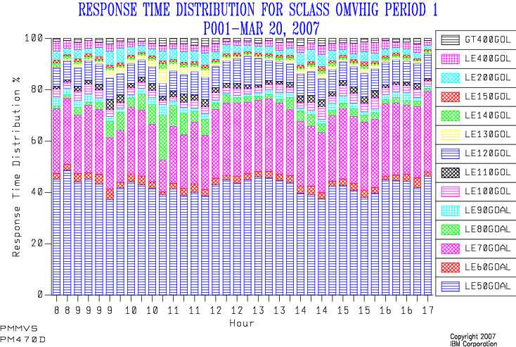
My first implementation stacked up the buckets as percentages, and here’s an example:
Isn’t it “busy”. 🙂
And what was the goal?
And the legend is pretty cruddy, too.
(This is explained by the reporting tool (SLR) insisting on using table column names as series names.)
Because I couldn’t see the wood for the trees I refurbished this graph a couple of years ago:
The graph title states the goal.
I only show the “within goal” and “not within goal” percentages.
(Obviously I do this by summing up the appropriate buckets – and that’s where the “100% of goal” bucket boundary is needed.)
When the goal is invariant I draw a datum line at the % number in the goal.
I stopped letting SLR drive GDDM to create the graph and used the REXX GDDM interface to draw the graph instead.
This meant I could label the series whatever I wanted, including using spaces.
(This is considerably more fiddly programming – but I use the code on a frequent basis so that’s tolerable.)
The result looks like:
(This is actually from a customer performance test so don’t be put off by the repetitive hour labels on the x axis. One day I’ll get round to tidying up fractional hour labels – when I get sufficiently disgusted.) 🙂
This is much cleaner than the old version:
For most of the time more than 90% of the transactions ended within the goal (0.5 seconds) – so the goal was met, sometimes comfortably.
There were times when the goal was only just met.
There was a protracted period when fewer than 90% of transactions ended quickly enough.
So, this has served me well for a while.
Thoughts For The Future
I think I might’ve gone too far in the direction of simplification with this:
I’d like to add the “just made it” and “almost made it” buckets back in.
(Whether I use shading or different colours for these is still up for debate.)
The buckets I’m tempted to break out are 90% to 100% and 100% to 110%.
The data I see, though, might drive me to use 80% to 100% and 100% to 120%.
We’ll see.
I also can’t see how goal attainment relates to transaction rate:
You might expect there to be a positive correlation though you’d hope for a neutral one.
No correlation would mean something external was going on.
Missing the goal for all transaction rates – “unsafe at any speed” 🙂 – is also significant:
Either the goal is unrealistic or something that WLM can’t affect dominates response times.
So, adding a second y axis and plotting transaction rate against it would tell that part of the story.
I’d like to understand how the percentage of transactions ending in Period 1, Period 2, etc varies:
Just today I had a situation where – over a weekend – the percentage of transactions ending in Period 1 dropped, as transactions got suddenly more CPU-heavy.
At present the code treats each Service Class Period independently, though it does print shift-average transaction rates ending in each period, along with the average CPU (not per transaction but totalled).
One thing I consider a very long stretch would be to make this a 3D chart – with the bucket boundaries considered to be “contour lines”.
That would be very pretty 🙂 but hard to draw and even harder to explain:
While I love pretty charts I actually want them to tell the story as clearly as possible.
Conclusions
I hope you’ll agree there’s lots you can usefully do with Response Time Distribution statistics.
Most particularly If you have significant workloads with percentile goals – which would be almost 100% true for DDF, and true of quite a few CICS workloads.
I also hope you’ve found the evolution of a chart interesting:
It’s been occasioned by lots of customer interactions over a number of years.
I can’t say either of the two charts I’ve shown actually caused evolutions but I think them interesting examples.
We’ll see if I actually get to make the changes I’m contemplating:
My hunch is I will – but I wouldn’t expect me to supply 3D glasses any time soon. 🙂
This post, to summarise, shows how you can use the OPSYN instruction to create your own copy of a macro as a “shim” for a supplied macro of the same name.
It’s a neat technique, involving renaming the macro in its own body, calling the now exposed original version, and then renaming the shim macro back.
The other thing we discussed was how to produce useful textual output from a macro invocation for use outside of the traditional purposes of an assembly listing. (In the original post’s case it was creating HTML documentation.)
This isn’t nearly so nice a story:
You can’t write a side file but you can write text to the assembly listing in a macro using MNOTE.
So a solution is to write lines using MNOTE with a special pair of delimiters that wrap the line.
For example
MNOTE *,'XYZZY<table>XYZZY'
will do nicely. 🙂
Then read the assembly listing with DFSORT.
(You could, of course, use REXX but DFSORT will do it just fine.
If you wanted to do some additional processing REXX might be preferable.)
With DFSORT you can write two files in a single pass using OUTFIL:
The HTML file, using OUTREC with PARSE to keep and edit the lines produced by the MNOTE instructions.
A complete listing or one with the “XYZZY” lines stripped out, to its original destination.
You can achieve the latter with the OUTFIL SAVE statement.
The question arises as to what the MNOTE lines actually look like:
By experiment we’ve discovered it varies, depending on the assembler you’re using.
For example, z390 produces different output from HLASM.
That’s not a significant problem:
If you were using this technique with z390 you wouldn’t be using DFSORT to post-process the listing.
Instead you could use any of the Linux or Windows or OSX tools available to you.
For example a simple sed invocation could extract the HTML, looking for the z390-specific version of the MNOTE lines.
The nice thing about this approach is it can be readily set up to produce the HTML documentation and the load module in the same job.
That’s particularly desirable as it means the documentation will always be up to date.
You could even have a final step that, with a clean assembly and linkedit, pushes the HTML to a documentation web server.
 I’m advocating a more comprehensive approach. (I was going to write a presentation about just that: within product considerations. I now think it’ll be a different presentation if it emerges at all.)