Not So Much Renaissance Man More Tool-Using Ape :-)

(Originally posted 2014-11-02.)

If you come to my blog only for Performance- or SMF-related topics you’re going to be disappointed in this post. But if, like me, you’re interested in storytelling and web-related technologies then read on.

This post is about HTML5 Canvas – a technology I really like.

Some Of Why I Care About Web Technologies

To try and keep this focused I’m going to talk only about why web technologies are relevant to my “day job”.[1]

The tooling I curate and use was built over many years by many people. Its graphics are built on GDDM, and look like they date from the 1970s. But I’m not so concerned about how they look, so long as they tell the story well. [2]

But there are some stories that require some new methods of depiction, some new diagram types. Perhaps the ones in WLM Velocity – Another Fine Rhetorical Device I’ve Gotten Myself Into are a poor example of that. I don’t think I’ve shown you machine diagrams yet, but plenty of customers this year have seen them. And they’re a much better example of stuff that would require some quite low level GDDM programming.[3]

So I adopted a new approach, one that already yields nicer graphics than (I think) I could do with GDDM.

Step Forward HTML5 Canvas

Web standards, and HTML5 in particular, are slowly evolving. One of the most stable pieces is the “new” <canvas> tag. And it’s the one I find most immediately useful.

With canvas you use javascript to create diagrams. [4]

While many of you probably don’t know javascript a lot of people do and it’s a fine, readily learnable, language. It’s certainly fit for the purpose of manipulating character strings and driving diagram creation. [5]

Today I actually create the HTML and javascript using PHP – which is good for most things, especially parsing XML and HTML and string manipulation.

To use all this you need a modern web browser, of which more anon.

Note: You can build sophisticated, 3D, diagrams using WebGL. WebGL can use Canvas. But today I don’t use WebGL – but I have a book on it so one day I might.

Insufficiently Clever By Half?[6]

HTML5 Canvas is supported by most “modern” web browsers. You could say any browser unable to support Canvas is not a modern browser. But the degree of support varies by browser, and between browser releases. My recent experiences with Firefox Nightly shows it supports some drawing capabilities previous releases don’t – such as dashed lines. [7]

Support for drawing capabilities is one thing; Another is behaviour in the browser:

In Firefox right-clicking on a canvas element brings up a menu with a “View Image” item. This displays the graphic as a PNG. [8] This PNG can be copied or saved in a file.

Three snags:

  1. It would be better workflow if Firefox allowed you to Copy or Save the graphic without having to View Image first.

  2. When I last checked neither Mobile Safari nor Chrome have the same workflow.

  3. Dragging the graphic into Symphony seems to cause the latter to loop. (And you can’t drag from the page with the canvas in.)

A glance at the spec suggests it doesn’t address how a browser should behave with the canvas element. I’m not saying it should but, and this is perhaps my conclusion, it would be really nice to see browsers competing with each other on how they handle canvas.

As it’s an open-source browser I’d quite like to fix it for Firefox, but I simply don’t have the time. 😦

But for now, it’s really satisfying to be able to generate diagrams this way that (to my eyes at least) look decent. And so far I have:

  • Machine diagrams
  • WLM depictions
  • Gantt charts – in colour [9] and with the scale in hours and minutes

And I’ll confess it’s been fun. πŸ™‚


  1. There are plenty of other reasons for liking web technologies, of course.  ↩

  2. One day we might hire a graphics designer – but finding one who knows GDDM is going to be tough.  ↩

  3. Albeit in REXX, probably.  ↩

  4. There are plenty of HTML5 Canvas tutorials on the web; None strikes me as overwhelmingly better than the rest.  ↩

  5. Learn it anyway; As a useful programming language in its own right.  ↩

  6. When people say something is “too clever by half” I think they really mean it’s “insufficiently clever by half”.  ↩

  7. I actually use this in my machine diagram and have to use a kind of polyfill for when I’m running in an older version of Firefox.  ↩

  8. Using a Data URI.  ↩

  9. This is something I haven’t been able to do before – colour – and I’m only just beginning to think of uses for colour coding in Gantt charts.  ↩

The End Is Nigh For CICS

(Originally posted 2014-10-12.)

… and other address spaces, too. πŸ™‚

In Once Upon A Restart I talked about how to detect IPLs and restarts of CICS regions and MQ subsystems (and other long-running address spaces) – from SMF Type 30 Interval records.

It’s easy to see starts but what about stops?[1]

It turns out you can estimate when address spaces stop from the SMF 30 Interval records (Subtypes 2 and 3):

  • When there is no longer a record for the address space (with a given Reader Start Time) the address space has terminated. So the last record for that job name with the given Reader Start Time marks when it came down.
  • When there is again a record with the same job name it will have a new Reader Start Time and the address space has come up again.[2]

This is actually a naive implementation but it gets me very close to when an address space comes down.


So What?


The flippant answer is that I extend what my tooling does because it pleases me to. πŸ™‚


But actually that’s not true: To the extent that it needs a justification I’m more useful the closer I get to how my customers are running things, and to understanding their problems.

Specifically, in the handful of customers I’ve tested this code with, I have quite a good understanding of the relationship between CICS regions [3] and the batch. For example:

  • I see CICS regions come down and not come back up again for hours, sometimes on a timer pop and sometimes event-driven. This is usually overnight and I’m therefore seeing a Batch Window.
  • I see CICS regions come down and immediately restarted – in a way that suggests being put into read-only mode or to flip data sets. [4] Again this can be a sign of a batch window.
  • I see test regions come up for very short periods of time and then go down again. [5]

Actually, being (supposedly) open minded, I don’t know quite what I’ll see. But these are the sorts of things I think I’ll see.

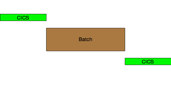
Here’s a depiction of CICS coming down for Batch and restarting after:

CICS Down For Batch

and here’s a conflation of a number of scenarios where CICS gets bounced but is still up alongside batch. In this case it’s in “Read Only” mode:

CICS Read Only


Again, So What?


The answer to why this might be relevant to you is:


  • Many of you are looking after a plethoration [6] of systems and applications. This technique might save you time.
  • If I start talking to you about up and down times this might help you understand where I got it from. The words “see my blog” escape from my lips quite frequently these days.

And I expect I’ll be updating Life And Times Of An Address Space with this.


  1. Yes you can use SMF 30 Subtypes 4 and 5 to get step- and job-end timings but I prefer not to make customers send me these. I might change my mind, one day.  β†©

  2. But I treat this as a new instance of the region / address space.  β†©

  3. It’s really only the CICS regions that get frequently restarted. But I’d notice if others did.  β†©

  4. In one customer case this is to pick up new versions of VSAM data sets the batch has created.  β†©

  5. I probably should pick up termination code to see if they ABENDed. Unfortunately there isn’t one as the Completion Section isn’t created for SMF 30 Subtypes 2 and 3 but only Subtypes 4 and 5.  β†©

  6. It probably should be “plethora” or “proliferation” but I like combining the two into “plethoration”. I hope you do, too. πŸ™‚  β†©


Curiouser And Curiouser, Spike

(Originally posted 2014-09-28.)

As you’ve probably gathered I like to get nosy about how customers run systems. This is probably best and most recently exemplified by this blog post: Once Upon A Restart

So this post is about another piece of curiosity: What spikes can tell us about how people run systems. In a way it’s similar to what restarts tell us, hence the above blog post link.

I like “Think Fridays”. But I’ve been rather busy of late, so what I got to do this past Friday was brief, embryonic and just showing some of the potential of the method. In short it’s a prototype or an experiment. But, in line with the “Fink Thriday” πŸ™‚ idea, it did get me thinking and exploring.

But such things don’t happen in a vacuum: I’ve noticed spikes in CPU and memory usage by address spaces before. Many times before. So that has gradually formed a question in my mind:

"Is there an event that triggers a spike in an address space?

Now, I’m not really thinking of the sorts of anomalies that zAware might learn to detect. I’m thinking of the more mundane “such and such happens every Tuesday night at 8PM” kind of event.

My Prototype

For my experiment / prototype I took a pair of LPARs. Let’s call them PROD and DEVT – for that is the roles these LPARs have.

I took SMF 30 Interval (Subtypes 2 and 3) records for both systems and examined a number of address spaces I’d spotted spiking:

  • DFHSM – on both systems, in STCMD.
  • DFRMM – on both systems, in STCMD.
  • CATALOG – on both systems, in SYSTEM.
  • An address space related to data extraction and transmission – on PROD, in STCMD.

For each of these I wrote code to examine CPU for each of these

  • It computes the Average CPU across the whole set of data for the address space.
  • It detects intervals where the address space uses at least 2x, 4x, 8x, 16x etc. the Average CPU.

Between these two I get spikes – whether broad or narrow, tall or short. Right now I just pump them out in a table – so lots of refinement can happen later on.

DFHSM

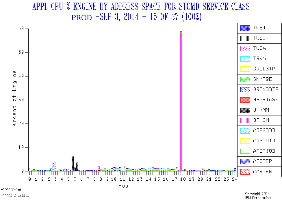
In PROD there’s a daily narrow spike around 5:30PM. And it’s a very substantial spike, CPUwise. So this looks like daily Space Management or similar daily functions. And its timing is regular as clockwork.

Here’s one day’s view of the service class that contains the DFHSM address space, as well as two of the other spiky address spaces.

In DEVT there’s a daily narrow spike around 8PM, but it’s not well-pronounced. But additionally there are lots of other, broader, episodes of well-above-average CPU consumption. The 8PM spike might well be Space Management or similar; It’s hard to tell. I expect Development LPARs will turn out to show this behaviour with DFHSM.

DFRMM

In PROD there are daily broad peaks – of around 45 minutes – just before the working day starts. But their incidence varies by as much as an hour and a half. Quite probably when the overnight Batch ends.

In DEVT there are narrower spikes at around the same time as PROD in the morning. But there are also narrow spikes around 8PM.

CATALOG

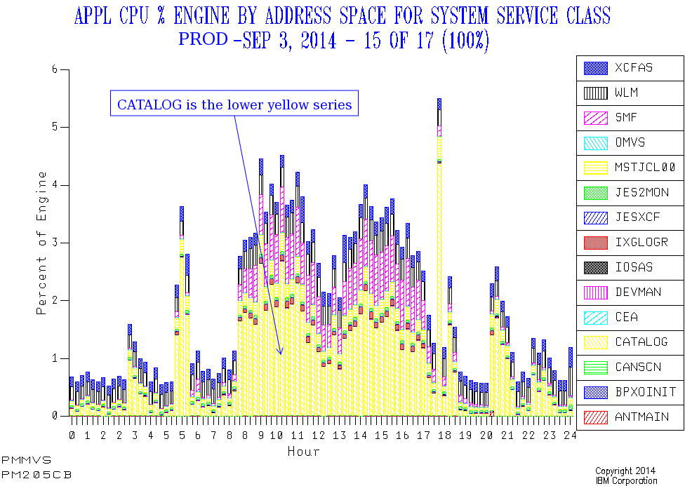
In PROD CATALOG has a number of spikes that line up with the previously-mentioned ones. As well as some in the evening Batch window.

But here the picture is less stark – largely because the general daytime level of CATALOG CPU drives up the overall average.

In DEVT CATALOG CPU usage varies enormously, with no obvious spikes and no clear pattern. That too is probably a feature of Development workloads.

So I won’t claim the “spike” treatment is such a success for CATALOG: You can see the spikes from the graph, but my prototype code doesn’t throw them and their timing into sharp relief. So maybe I just need to work on the code some more.

Data Extract / Transmission Address Space

This only runs in PROD. Every day this spikes for a brief while, regularly each morning around 2:30AM to 3AM.

This doesn’t appear to be on a “timer pop” so much as having prereqs, but I’m not 100% certain of this; That would be something to ask the customer.

SMF Interval Accuracy

Obviously, using interval records, the timing of an event can only be approximated using this method. Most customers I know use 15 or 30 minute intervals, which is fine. And our code picks the midpoint of the interval as a timestamp.

So we’re not going to detect events this way to more than 7.5 – 15 minutes’ accuracy. But I think that’s enough.

Events Dear Boy, Events

Now, having said I’m not really looking for anomalies a la zAware, there is already one case where I do see happenings of the undesirable kind.

In the test data I’m working with I see DUMPSRV (Dump Services) suddenly use more memory at two points in the day. After each of these events memory usage returns to a very low value. CPU doesn’t show the same spikiness.

From my restart code I can see that a CICS region restarts (unusually) right after the second spike. So, based purely on SMF 30 Interval records it’s a reasonable guess that the region ABENDed and dumped at the time of the second spike. Not conclusive, but a reasonable guess. And the relationships between certain spikes and restarts is worth exploring.

Other Address Spaces And Metrics

I made arbitrary choices of job name, based on this set of data. I could equally have roped in such things as Sterling Connect Direct.

And I could look at all sorts of spikes, such as in EXCP rate, Virtual Storage Allocation and zIIP Usage. To do that I might have to make the code more specialised; For example, with DUMPSRV only looking at memory usage (not CPU).

Timer Pops And Movable Feasts

Timing – as with restarts – is interesting to me:

  • If something kicks off bang on, say, 8PM every single day what does that mean?

    Perhaps this is conservatively timed and could be earlier and event-driven.

  • If something kicks off at the same time every day, but not on a timing boundary, what does that mean?

    It might mean the processes in front of it are regularly but take a few minutes to complete. For example: CICS comes down at 8PM exactly but a post-shutdown job always completes at 8:03, allowing the batch to always start at the same time.

  • If something moves around what does that mean?

    Perhaps the chain of events it depends on takes a variable amount of time to complete, which might be a problem. For example backups kicked off when the batch completes.

Conclusion

So I’m not telling the customer what to do about these spikes; There probably is nothing for them to do. But I feel I’m getting closer to how they operate. And maybe I’m seeing some challenges, such as the variability of timing of things that happen just before the online day.

As this was a quick experiment there are obviously some rough edges, and there’s more it could do.

I think I’m edging towards a “Day In The Life” approach to systems, key address spaces and applications. It might include both spikes and restarts. And probably the general “double hump” etc. patterns in workload we usually see. Now that could be useful. The journey continues… πŸ™‚

WLM Velocity – Another Fine Rhetorical Device I’ve Gotten Myself Into

(Originally posted 2014-09-21.)

Back in 2010 I wrote about a graph I’d developed for understanding how a Service Class Period’s velocity behaves. That post is here: WLM Velocity – “Rhetorical Devices Are Us”.

At the time I was concerned not to show up the customer by displaying the graph. I think that was the right decision. But in the presentation I mention here: Workload Manager And DB2 Presentation Abstract I do have an example. And indeed it’s a significant part of my “zIIP Capacity Planning” presentation (you can get from System z Technical University, Budapest 12–16 May 2014, Slides).

I regard that graph as a nice rhetorical device[1] as it has led to many fine discussions with customers (and I’ve tweaked it a little in the process).

But this blog post is about a very new graph I’ve developed on the theme of Velocity. I hope it, too, will lead to lots of interesting discussions with customers.

But the reason for sharing it with you is that you might well want to do something similar.

The primary purpose of the graph is twofold:

  • To show the hierarchy of importances and velocities.
  • To show when too many WLM service class periods are too similar – both in terms of velocities and importances.

As I write this those two bullets look remarkably similar but they’re not.

The Importance Of Importance

Question: Given two service class periods with equal velocities, which will be served first?

Answer: The one with the higher importance.

It’s a fact that importance is the major distinction in that WLM will try to satisfy the goal of a more important service class period before attempting to satisfy the goal of a less important one.

But note that some goals are unattainable and some velocity calculations are dominated by things WLM can do little about.

So this addresses Bullet 1 – the hierarchy.

The Importance Of Being Earnest

Sorry for the gratuitous section heading but it sort of fits: If you have a goal that’s greatly overachieved it’s not protective. For example, if STCHI has a goal of 40% and it always achieves around 80% it’s not protective: If CPU becomes scarce, as just one scenario, the velocity delivered could easily drop down towards the goal 40%.

So set goals that are “in earnest” and protective, unless you really don’t care if service drops off.

Flight Level Separation

But importance isn’t the only, ahem, important πŸ™‚ thing: The difference in goal velocities is also important: Goals that are too close together aren’t really useful.

If possible keep velocities at least 10 apart, or try to merge the service class periods.[2]

So this addresses Bullet 2 – the separation.

And Now To The Graph Itself

The graph I’m describing in this post is also a nice rhetorical device.

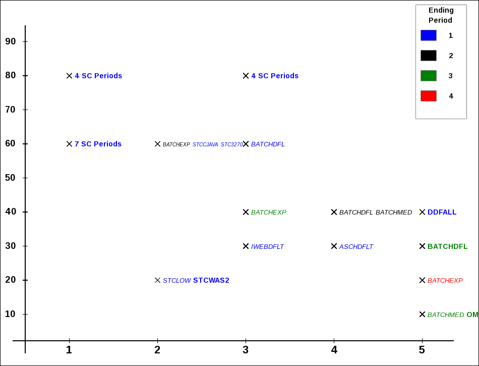
The graph has along the x axis WLM importance. On the y axis is the goal velocity. Each marker is a unique combination of importance and velocity. Next to the marker is a list of service class periods defined with that importance and velocity.

At least that was the first implementation.

Then I refined it (and I’m still fiddling with it):

  • If the service class period consumes significant CPU I bold and enlarge the name. If it doesn’t I draw the name in italics. So there’s a distinction between significant service class periods and insignificant ones – for this shift and this system. “Significant” is a “movable feast” so I expect I’ll tweak this in the future.

  • If there are more than 3 service class periods with the same importance and velocity I don’t list them but the label becomes e.g. “7 SC Periods”. It’s significant if many service class periods share the same importance and velocity.

  • I use colour coding for the service class periods – instead of adding e.g. “.1” to denote first period to the label. (I’m having to get fancy to manage the label “real estate”.)

OK. So enough prose; Let’s see some pictures. πŸ™‚

Here are some example graphs. I’ve scaled them down to fit into the page column so you’ll find them clearer if you open the picture in a new tab or window.

First a straightforward one.

velocityI

In this example there are four significant service classes: SERVERS, PRDBATHI, STCMD and PRDBATMD. Here SERVERS (assuming it has the right things in it [3]) is sensibly located to the right and above everything else. STCMD and PRDBATHI are together in the middle and PRDBATMD is down and to the right.

This looks like a sensible hierarchy and generally the velocity “flight levels” have good separation.[4].

You’ll also notice a couple of (in black) Period 2 data points. Period 1 for these service classes have response time goals.

Now a case where the flight levels are too close together:

velocityK

Importance 2 and, even more so, Importances 3 and 4 have lots of crowding – with velocity separations down to 2 in some cases. WLM will have a hard time working with this.

Finally a more extreme case:

velocityZ

Here we have several cases where 4 or even 7 service class periods share the same importance and velocity.

Limitations Of The Method

The most obvious limitation is that other goal types – SYSTEM, Response Time and Discretionary – can’t be plotted on the same graph. It would be possible to draw SYSTEM / SYSSTC to the left and Discretionary to the right but it doesn’t add anything.

I’m going to have to think about how to plot Response Time goals – on a separate graph. There isn’t an obvious y axis. By the way, in all three examples there are service classes where the first (or first few) periods have Response Time goals and subsequent ones have Velocity goals. This is often observed – and this graph won’t show these early Response Time periods.

Also this is fairly static – being a “shift” summary.

The real question is “what do I do about flight levels that are too close together?” The ones that are identical might be amenable to combination but you can’t really combine PRDBATHI and STCMD (as in the first example) – unless these service class names are misnomers.

So this is why I consider this graphing technique a “rhetorical device”: I really want customers to think about whether it makes sense to combine service classes. And part of the motivation for this is WLM works better when the work in a service class period is sizeable.

This is also a “single system” graph and the constraints of running in a Parallel Sysplex – where there is only one WLM policy in effect for all members – aren’t reflected here. Again, doing the thinking is the important thing.

One, perhaps subtle, issue is the fact RMF records CPU in the Service Class Period where the work ended. You can see this for BATCHMED in the second example:

  • Periods 1 and 2 have little CPU in them; The name is italicised.
  • Period 3 has CPU in it; The name is in bold. Clearly work accumulates service (which has to include CPU) when it progresses through the periods. But there isn’t a good way to back-calculate the CPU in each period.

Conclusion

So I hope this graph gives you some ideas. Certainly I’ll be using it in customer situations and it’s a very easy graph for me to produce[5]. It will, of course, evolve – in all likelihood. For example you can see cases where the labels are either cut off or overlap something else.


  1. When I use the term “rhetorical device” I mean the graph is useful but not to be taken too seriously: It should usefully contribute to the discussion, warts and all.  β†©

  2. This, as we shall see presently, is easier said than done.  β†©

  3. You can tell (mostly) what’s in a Service Class using SMF 30: Workload, Service Class and Report Class are fields in the record.  β†©

  4. The more I use the term “flight level” the more I like it.  β†©

  5. It’s actually written in PHP which generates javascript. This in turn draws on an HTML5 Canvas element. In most browsers you can readily save the javascript and indeed the drawing as a PNG file. Actually I think browsers have a slightly awkward handling of Canvas elements – but nevermind. (If I, to paraphrase the late great Tony Benn “retire to spend more time doing real computing” πŸ™‚ I fancy I might be working on this.)  β†©

DFSORT JOINKEYS Instrumentation – A Practical Example

(Originally posted 2014-09-08.)

Some technologies show up “in the field” very soon after they’re announced and shipped. Others take a little longer.

Back in 2009[1] I blogged about one technology – DFSORT JOINKEYS. For this post to make much sense you’ll probably want to read that post first. Here it is: DFSORT Does JOIN.

Dave Betten and I have – at last – a set of data from a customer where one of the major jobs does indeed use JOINKEYS. The purpose of this post is to show you what one of these looks like – from the point of view of SMF records.[2] I won’t claim this post highlights all the statistics available to you but I hope it gives you a flavour.

Though the job is repeated this post will concentrate on one such running. As you’ll see from the graphic below it runs from 15:25 to 16:33. There are two steps:

  • A SORT invocation, running from 15:25 to 16:11.
  • A JOINKEYS invocation, running from 16:11 to 16:33.

SORT and JOIN Gantt

SORT Step

While the SORT step is the longer the purpose of this post isn’t to discuss how to speed up the job overall. But it’s a good “warm up”:

  • In this case we can see the Input phase (marked by the timestamps for OPEN and CLOSE of the SORTIN data set): 15:25 to 15:51.
  • We can equally see the Output phase: 15:51 to 16:11 (from the SORTOUT data set OPEN and CLOSE timestamps).
  • We can see 22 SORTWKnn data sets were OPENed and CLOSEd, spanning both input and output phases.[3]
  • We can see no Intermediate Merge phase – the Input and Output phases abutting each other.

From The SORT Step To The JOINKEYS Step

The SORTOUT data set from the SORT step feeds directly into the JOINKEYS step as the SORTJNF1 data set. Note it’s sorted twice – once in the SORT step and again in the JOINKEYS step – which seems rather a pity. It is read by a TSO user later, so maybe the two different sort orders are needed.

What I’ve just used is our Life Of A Data Set Technique (or LOADS for short). Below is the LOADS table for this SORTOUT data set.

SORTOUT LOADS

JOINKEYS Step

This is where – to me – it gets more interesting. In this case we’re joining two data sets – DDs SORTJNF1 and SORTJNF2.

  • As you just saw SORTJNF1 came from the previous SORT step.

  • SORTJNF2 is a relatively small data set.

both data sets are sorted on the same key fields. We know this just because they each have Sort Work File data sets – 5 used in one case and 21 in the other.[4]

You might’ve spotted that everything I’ve said so far is based on SMF 14 and 15 (Non-VSAM CLOSE for Read and Update) records. Now let’s start to dig into the SMF 16 (DFSORT Invocation) records, restricting ourselves to the JOINKEYS step.

We have three SMF 16 records for this step:

  • JNF1 Sort

  • JNF2 Sort

  • Joining Copy

The two sorts are necessary because the programmer told DFSORT to sort both files so the key fields for the Join are in order. As I indicated in DFSORT Does JOIN there are ways of avoiding this if the sorts are unnecessary (and terminating if the sorts are proven necessary).

For a real tuning exercise you’d try to avoid unnecessary sorts.

The following is a schematic of how the three invocations work. JOIN Flow

Let’s look at JNF2 first. The 5 Sort Work File data sets OPEN and CLOSE within the same minute (16:11) according to our Gantt chart. Indeed there are zero EXCPs to them. But the SORTJNF2 data set is held open until the end of the JOINKEYS step (16:33).

Note there’s no output data set from this sort.[5] We’ll come to what happens to the output data in a minute.

Turning to JNF1 the Sort Work File data sets stay open throughout the JOINKEYS step; There’s lots of I/O to them.

Again there’s no output data set from this sort.[5]

The third SMF 16 record relates to the Copy (with an exit) that does the actual join. It has no input data sets but it does have an output data set (DD OUTFILE1).[6]

So let’s turn to what SMF 16 tells us about records and how they flow:

  • JNF1 reads 179 million records from DD SORTJNF1 and passes them to a DFSORT E35 exit, writing none to disk. These records are fixed-length and each 300 bytes. The sort’s key length is 15 bytes.
  • JNF2 reads 5,000,006 records from DD SORTJNF2 and passes them to a DFSORT E35 exit, again writing none to disk. The sort is for 15 bytes again, which is curious as the LRECL appears to be 11 bytes; Some padding must occur – perhaps to match the keys from JNF1.
  • COPY inserts 179 million records, passing that many to OUTFIL.
  • OUTFIL reduces the 179 million records to 30 million; The SMF 16 record says OUTFIL INCLUDE/OMIT/SAVE and OUTFIL OUTREC was used, which begins to explain the reduction. But the LRECL remains 300 bytes; I suspect the JOIN is to decide which records to have OUTFIL throw away, before writing them to DD OUTFILE1, and the OUTREC is to remove the extra bytes from JNF1 used in the record selection.

One other point – from SMF 14 and 15 analysis: In this case I don’t see records for SYMNAMES or SYMNOUT DDs, so either DFSORT symbols aren’t being used or they are SYSIN or SPOOL data sets, respectively. To my mind SYMNAMES data sets are most valuable when they are permanent. I don’t expect SYMNOUT to have permanent value, beyond debugging.

Conclusion

There’s lots of extra detail in the SMF 14, 15, and 16 records of course. But I hope this has given you some idea of how to view the data when JOINKEYS is invoked.

And the reason it’s taken us a while to see JOINKEYS in a customer is quite straightforward: It’s not something you flip a switch to use; Rather you have to write code to use it.

And note that this post hasn’t given any real tuning advice: The previously-mentioned blog post does. And the actual customer situation is a little more complex than this (though the facts I’ve stated are all true).


  1. I would think most customers have the function installed by now, so hopefully if you like JOINKEYS it’s there for you to use.  β†©

  2. To replicate this sort of thing you need SMF 14 and 15 for non-VSAM data sets, 62 and 64 for VSAM, 16 with SMF=FULL for DFSORT, and 30 subtypes 4 and 5 for step- and job-end analysis.  β†©

  3. In preparation for writing this post I took a detour: This Gantt chart used to, rather unhelpfully, have 22 lines for these SORTWKnn data sets, each with the same start and stop times. I now feel I can use this chart in a real customer situation as rolling up the SORTWKnn data sets that indeed have matching timestamps makes it so much punchier.  β†©

  4. Curiously JNF1WK16 is never OPENed. Perhaps I should teach my code to detect “missing” Sort Work File data sets like this.  β†©

  5. Both the absence of output data sets from SMF 15 and the absence of Output Data Set sections in the DFSORT SMF 16 record confirm this.  β†©

  6. You only get Output Data Set sections in SMF 16 if SMF=FULL is in effect for them.  β†©

Workload Manager And DB2 Presentation Abstract

(Originally posted 2014-08-18.)

I’m pleased to be presenting three sessions at UK GSE Annual Conference, Tuesday 4th and Wednesday 5th November in Whittlebury Hall.

Two are on the zCMPA (Performance and Capacity or “UKCMG”) track:

  • Life and Times of an Address Space (Tuesday)
  • zIIP Capacity Planning (Wednesday)

I’ve written about these extensively. Obviously they’re evolved a bit and I have specific reasons to believe my experience will be further evolved between now and then.

But there’s a new one, on the DB2 track:

  • Workload Manager and DB2 (Tuesday)

I can’t be crisp about how this presentation came about πŸ™‚ but I’m pleased to be doing it.

So here’s the abstract:


DB2 people don’t know WLM. WLM people don’t know DB2.


A slightly β€œcartoon” view but with an element of truth.


The point of this presentation is to unite the two perspectives, to give better DB2 performance while ensuring WLM is properly set up.


Over the years a recurrent theme has been enabling conversations between z/OS and DB2 people (and I admit to be more in the former camp than the latter).


By the way, I know it’s been a long time since I last posted. I might’ve totally lost my audience, but somehow I don’t think so. πŸ™‚

I had a lovely holiday in Australia and then got very busy with a number of customer situations (which, personally, is the way I like to be). And, frankly, I had nothing to say. So I didn’t say it. πŸ™‚ But now, while I’ve a heavy caseload, I’m seeing things that make me go “hmmm?” πŸ™‚

I’m also pleased to say that my good friend Dave Betten joined the team I’m in as our Batch expert on 1st August. I’m hoping to coax some “guest posts” out of him, particularly in the area of DFSORT Performance. It’s great to have him onboard! I should also say I’m not giving up Batch and Dave is going to work on the full range of engagements I’m involved in. Two heads, I hope, will be better than one. For completeness, I’m also pleased to have Dave Hauser continue as our DB2 Performance lead.

Broker And SMF 30

(Originally posted 2014-06-03.)

Sitting in Dave Gorman’s Broker V9 presentation in Budapest it struck me it would be a useful exercise to apply the “Systems Investigation” techniques I write about to Broker running on z/OS. So let’s see how far we can get with SMF 30 Interval records, in the vein of Life And Times Of An Address Space. It’s a nice exercise [1] but I think it’s directly useful for looking at Broker itself.

By the way the name IBM Integration Bus is in use as of V9, but I’ll persist with “Broker” in this post.

I have two sets of customer data with Broker in, one active and one where Broker is up but not active.

What Is Broker?

Broker is a multiplatform product family that allows business information to flow between disparate applications across multiple hardware and software platforms. Rules can be applied to the data flowing through the message broker to route and transform the information. The product is an Enterprise Service Bus providing connectivity between applications and services in a Service Oriented Architecture.

The previous paragraph is mostly not my words. In my words I would say you get to connect disparate applications together using pipeline-like constructs called flows. These flows have nodes, akin to pipeline stages.

As well as running on other platforms Broker runs on z/OS. It writes Statistics and Accounting data in it’s own SMF 117 record (but this post isn’t about that).

Am I Broker?[2]

An address space is Broker if one of the following sets of conditions is met:

  1. The program is BPXBATA8 and the Proc Step Name is one of “BROKER”, “EGENV” or “EGNOENV”.  
  2. One of the SMF 30 Usage Data Sections for the address space had a product name of WMB.

These conditions are corroborative but the second condition is possibly simpler to detect than the first.

All the address spaces for a Broker instance have the same job name (but, obviously, different job IDs).

The structure of a Broker instance is as shown here:

Broker Address Spaces

Broker Instance BRK1 has a Control Address Space and three others.

Execution Groups

Broker flows run inside Execution Groups, each of which is an address space. The step name is different for each Execution Group, being the last 8 characters of the Execution Group Name.[3]

In the two sets of data one has a handful of Execution Groups, each with a mnemonic name.[4] The other has no Execution Groups, so no flows can be deployed to this one.

In the example diagram above, there are three Execution Groups: Tom, Dick and Harry. Each has its own flows.

There’s one further piece of information we can glean about execution groups:

If the Proc Step is EGENV the Execution Group has its own specific profile. If it’s EGNOENV it doesn’t. In the case of the customer with Execution Groups they are all EGNOENV.

Which Broker?

The Broker instance is given by the job name which, as I said, is the same for the Control Address Space and all the Execution Groups.

Which Version?

You can use the Usage Data Section to establish the Broker version, except I’m seeing “NOTUSAGE” in both the sets of data I’ve seen – which doesn’t help distinguish Version 7 from 8 from 9. But I’ve only got two sets of data…

CPU

Drilling down into individual address spaces / Execution Groups pays dividends when it comes to CPU:

For the customer with a handful of Execution Groups only two use significant amounts of CPU. The total is about 3.5 engines’ worth and one Execution Group uses 60% of that and the other uses 40%.

There was a tiny amount of zIIP CPU usage in the active case, also. As you can write nodes in java that’s not surprising. You can also access DB2 in a flow but whether it’s the right kind for DRDA zIIP Eligibility I don’t know.

Memory Usage

There’s good news here:

Because Broker is 64-Bit the vast majority of virtual storage is allocated above the bar and memory (and Aux / Flash) usage numbers are accurate. For 24-Bit and 31-Bit Virtual Storage I can only see Allocated but, as there’s not much of it, I can live with treating that as Used Real without too much overstatement.

The LE Heap is the main user of memory, and thank goodness it’s 64-Bit: I’m seeing values from a few hundred MB to several GB. In the customer with no Execution Groups much of this is paged out to Aux. I can tell this because, as I said, 64-Bit Virtual is reported in SMF 30 as either backed by real memory or Aux / Flash.

Who Do I Talk To?

As those of you who’ve seen me present Life And Times Of An Address Space know I see two main ways of figuring out who an address space talks to, without going deeper than SMF 30:

  • Usage information in SMF 30.
  • XCF Member information in SMF 74–2.[5]

In the data I’ve seen Broker doesn’t directly use XCF signalling (and I think that’s generally true of Broker) so I don’t expect 74–2 data to show anything.

I do see Usage information for other products associated with the address spaces:

  • In one case I see DB2, Websphere MQ and Websphere Transformation Extender (WTX).
  • In the other case I just see DB2 and Websphere MQ.

In both cases I see the DB2 and MQ versions and subsystem names. In the WTX case I again see “NOTUSAGE” but this is a single data point.

Workload Manager

I see, of course, WLM Workload, Service Class and Report Class in SMF 30. One of the features of Broker is you can classify each Execution Group (address space) separately to WLM. I’ve not seen it done but I’m certain that would be reflected in SMF 30.

I/O and Database

In the case of the customer with active flows I see quite a high EXCP rate (290 per second), with one Execution Group performing about 90% of this. I also see a small amount of Unix File System I/O, this time mainly in a different Execution Group.

I would expect I/O to vary depending on the nature of the flows.

I was not in a position to look at DB2 but some flows process SQL so I would expect DB2 Accounting Trace to be of some use here.

Handling Multiple Address Spaces With The Same Name

As I said, a complete Broker Instance comprises a set of address spaces, each with the same name. My code generally summarises all the address spaces with the same name into one row per reporting interval (or higher). That’s what the SLR Summary Table does.

In this case that level of summarisation is unhelpful. So I retained the Log Table, which does keep separate JobIds separately and wrote reporting to go against this log table – but only if the sum of In and Out address spaces with a given name is more than 1.

It more or less doubles the size of my performance database doing it this way. But for cases like this it’s worth it.

There are some other cases where this approach might well yield dividends. A good example might be DB2 Workload-Manager Stored Procedure address spaces (which I tend to term Server Address Spaces). Potentially these can be legion, with the same job name.

Conclusion

I think you can do quite a bit with detecting and analysing Broker. To really go to town on it you do need SMF 117 (or the Distributed equivalent), of course. And I don’t yet know what DB2 Accounting Trace (SMF 101) would reveal.

I haven’t, in this post, written about a time-driven view using SMF 30. After all these are Interval records. I’m about to teach my code to pump out some graphs that will help me do that. Stay tuned.

It’s been an interesting exercise which has stretched my code[6]. I’m, in parallel, applying the code and techniques to CICS, CTG, DB2, MQ, and IMS [7] groups of address spaces. I might write about some of those too. Again, stay tuned.


  1. Which should make it interesting and useful for z/OS customers who don’t have Broker on z/OS.  β†©

  2. As opposed to Broken. πŸ™‚  β†©

  3. The Control Address Space name, in SDSF, is the same as the job name, being the Broker name. In SMF 30 Interval records, however, it just says “STARTING”.  β†©

  4. Actually they have two LPARs, each with a Broker instance on. The Execution Groups are the same in each, except one Execution Group where the two instances have slightly different spellings on the name. I’m not sure if this is deliberate or a mistake.  β†©

  5. If you process SMF 30 you probably process 74–2 so I don’t count that as deeper.  β†©

  6. Which is, in my book, always a good thing. πŸ™‚  β†©

  7. I generated test cases around specific IBM products. I might well add to this list. And I just applied the code to a group of jobs beginning “NTA” which explained a CPU spike early one morning on a customer system. (Even though I could have step- and job-end SMF 30 (Subtypes 4 and 5) Interval records helped with this spike rather better.)  β†©

System z Technical University, Budapest 12-16 May 2014, Slides

(Originally posted 2014-05-21.)

In Budapest at the European System z Technical University I presented three topics:

The links take you to the Slideshare uploads of these presentations. The first two of these are updated for this conference and I’ve overwritten the previous versions – as the new versions subtracting nothing.

I think this was a really good conference, with lots of interesting discussions, some catching up with friends, and acquiring some new ones.

Comments and questions welcome, as always.

And Just Complain

(Originally posted 2014-05-18.)

“Mobile” appears to be “flavour of the month” right now, and this week at System z Technical University it has certainly been a topic in evidence, whether it’s discussions in the breaks, sessions on software pricing, or sessions on Mobile-enabling technology.

I don’t intend in this post to discuss any of these.

Instead I want to talk about the types of users Mobile brings, and the impact on such things as capacity planning. But, for once, I don’t want to talk at length about either topic.

User Characteristics

The title of this post [1] nods in the direction of the kind of users mobile brings.

Compare Mobile users with traditional interactive users. I’m thinking in particular of CICS and TSO users. These traditional users have at least some understanding of computers, though I might be overstating this.

Mobile users, though, have no real understanding of how the service is provided and don’t really care (and nor should they.) So I think they can be characterised as much less patient and much less tolerant of service issues, and that’s fine.

Capacity Planning

In recent months most customer interactions have included at least some discussion about the onslaught of Mobile, even if the discussion didn’t start out that way: Customers are volunteering it, unprompted. In a word they’re worried.

A colleague pointed out that it isn’t really possible to do Capacity Planning for Mobile:

  • You can measure load and attempt to assess the footprint of a user – up to a point.
  • You can’t predict the demand.

So there are two things to do:

  • Understand what might limit scaling, whether it be some resource such as CPU or CICS Virtual Storage, or something logical like locking. Then you build a plan to overcome those potential bottlenecks. Fortunately we have nice CPU, memory, disk etc scale up capabilities – but not for free. And we have good facilities to deal with many kinds of logical constraints, too.

  • Try to get some interlock between the business units doing Mobile and the IT people who have to handle the workload. One example that came up a couple of times this week is of a bank’s customers who drive many more transactions for no more bank revenue: The customer still expects to get good service, or they’ll go elsewhere.[2] So the organisation needs to understand the cost implications.

Is This Just Mobile?

Actually I don’t think it is just Mobile, and that might be reassuring to know.[3]

Web users in general are in many ways similar, with the same impatience, unpredictability of load and incomprehension characteristics.

But, not counting Mobile users, the scale has been smaller with Web. I say “not counting” because many Mobile users are web users, using the same http(s) protocol.

Actually this begs the question “what is Mobile?” Some of the discussion this week has been around that very topic. Which leads to a plea…

A Plea

As a Systems or Performance / Capacity specialist try to understand your installation’s Mobile architecture. And try to spot the roll out and ramp up.[4]

An informal sampling of customers this week suggests that could be quite hard to do. But it will, I think, make life easier in the long run.

And finally a thank you to my friend Theresa Tai for the pun word “mobilise”. She used it in her presentation on Monday to mean “make ready for Mobile”, but I like the other meaning: So let’s mobilise for Mobile. πŸ™‚


  1. Fairly obviously a gratuitous Queen reference: To Radio Ga Ga. πŸ™‚  ↩

  2. With customers like that maybe you want them to. πŸ™‚  ↩

  3. Maybe only because we’ve seen it before.  ↩

  4. Part of this is about recognising componentry appearing and evolving. Part of it, though, is about defining metrics and actually using these to measure.  ↩

Hints Of Other Systems

(Originally posted 2014-05-17.)

You can blame the weather for this post. πŸ™‚ I’m writing it on a flight above thick cloud[1] on my way to Munich and then to Budapest for this year’s European System z Technical University.

I like to see the complete picture when I’m examining systems: It makes getting it right so much easier. And there’s something rather satisfying about getting your arms all the way round something.

But I don’t always get “complete” data from a customer. So I work with what I can get and this post is about what I can infer about others systems whose data I don’t have.

When I talk of “not getting data from all systems” I should perhaps clarify: Most installations run RMF on most of their systems and the SMFID in the header of SMF records is the system RMF ran on. I do get information at some level about other systems from RMF SMF records, but its far from complete.

Partial Data

There are a number of good reasons why customers don’t send me data for all systems, including:

  • It can be a lot of data.
  • Coordinating across multiple systems can be difficult.
  • One system, or maybe two, shows the behaviour of all eight.
  • Only a subset of the systems are of interest.

The last of these is the most common, particularly with installations jamming all their Production systems into one Sysplex.[2]

For some situations I really do need to see all systems. A few examples that come to mind are:

  • When designing a software cost minimisation scheme I want to see all the systems’ use of CPU.
  • When understanding the dynamics of a coupling facility structure I want to (at very least) see the request rates from all systems using the structure.
  • I recently had a Group Capacity situation where I only had SMF 70–1 data from 1 of the 2 systems in the group: I couldn’t explain why it was hitting the cap.[3]

But generally I can tolerate seeing data from a subset, so I’m not insistent when I don’t need to be.

The question of the day is “how much can I glean about systems whose data isn’t present?” Because maybe I can get a good understanding of an installation anyway. So let’s see what we can do.

Spotting Other LPARs

You can see all the LPARs on a physical machine from SMF 70 Subtype 1 Logical Partition Data Section[4]. You get further detail on logical engines, memory allocated and CPU Utilisation in the 70–1 Logical Processor Data Section for these LPARs.[4]

Among other things the names and definitions of these LPARs can be fascinating.

You also get a small amount of data for deactivated LPARs, most particularly the name and Partition Number.[5] It’s relevant to know for example that one machine has an activated SYSB and another has a deactivated one.[6]

Spotting Other Systems

I can sometimes see the existence of other systems, not on the same footprint, Here are a couple of examples of how:

  • SMF 74–4 (Coupling Facility Activity) has a list of all the systems in the Parallel Sysplex[7]. But I don’t see from this data which footprint they are on, or anything else about them.
  • SMF 74–2 (XCF Activity) has information about XCF members (and their corresponding job name). So if this system uses XCF to communicate with members in other LPARs you see those other members and those other systems.[0]

    A nice example of this is DB2 Data Sharing where – through the three XCF groups involved – you see all the IRLMs. In one case I saw four IRLMs on four systems, despite only having RMF SMF from one of them.

    Another nice example is CICS regions that talk to ones on this system via XCF.

Spotting Coupling Facilities

RMF SMF 74–4 records are cut for all coupling facilities in the Parallel Sysplex, regardless of which footprint they are on.

This data nowadays includes the machine serial number and LPAR Number.

Sometimes I infer the existence of a whole machine – where none of the systems on it provided RMF data – from the existence of a coupling facility on it.

And What Of It?

Maybe not much to you if you work in a customer.[8] But to me this fills in handy gaps. And it’s nice to spot probably unintended clues.

(Completed on a bumpy ride from Munich to Budapest.) πŸ™‚


  1. Rest assured that if there were no cloud below I’d be enjoying the view instead of writing. πŸ™‚  ↩

  2. If you don’t know why then ask a grownup. πŸ™‚  ↩

  3. While from 70–1 I know when an LPAR is affected by the group cap for LPARs that I don’t have data for I don’t get each LPAR’s Rolling 4 Hour Average CPU Utilisation – if I don’t have the SMF records their RMF cut.  ↩

  4. Which shows up in the Partition Data postprocessor report.  ↩

  5. see LPARs – What’s In A Name?  ↩

  6. As you probably guessed, it’s likely to be a recovery LPAR in case, for example, the first machine dies.  ↩

  7. These are 8-character XCF System Names rather than 4-character SMFIDs but usually they are the same (or at least relatable).  ↩

  8. Actually I’m increasingly of the opinion this isn’t true: It’s probable as a customer you don’t know as much as you’d like to about what goes on in your installation.  ↩