CICS XCF Traffic Analysis – A Suitable Case For Treatment

(Originally posted 2015-02-15.)

In He Picks On CICS I mentioned XCF traffic and CICS. This post is about a customer situation where looking at this traffic was important.

Often I’m looking for topology (maybe “tourist information” to some of you). This time I have another motivation: Performance. In this customer saving z/OS CPU is important. [1]

I’ve noticed that the Coupling Facility CPU has XCF signalling structures as a sizeable component. [2] I’ve also noticed that the XCF address spaces [3] on each system consume a lot of CPU.

So the important question is “which XCF groups and members are driving this traffic, and this CPU?”

But we are in “the point, however, is to change it” [4] mode.

So, hard on the heels of the first question is another one: “What conversations between members are driving the traffic”. This question is a prelude to discussions about how to actually reduce the traffic – which is the eventual aim.

Customer Case Study

I’m going to simplify the customer situation without, I hope, any loss of fidelity.

In the sysplex are two intimately-linked systems.[5] Call them SYSA and SYSB. [6]

The major members of the DFHIR000 group on each system are:

  • On SYSA is a region I’m calling CICSF. From SMF 30 I can see it does a lot of I/O. From SMF 74–2 I can see a lot of traffic between it and SYSB in group DFHIR000.
  • On SYSB are regions I’m calling CICS1, CICS2 and CICS3. These are the ones with the vast majority of the DFHIR000 traffic to SYSA. They also perform very little I/O.

I don’t see much traffic from SYSA or SYSB to other systems in the DFHIR000 group.

The graph below plots, across a day, the traffic for these four members (and it’s genuine, from the data).

We can make the following observations:

  • CICSF traffic more or less matches the sum of traffic for CICS1, 2 and 3. But not quite. And it tracks well across the day.
  • CICS1 and 3 traffic is pretty evenly matched. So they can be viewed as clones.
  • CICS2 has much more traffic than CICS1 and 3. So it’s doing something different. (Or at least more)
  • The traffic has peaks at specific times of day. This might be significant.
  • The CICS regions don’t go down overnight. [7] They merely slow. [8]

One thing the graph doesn’t show, but the 74–2 data does, is XCF traffic is even in each direction.

So here are some, admittedly tentative, conclusions:

  • CICSF is in some sense data owning. The others aren’t.
  • CICS1 – 3 ship requests for data to CICSF. The one-to-one ratio of inbound to outbound requests supports that: A request for data followed by the data being returned.
  • While the traffic match is pretty good there are probably other CICS regions involved.
  • We wouldn’t see requests to CICSF from other regions on SYSA – as they wouldn’t be using XCF.

This Is Not Topology

We can’t claim we’re seeing the whole topology this way, for two reasons:

  • The traffic doesn’t entirely match, as the graph shows.
  • Traffic from other CICS regions on SYSA to CICSF isn’t detectable.

Yes, these are a restatement. The first one is perhaps resolvable with more processing of the 74–2 data. The second would require different sources of data. Maybe a (guessed) naming convention could help me here. It has before. ๐Ÿ™‚

We could, for example, be only seeing part of this topology:

In the above the dashed lines are not XCF. But we could probably guess them just from the existence of regions CICS4, 5, 6 – especially if they behaved like CICS1, 2, 3. [9]

Conclusion

The purpose of this, remember, is to begin to discuss tuning actions that can reduce the XCF traffic between SYSA and SYSB and hence the cost.

I think “begin” is right: Obviously deeper discussions on which region should own the data, for example whether VSAM RLS is the answer, and so on are needed. But at least this is better, I claim, than just saying “try to get DFHIR000 XCF traffic down”.

And note the matching I did is what I call a “guessing game”. It really is. But one day I’d like some code that helps me do the guessing. Maybe I’ll have to build it myself. ๐Ÿ™‚


  1. For which customers isn’t that the case? ๐Ÿ™‚  โ†ฉ

  2. Actually reducing Coupling Facility CPU would be handy for the customer, but it isn’t the primary goal.  โ†ฉ

  3. Called “XCFAS” in fact.  โ†ฉ

  4. See Thesis 11 here if you want to know the cultural reference.  โ†ฉ

  5. One of my reports uses XCF traffic (all groups) to determine which systems really talk to each other.  โ†ฉ

  6. There are other systems in the sysplex. But their XCF traffic to SYSA and SYSB is minimal, especially in group DFHIR000.  โ†ฉ

  7. See The End Is Nigh For CICS for another way of establishing this.  โ†ฉ

  8. This is a customer on Eastern Standard Time servicing multiple timezones across North America and further field. Make what you will of the traffic pattern by time of day.  โ†ฉ

  9. I have code that finds all the CICS regions in the data, with enough information in the report about each of them to make such matching feasible, so this is not far fetched.  โ†ฉ

Proposed “DB2 Through My Eyes” Presentation

(Originally posted 2015-02-08.)

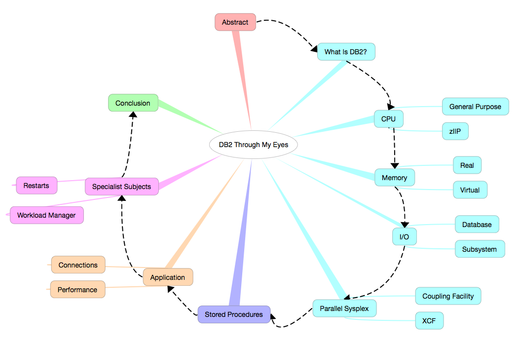
I have a new conference presentation in mind. Its working title is “DB2 Through My Eyes”. Here’s the structure I’ve devised for it:

  • Abstract
  • What Is DB2?
  • CPU
    • General Purpose
    • zIIP
  • Memory
    • Real
    • Virtual
  • I/O
    • Database
    • Subsystem
  • Application
    • Connections
    • Performance
  • Parallel Sysplex
    • Coupling Facility
    • XCF
  • Specialist Subjects
    • Restarts
    • Workload Manager
  • Stored Procedures
  • Conclusion

and here’s a prettier version:

(I made this version with the lovely iThoughts app – on my OSX laptop and my iPhone and iPad – and the text version of the structure was made by exporting to Markdown and some editing in Byword on OSX. I’m experimenting with the workflow.) ๐Ÿ™‚

Abstract

Here’s what I have for the abstract right now:

    Bridging the gap in perspectives between DB2 and System Performance specialists is a perennial concern of mine: As a specialist in one you're much more valuable if you CAN bridge that gap.  

    This presentation shows some techniques I use to understand a customer's DB2 environment BEFORE I talk to a customer's DB2 specialists (or indeed my own).  

    All these techniques are available to you, the data being readily available. I hope you find them useful.

Conclusion

I think I have material that covers the ground, but I’m open to ideas. I suppose I have the advantage here as I have some thoughts about what each of these topics really boils down to. There are several months to go before I actually have to turn the slides in – but that might be less time than I suppose as I’ve already had one offer of a user group appearance.

As you probably know I like to introduce at least one new presentation a year. (Last year I did two and maybe I will again this year: The year is still young.)

And I’m playing with the idea: “This is a bridge, not a bypass.” By this I mean this enables System Performance specialists and the like to talk to DB2 people better, rather than attempting to circumvent them.

And “stay tuned” for any “design in public work” on this. There’s quite likely to be some.

Some WLM Questions

(Originally posted 2015-01-10.)

As I’m working with a couple of colleagues on a performance study I thought I’d list some “starter set” questions I’d ask about any customer’s WLM policy.[1]

Before you go too far with this post you might like to read Analysing A WLM Policy – Part 1 and Analysing A WLM Policy – Part 2 but I don’t think I’m repeating myself much here.

So here are some key questions I can seek to answer:

  • Does the policy have a reasonable Importance distribution, CPU-wise?[2]
  • Is work appropriately classified?[3]
  • Are Importance 1 goals met barely, easily, or not at all?
    • How do they bear up with load?
    • Which components of Using and Delay feature most highly?
  • Are Importance 2 goal met barely, easily, or not at all?[4]
  • Do transaction-based goals have the right kind of period structure?
  • Does the policy have a proliferation of active service class periods?
  • Is there a sensible separation between velocity levels?[5]
  • Are policies enabled effectively?[6]
  • How are Report Classes used?

Many of you, I’m quite sure, are capable of answering all these questions – based on your analysis of your own data. But certainly these are questions I’m likely to address if you’re one of the customers I’m lucky enough to deal with.[7] Indeed I wrote a slide of questions – you might see – in parallel with writing this post.

Food for thought? ๐Ÿ™‚

And one final thought: There’s a question I can’t directly answer but would work with any customer of mine on:

  • How do the goals relate to business goals? For example, “where did this Response Time goal come from?”

  1. As it’s a starter set it’s not all the questions you’d ever want to ask; In particular additional lines of enquiry come up while looking at the data and answering these questions.  ↩

  2. If everything’s at Importance 1 there’s little work that can be displaced “when push comes to shove” so extra caution is required, capacitywise.  ↩

  3. For example DB2 DBM1, as mentioned in zIIP Address Space Instrumentation and further discussed in DB2 and Workload Manager – GSE UK Conference  ↩

  4. I’m tempted to write “and so on” here but I think Importance 3 and below probably need a graduatedly decreasing level of scrutiny.  ↩

  5. See WLM Velocity – Another Fine Rhetorical Device I’ve Gotten Myself Into  ↩

  6. For example Day and Night policies making sense.  ↩

  7. Its a bit of a wake up call that formulating this set of questions leads me to the conclusion that on a big study our reporting isn’t particularly efficient in answering some of these – though our reports do answer a lot of these questions, with some specialist time being burnt. More development work to do… ๐Ÿ™‚  ↩

I’m Surprised Nobody’s Complained :-)

(Originally posted 2014-12-31.)

It’s a little surprising to me that nobody complained about one aspect of the behaviour in the code in GreaseMonkey Script To Sum Selected Numbers In A Web Page. I’ve been muttering under my breath and I wrote the code. ๐Ÿ™‚

This code naively assumes that in every web page there is just one body element. It is rather naive, and I’ve known that for a long time.

What really surprised me was quite how prevalent multiple body elements are in a page. Yes, I expect that in frames; no I don’t expect too many other cases.

So, I’ve been noticing lots of pages where the little “Sum Up” button showed up in places I didn’t expect it; It seems people embed body elements in all sorts of strange places.

The fix is really very simple. I’ll show you it and then I’ll explain it.

So replace the lines

    // @version     0.0
    // ==/UserScript==

with

    // @version     0.1
    // ==/UserScript==

    // Only add to topmost window in the tab
    if(window.top!=window.self) return

and now the script will only add the button at the top of the page / tab.

So the magic here is in knowing window.top is the top-most window in a web page. The script is loaded in every window – but this new line says "do nothing for every window that isn’t the topmost window.

Now, what’s (only slightly) surprising is that nobody’s complained. It probably means only one thing: Very few people have installed the script.

But I have – and I’m benefiting from it. So I’m still ahead.

And with that I’ll wish you all a Happy New Year! (Conscious as I am that for some the new year starts at a different time but deeming it much less controversial than “Merry Christmas”. If you wish me a Happy or Merry anything I’ll probably say “thank you very much and the same to you”. “War On Christmas” my eye!)

GreaseMonkey Script To Sum Selected Numbers In A Web Page

(Originally posted 2014-12-13.)

This post is meant to inspire people who like programming the web to do simple tasks. It contains a sample Firefox GreaseMonkey [1] script, which I hope you will find useful. [2]

Suppose you are looking at a web page, perhaps one with a table in, and you want to add up some numbers you see there. Perhaps they’re in a column in that table.

With this script you select the numbers you’re interested it and push the “Sum Up” button that appears at the top.

Here’s the script:

    // ==UserScript==
    // @name        swipeCalc
    // @namespace   MGLP
    // @description Does calculations on selected text
    // @version     0.0
    // ==/UserScript==

    input=document.createElement("input")
    input.type="button";
    input.value="Sum Up";
    input.onclick = showResult;
    document.body.insertBefore(input,document.body.firstChild)

    function showResult()
    {
      // Get array of space- and range-separated tokens
        selection=window.getSelection()
        var tokens=[]
        for(r=0;r<selection.rangeCount;r++){
            rangeTokens=selection.getRangeAt(r).toString().split(" ")
            for(t=0;t<rangeTokens.length;t++){
                tokens.push(rangeTokens[t])
            }
        }

        // Sum up any detected number values
        tally=0
        count=0
        maximum=Math.max()
        minimum=Math.min()
        for(t=0;t<tokens.length;t++){
            tokenValue=parseFloat(tokens[t])
            if(!isNaN(tokenValue)){
                tally+=tokenValue
                count++
                maximum=Math.max(maximum,tokenValue)
                minimum=Math.min(minimum,tokenValue)
            }
        }
        alert("Sum: "+tally+" Average: "+tally/count+" Minimum: "+minimum+" Maximum: "+maximum)
    }

Everything up to the function definition is code to insert a button at the top of every page, with the words “Sum Up” on it. [3] When you push the button it invokes the function “showResult”

Most of the code is the function “showResult”, which is actually quite simple:

  • First we break up the (perhaps disjoint) selected text into words.
  • Then we loop through all the tokens, using parseFloat() to turn them into floating-point numbers. [4]
  • For each valid floating point we use it to contribute to the sum, average, maximum and minimum tallies.
  • We display in an alert the statistics we’ve computed.

I hope this script doesn’t look intimidating. Personally I intend to build on it – as there’s so much more we can do with GreaseMonkey.

When I wrote about GreaseMonkey in 2005 I didn’t then realise I’d be using it to prototype Firefox Extensions. I just might do that here. But, of course, time is fleeting and there are lots of challenges out there, with more appearing (it seems) every day.


  1. Greasemonkey is a Firefox extension. I first wrote about it here (in 2005): GreaseMonkey  ↩

  2. Feel free to swipe it and build on it.  ↩

  3. You might not like the behaviour of adding the button to all pages. GreaseMonkey makes it easy to control that.  ↩

  4. parseFloat is a built-in javascript function that treats anything up to the first non-number-related character as a valid floating point number. So “1234X” would be treated as 1234. It’s not quite up to the most sophisticated of requirements but it’s simple and useful.  ↩

How I Look At Virtual Storage

(Originally posted 2014-12-07.)

I thought I’d write about how I begin looking at virtual storage, occasioned by a customer who had a 24-bit virtual storage (878–10) ABEND[1] . Most of this is in our code, so easy for me to do. I hope you’ll find it similarly easy.

You’ve had hints of this in How Many Eggs In Which Baskets? and Broker And SMF 30.

The game is really to use product-neutral instrumentation first. Then use the product-specific instrumentation (where available) only where you really need it.

This post won’t talk about the latter; It’s reasonably well documented.

Almost everything I’m about to say is equally true of 24-bit and 31-bit virtual storage; Just the field names are different in the records.

I divide the analysis into two parts:

  • System Virtual Storage
  • Address Space Virtual Storage

The data for the former comes entirely from RMF’s SMF Type 78 Subtype 2. For the latter it’s in the SMF Type 30 record (though you can also get SMF 78–2 information for a small number of suitably-chosen specific address spaces.

System Virtual Storage

Here we establish how the Common areas are defined and used, together with the size of the Private area.

This is easy to do. In this example the data is all 24 Bit.

The highest level view looks like this:

This is a static picture.

The first thing to notice is that the Common Boundary is at 9MB.[2]

In case you need a larger Private Area examine the largest allocated area of Common Storage and it is, in this case, CSA.[3]

Here’s how I begin to drill down into CSA usage (rather than allocation):

(You might want to pop it out into a different tab – as it’s quite wide.)

Each line, except the first two, represents a different time range. In this case I’m summarising at the half-hourly level. [4]

The first two lines are maxima and minima. In this case they show only slight variation through the day, which is good to know.

The first thing I notice about this is there is some SQA free (and in the 31-bit case I print a “SQA Overflow Into CSA” column instead – as that’s what’s happening with this set of data). SQA can overflow into CSA but not vice versa – so this is wasted virtual. I recommended decreasing the SQA size by, say, 250KB [5]

That’s not strictly necessary as the Minimum CSA free (rightmost column) is over 2.5MB. So an easy way to get a 10MB region is to decrease the CSA size by 1MB. 2MB would be pushing it – as the customer wants to allow the whole of Key 7 to be duplicated. [6]

Talking of which, you can work out which Storage Protection Keys represent the bulk of the CSA usage. In this case it’s Key 0, Key 7 and Key 8+. [7]

But you can go further. Look at this:

It’s Subpool 241 Key 0 that’s the biggest, then Subpool 228 for Key 8+, then evenly split Subpools 231 and 241 for Key 7.

I’ve deliberately summarised this table over a “shift” – to avoid having to make the table 3-dimensional ๐Ÿ™‚ . But the conclusion is still clear.

If you had to tune CSA usage you’d use this information and drill down further.

For completeness, here’s the Subpool breakdown for SQA:

It’s obvious Subpool 245 dominates.

Two things to note:

  • You don’t get either the CSA or the SQA Subpool breakdown for 31-bit (as it’s not in the data).

  • You can’t break down the SQA Subpool usage by Storage Protection Key.

But you can see a good breakdown of Common Storage can be had from RMF 78–2 data.

Fortunately, we can already do enough with just a CSA reduction (and perhaps with a SQA reduction) to get us at least 1MB more 24-bit Private.

Address Space Virtual Storage

Here we examine Private Area Allocated [8] Virtual Storage for individual address spaces.

While it’s possible to examine Private Area virtual storage with SMF 78 Subtype 2 data most customers don’t set up monitoring of individual address spaces.

Instead SMF 30 Interval records tend to be readily available. So from these you can get 24- and 31-Bit “Low Private” and “High Private” numbers.

In the example customer’s case their IMS DL/I SAS (address space) takes almost the whole of the 24-bit Private Area. About half is Low Private and half is High Private.[9]

Interval-on-interval there is little change is Private Area usage (but I don’t have data from the day the ABEND happened – yet). It’s just clear this address space is always “close to the edge”.

So, working on the 24-bit virtual storage usage by this address space is strongly indicated. But having a 1MB bigger 24-bit region can’t hurt either. So I’ve advised doing both.

Conclusion

I hope you can see it’s quite easy to analyse virtual storage with SMF 78–2 and SMF 30 Interval records.

I’d say that – with a few exceptions – you shouldn’t obsess over virtual storage. What you should do is consider setting up some “light touch” monitoring; Perhaps CSA Free and SQA Free (24- and 31-bit) and Virtual Allocated for some key address spaces. That way the usual applies:

  • You get to know how your systems operate.
  • You can spot impending problems.

And I’m going to make sure in future we always pump out this sort of reporting – assuming the data’s there. And generally it is: You’re collecting it so use it.


  1. It’s the ABEND macro so while I will tolerate “abend” I prefer to write “ABEND”.  ↩

  2. This is about average; Some systems have a higher Common Boundary and I’ve worked with lower (in the late 1980’s at 6MB, for example).  ↩

  3. PLPA is also quite large, so you might study that also.  ↩

  4. In this and subsequent diagrams any cell with a dot in it means a “small non-zero value”. It’s quite a useful device.  ↩

  5. That’s right kilobytes. ๐Ÿ™‚  ↩

  6. Think “the entire CSA for an IMS subsystem orphaned after a crash”.  ↩

  7. RMF doesn’t break out Keys 8 to 15 separately.  ↩

  8. In How Many Eggs In Which Baskets? I point out the difference between Allocated and Used, particularly as CICS manages its own virtual storage (as do DB2 and many other products).  ↩

  9. There is no such 31-bit crunch, as it happens.  ↩

The Effect Of CF Structure Distance

(Originally posted 2014-11-29.)

Here’s an interesting case that illustrates the effect of distance between a z/OS image and a Coupling Facility structure.

I don’t think this will embarrass the customer; It’s not untypical of what I see. If anything I’m the one that should be slightly embarrassed, as you’ll see…

A customer has two machines, 3 kilometers apart, with an ICF in each machine and Parallel Sysplex members in each machine. There is one major (head and shoulders above the rest) structure: IRRXCF_P001 (with a backup IRRXCF_B001 in the other ICF).

The vast majority of the traffic to this structure is from a system on the “remote” machine (the one 3km distant from the ICF).

At this point I’ll admit I’d not paid much attention to IRRXCF_Pnnn and IRRXCF_Bnnn structures in the past – largely because traffic to them is typically lower than other structures such as DB2 LOCK1 and ISGLOCK (GRS Star). I hadn’t even twigged that this cache structure was accessed via requests that were initially Synchronous. (And that’s the tiny bit of embarrassment I’ll admit to.)

RACF IRRXCF_* Structures

Let me share some of what the z/OS Security Server RACF System Programmer’s Guide says:

To use RACF data sharing you need one cache structure for each data set specified in your RACF data set name table (ICHRNDST). For example, if you have one primary data set and one backup data set, you need to define two cache structures.

The format of RACF cache structure names is IRRXCF00_tnnn where:

  • t is “P” for primary or “B” for backup
  • nnn is the relative position of the data set in the data set name table (a decimal number, 001-090)

So the gist of this is that it’s a cache for RACF requests and it’s accessed Synchronously – at least in theory.

So what does “accessed Synchronously” actually mean?

RACF issues requests to XES, which is the component of z/OS that actually communicates with Coupling Facility structures. XES can decide to convert Synchronous requests to Asynchronous, heuristically.1 So in this case it means RACF requested Synchronous; XES might have converted to Async, depending on sampled service times.

A Case In Point

Now to the example:

Three systems (SYSA, SYSC and SYSD) are on the footprint 3km away from the structure. SYSB is on the same footprint as the structure.

Let’s first examine the traffic rate:

As you can see the vast majority of the traffic is from SYSC and almost all the traffic is Async (and RMF doesn’t know if RACF issues the requests Sync (and they were converted to Async) or if RACF issued them Async). The fact all three remote systems are more red than blue, while the local one (SYSB) is all blue, suggests RACF issues them Sync (as if we didn’t know).

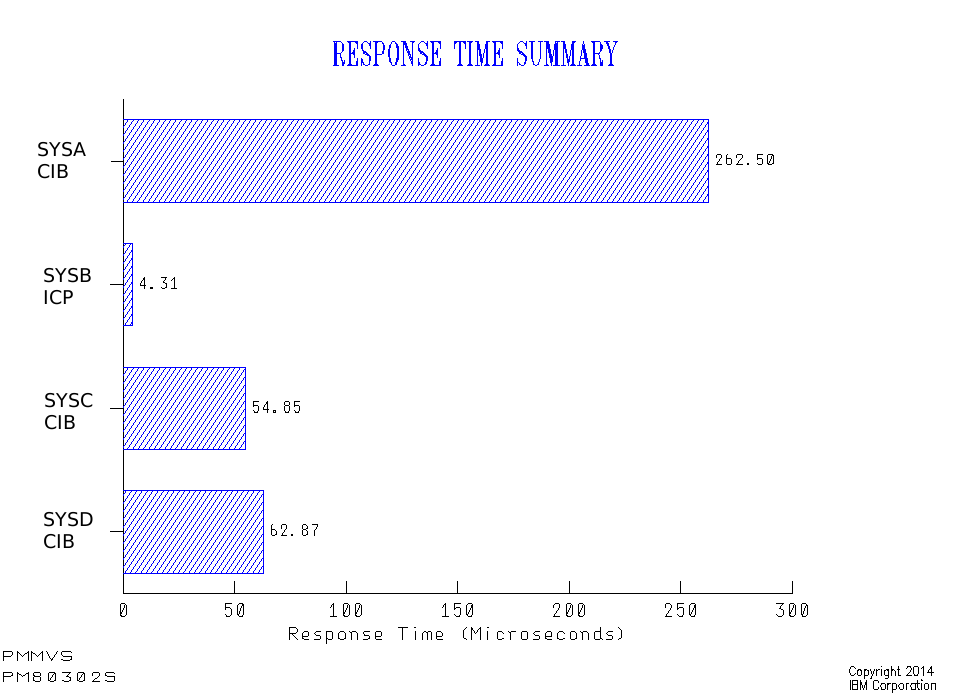
Now let’s look at the response times:

Here the local system (SYSB) using IC Peer (ICP) links shows a very nice response time under 5ยตs.

The remote systems (using Infiniband (CIB) links) show response times between 55 and 270ยตs.

A reasonable question to ask is “how come SYSC has so much better response times than SYSA and SYSD as they’re on the same footprint?”

You might think it’s because it has some kind of Practice Effect; You drive a higher request rate and the service time improves (which XCF’s Coupling Facility structures often appear to exhibit).

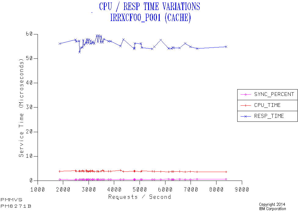
But here’s a graph – just for SYSC – which disproves this:

I’ve sequenced 30-minute data points not by time of day but by request rate. Here are the highlights:

  • The response time stays level at 50-60&us. regardless of the request rate. So it’s not a Practice Effect.

  • The percent of requests that are Sync stays very low – so conversion is almost always happening. (At least it’s consistent.)

  • The Coupling Facility CPU per request (not Coupled (z/OS) CPU) is around 5&percent. of the response time; The rest is the effect of going Async as well as the link time.

Now SYSA has a much lower LPAR weight than SYSD, which in turn has a lower LPAR weight than SYSC. The response times are the opposite: SYSC lowest, then SYSD, then SYSA.

So we have (negative) correlation. But what about causation?

Well, I’ve seen this before:

When a request is Async (whether converted or not) the request completes by the caller being tapped on the shoulder. In a PR/SM environment this can’t happen until the coupled (z/OS) LPAR’s logical engine is dispatched on a physical engine. If the weight for the LPAR (or vertically for the engine in the Hiperdispatch case) is low it might take a while for the logical to be dispatched on a physical.

The consequence is that lower-weighted LPARs get worse response times for Async because of the time taken to deliver the “completion” signal.

A Happy Ending

My advice to the customer was to move the IRRXCF_P001 structure to the Coupling Facility on the same footprint as the busiest LPAR (SYSC).

They did this and the response time dropped to 4ยตs, with the vast majority of the requests now being Sync.

This is an unusual case in that normally one LPAR doesn’t dominate the traffic to a structure. So the choice of where to put the structure was unusually easy.

I would add two things related to the applications on SYSC:

  • They are IMS and I don’t know enough about IMS Security to know whether it is possible to tune down the SAF requests to reduce the Coupling Facility request rate, without compromising security.

  • There is no direct correlation between IRRXCF_P001 service time and IMS transaction response times. Such is often the way.

But this has been an interesting and instructive case to work through. And you could consider this blog post penance for mistakenly thinking RACF Coupling Facility requests were always Async. ๐Ÿ™‚

In a similar vein you might like:


1 But XES can’t convert Async requests to Sync.

Coupling Facility Memory

(Originally posted 2014-11-23.)

Or “who made all the pies”? ๐Ÿ™‚

I’ve written a number of times about Coupling Facility Performance but I don’t think I’ve written about memory for a while.

In any case I’d like to share with you a couple of graphs I’ve taught my code to make. The first isn’t strictly speaking specific to Coupling Facilities. But it’s useful anyway and does help tell the story.

Machine-Level Memory Allocation

This graph is, as I said, applicable to any machine – whether it has Coupling Facility LPARs or not.

LPAR Memory allocation is more or less static, so a pie chart is appropriate. In fact my code averages over a shift. [1]

What z/OS and RMF don’t know is the amount of memory (purchased) on a machine – so the Unallocated memory can’t be depicted without the analyst (me) manually telling the code.[2] Which is why I’m not showing it here.

In this (confected) example memory usage is dominated by two Linux [3] (probably under z/VM) LPARs and MVSA. There are also two Coupling Facility [4] LPARS – PRODCF1 and PRODCF3.

This data is from SMF 70 Partition Data Report data, having avoided double-counting if e.g. zIIPs are present. In my real code I also group together the small LPARs.

Coupling Facility Memory

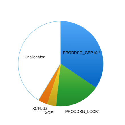
So let’s continue with our fictional example by examining one of these two Coupling Facility LPARs and drilling down:

This is from Coupling Facility Activity (SMF 74–4) data.

In this case I do know the Unallocated memory and so show it on the graph. It’s actually useful because it can help drive some conversations like:

  • What’s your “white space strategy?”
  • Perhaps you could increase the size of, say, GBP 10.

In this example I’ve marked GBP 10 with a *. In my code this denotes the structure is already at its maximum size: When defining a structure you specify its Maximum, Minimum and Initial sizes. Whether by manual intervention or using the AUTOALTER mechanism[5] the structure might grow to the Maximum. RMF documents these sizes so it’s easy to test whether a structure has grown to its limit.

Just because a structure has grown to the limit doesn’t mean you have to increase the size: RMF also documents whether the structure is full and whether this fullness is leading to such things as Directory Entry Reclaims or Data Element Reclaims. The extent to which this matters depends on the structure exploiter.

For example, the two XCF structures have their own instrumentation (SMF 74–2) which could be handy. In this case one could guess that one structure is for standard size (956 byte) messages and the other for large messages – but 74–2 data would confirm this and document the traffic.

“White space” is a complex subject and involves understanding how structures are allocated in Coupling Facilities and are to be recovered. I won’t try and do it justice in this post. But it’s a major reason why memory is left unallocated in Coupling Facility LPARs. Basically you should ask questions like “what happens if this structure fails?” and “how would I recover structures in the event of a failing Coupling Facility LPAR?” White space can be part of the answer.


Making Pies

I generally don’t like pie charts. But for the two cases outlined above they’re OK. The data is relatively static, though occasionally the values and names do change.

In this particular case the pie charts fill a niche in “storytelling”: I needed something to talk about where a machine’s memory is going. And I needed something to talk about the memory inside a Coupling Facility image.

What I wouldn’t like is to flash up these two charts and not dig deeper. Well, the data allows for much deeper digging; And I’m not inclined to stay shallow… ๐Ÿ™‚

Other Posts on Coupling Facility You Might Like

I’m reminded by a friend’s question a couple of days ago I’ve written a bunch of posts on Coupling Facility. Here are a few:


  1. A bunch of contiguous hours.  โ†ฉ

  2. In some cases I do tell my code how much memory the customer has. I get it from Vital Product Data, which z/OS and RMF don’t have access to.  โ†ฉ

  3. I’m increasingly seeing very large Linux LPARs; I’m not sure if it’s lots of small Linux virtual machines under VM or a few large ones.  โ†ฉ

  4. And we can tell they are Coupling Facility LPARs by means other than just guessing from their names.  โ†ฉ

  5. For those structures that support it.  โ†ฉ

After An Indecent Interval

(Originally posted 2014-11-16.)

In After A Decent Interval I talked about the need for frequently-cut SMF Interval records. This post is about bad behaviours (or maybe not so bad, depending on your point of view).

It’s actually an exploration of when interval-related records get cut, which turned into a bit of a “Think Friday” experiment. But I think – quite apart from the interest – it has some usefulness in my “day job”.

I share it with you in the hope you’ll find it interesting and perhaps useful.

And it’s in some ways related to what I wrote about in The End Is Nigh For CICS.

Code To Analyse SMF Timestamps

Let’s start with a simple DFSORT job to analyse the minutes when SMF 30 records are cut – in the hour. It’s restricted to looking at SMF 30 Subtype 2 Interval records. These are the 30’s one would most expect to have cut on a regular interval. (Subtype 3 records are cut when a step ends – to complement the Subtype 2’s.)

In reality the analysis I’m sharing with you uses more complex forms of this basic job. But we’ll get on to the analysis in a minute.

The first step is very simple and deletes a report data set. The second step writes to this data set and, identically, to the SPOOL. [1]

The INCLUDE statement throws away all record types other than SMF 30 Subtype 2.

The INREC statement turns the surviving records into two fields:

  • The record’s time in the form hhmmss, for example ‘084500’ for 8:45AM.
  • A 4-byte field with the value ‘1’ in.

These two fields are used in the SORT statement to sort by the minute portion of the timestamp and the SUM statement to count the number of records with a given minute.

The purpose of the OUTFIL statement is to format the report for two destinations. It produces a two-column report. The first is the minute and the second the number of records whose timestamp is within that minute. For example:

MIN             Records
---             -----------
 00                   49844
 01                      23
 02                      45
 ..                      ..

Here’s the code.

//DELOUT   EXEC PGM=IDCAMS 
//SYSPRINT  DD  SYSOUT=K,HOLD=YES 
//SYSIN     DD  * 
 DELETE <your.report.file> PURGE
    IF MAXCC = 8 THEN SET MAXCC = 0 
/* 
//* 
//HIST     EXEC PGM=ICEMAN 
//SYSPRINT DD SYSOUT=K,HOLD=YES 
//SYSOUT   DD SYSOUT=K,HOLD=YES 
//SYMNOUT  DD SYSOUT=K,HOLD=YES 
//SYMNAMES DD * 
* INPUT RECORD 
POSITION,1 
RDW,*,4,BI 
SKIP,1 
RTY,*,1,BI 
TME,*,4,BI 
SKIP,4 
SID,*,4,CH 
WID,*,4,CH 
STP,*,2,BI 
* 
* AFTER INREC 
POSITION,1 
_RDW,*,4,BI 
_HOUR,*,2,CH 
_MIN,*,2,CH 
_SEC,*,2,CH 
_T30,*,4,BI 
//SYSIN   DD * 
  OPTION VLSCMP 
  INCLUDE COND=(RTY,EQ,+30,AND,STP,EQ,+2) 
  INREC FIELDS=(RDW,TME,TM1,X'00000001') 
  SORT FIELDS=(_MIN,A) 
  SUM FIELDS=(_T30,BI) 
  OUTFIL FNAMES=(SORTOUT,TESTOUT), 
  OUTREC=(_RDW,X,_MIN,X,_T30,EDIT=(IIIIIIIIIT)), 
  HEADER1=('MIN',X,'   RECORDS',/,'---',X,'----------')
//TESTOUT   DD SYSOUT=K,HOLD=YES 
//SORTIN    DD  DISP=SHR, 
//             DSN=<your.input.data.set>
//SORTOUT   DD DISP=(NEW,CATLG),UNIT=PM,RECFM=VBA, 
//            SPACE=(CYL,(1,1),RLSE),DATACLAS=FASTBAT, 
//        DSN=<your.report.file> 

Of course you’ll need to fiddle with things like the DATACLAS parameter and which output class you use. I’m assuming that’s within the skill set of anybody reading this post.

A “Well Behaved” Case

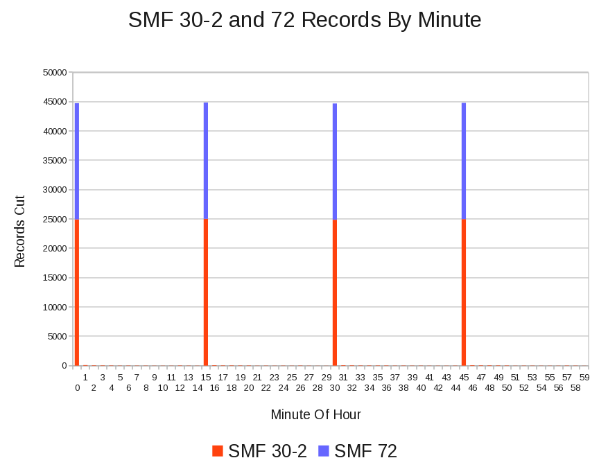
The following graph is from a customer whose SMF 30–2 and RMF records all appear, regular as clockwork, every 15 minutes. I’m showing SMF 72 (Workload Activity) records stacked on SMF 30–2 – as these are of similar volumes. [2]

In reality a few 30–2 records are cut every minute but no RMF records are cut “off the beat”.

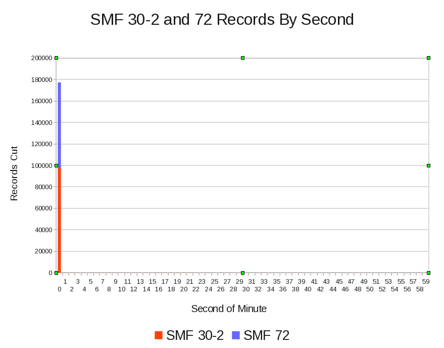
Drilling down to seconds, as the next graph shows, almost all the records are cut in the first second of the minute – both SMF 30–2 and 72. [3]

A Less Tidy Case

Contrast the above example with another customer, whose data is less well behaved. [4]

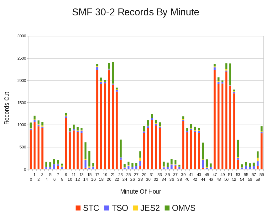
In this case the RMF records are all cut “on the beat”; It’s the SMF 30–2 records that aren’t.

In fact this is data from just one system out of many.[5]

In the previous case I surmise Interval Synchronisation was used (SYNCVAL and INTVAL parameters in SMFPRMxx) but in this case my best guess is that it isn’t.

Looking at Reader Start Times (which are in each Interval record, just as they are in Subtypes 4 and 5 for Step- and Job-End recording), the time when an SMF 30 is cut is determined by when the address space started.[6]

Let’s drill down a little, using field SMF30WID in the SMF Header; It gives the subsystem as SMF (and SMFPRMxx in particular) sees it:

Superficially it looks as if the SMF interval is 10 minutes; It isn’t. It’s actually 30 minutes. The high peaks are thirty minutes apart but there is something going on every 10 minutes, affecting STC and probably OMVS. It’s something I’ll want to discuss with the customer.

Conclusion

You might ask why I care about this sort of thing.

Partly it’s curiosity, sparked in this case by occasional glimpses that things aren’t as simple as they appear: If you really want to believe Interval records are tidily cut on interval boundaries that’ fine – but occasionally the fine (or not so fine) structure will up and bite you.

In my case the code I use occasionally produces bad graphs because it summarises records on 15, 30, or whatever minute intervals and records fall into the wrong interval. I’d like to at least be able to explain it.

But more generally, I have to pick a summarisation interval. Understanding how frequently and tidily Interval records are cut enables me to do that. I’m going to put code to do a basic form of this analysis into our process – right after we fetch the raw SMF from where you send it to (ECUREP, probably). This will save no end of time – as rebuilds of our performance databases and reruns of reporting can be reduced.

And, if nothing else it’s prompted me to re-read the SMFPRMxx section in z/OS Initialization And Tuning Reference.

Now that can’t be a bad thing. ๐Ÿ™‚


  1. That’s what the OUTFIL FNAMES parameter achieves.  ↩

  2. In my Production code I actually break down by SMFID and by record type in the range 70 to 79.  ↩

  3. In a busier or bigger system it might take more than 1 second on an interval to cut all the records; I look forward to seeing if that’s the case.  ↩

  4. It’s not really a moral judgment, but I expect this sort of data to cause more problems.  ↩

  5. My actual Production code report by system – in order to see the differences at a system level.  ↩

  6. Thanks to Dave Betten and some SMF 30 code of his it’s possible for me to see the Reader Start Time – which isn’t in the SMF Header and so can’t rigorously be processed by a simple DFSORT job.  ↩

What’s The Point Of WLM?

(Originally posted 2014-11-09.)

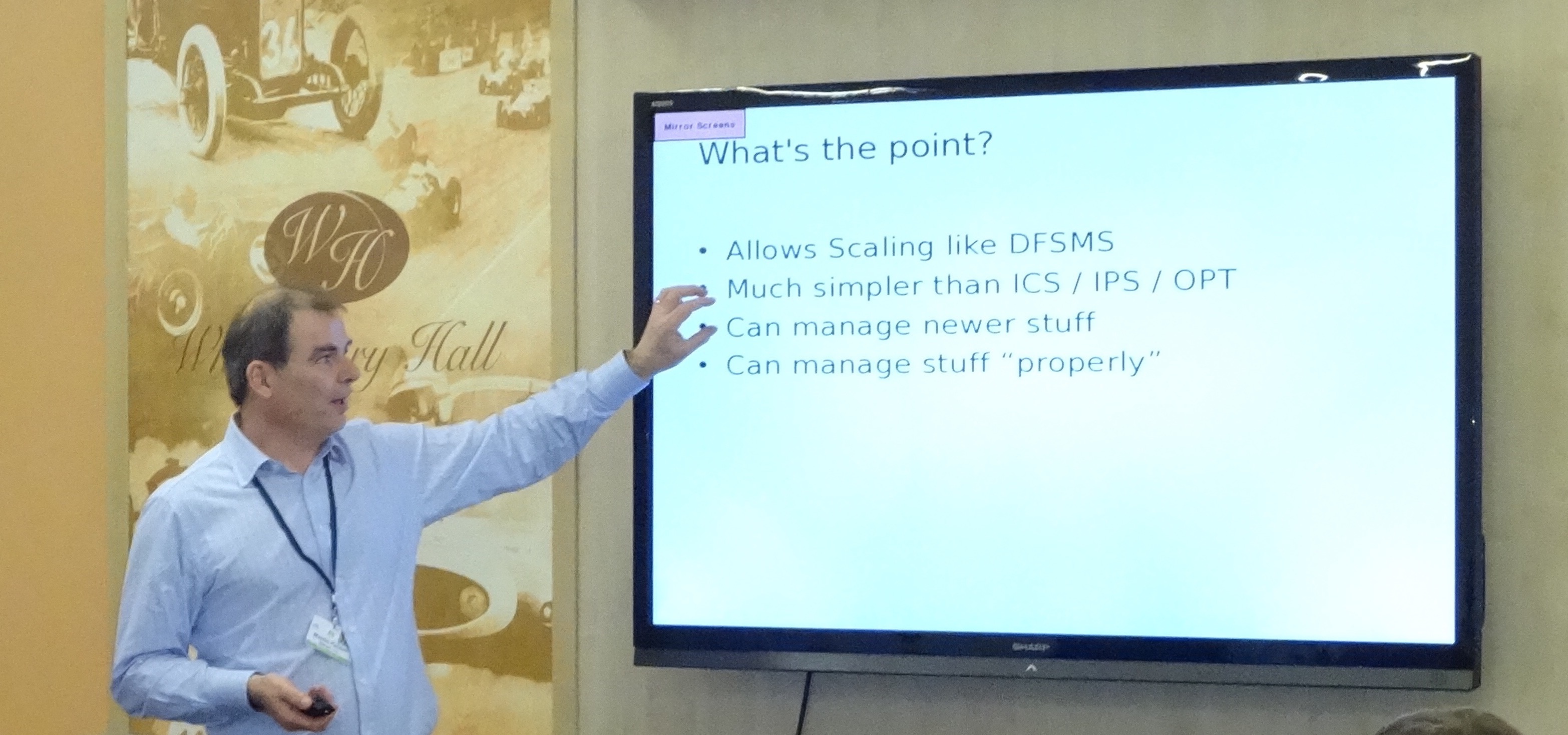
At UK GSE Annual Conference I presented on DB2 and Workload Manager. It occurred to me that one of the slides was a good basis for a blog post, posing the question “what’s the point of WLM?” And this was the slide, with me “for scale purposes”. ๐Ÿ™‚

(Thanks to Karen Wilkins for the photograph.)

So let me try to give you a synopsis of my view, expanding on each of the points on the slide.

Allows Scaling Like DFSMS

Back in 1988 I was one of the IBM Systems Engineers (SE’s) who supported a major UK customer in beta’ing DFSMS.[1] So I remember well the improvements in Storage Management that DFSMS brought.

Most notably the growth in data – data sets and volumes – was predicted to become unmanageable with the old ways of doing things. DFSMS, being Policy-Driven, provided constructs that enabled large numbers of volumes and data sets to be managed quickly.

The word “policy” is key to the analogy; WLM is also policy-driven, providing the same kind of leverage.[2] For many customers it would be inconceivable to manage performance with Compatibility Mode – even if it were still supported; The people cost would be too high, with the complexity of modern environments.

Much Simpler Than ICS / IPS / OPT

I’ll confess to never having been entirely comfortable with ICS / IPS / OPT; Sure I understood the mechanics but it was too early in my career to gather much experience of how it actually operated in real customer environments.[3]

There are, of course, people who “grew up” ๐Ÿ™‚ with Compat Mode (and probably watched it evolve) and for them I’m sure it makes perfect sense.

For the pedants, yes we still have OPT (IEAOPTxx) but it is much simpler now.[4] And what was got rid of I think we can happily live without.[5]

Can Manage Newer Stuff

It’s been so long now since WLM became the only game in town that I forget the myriad enhancements that assume it’s present. So I’ll take one example area: Server Address Spaces.

There are at least three functions that use some variant of the Server Address Space mechanism:

  • WLM-Managed Initiators.
  • Websphere Application Server address spaces.
  • DB2 Stored Procedure server address spaces.[6]

All three of them rely on WLM to balance system conditions against goal attainment when deciding on whether to start additional address spaces. There was nothing like it in Compat Mode.

As I said, it’s one area and there are numerous others.

Can Manage Stuff “Properly”

I said WLM was policy-driven. From the outset the rhetoric was that you could couch the policy in business terms. For response time goals that’s obviously true. For velocity goals it’s little less clear.

Certainly WLM Importance can be used to separate, with clarity, important work from less important work.

So I think WLM enables you to much more closely align performance specifications with business goals.

Conclusion

This has been a brief synopsis. Much more and “TL;DR”[7] definitely would apply. And because it’s brief it’s had to be selective.

And if you think it egotistical of me to post a photo of myself, consider I look different from my previous avatar; Clearly older, but I probably don’t look wiser. ๐Ÿ™‚

One final thought: There’s an enormous amount of Performance Tuning that has nothing to do with WLM; It’s important to be realistic about that; And anyone who talks about WLM like its some panacea – and people do – needs to be reminded of that.


  1. If I tell you I was an IBM SE you are supposed to understand my mindset and “get the hint”. The hint that I’ve been around a while and done interesting things. ๐Ÿ™‚  ↩

  2. Both DFSMS (through ISMF) and WLM are panel-driven, wherein you manage the policy. I already take the WLM ISPF TLIB and generate reporting from it. I wonder if the same approach would work with ISMF.  ↩

  3. And the instrumentation – mainly in RMF but also in SMF 30 – is so much better, which really helps.  ↩

  4. And, again for the pedants, what’s been added to OPT is new, rather than reversing the simplification.  ↩

  5. Anyone care to challenge that?  ↩

  6. I wrote the Server Address Space Management chapters of DB2 for z/OS Stored Procedures: Through the CALL and Beyond in 2003.  ↩

  7. Too Long; Didn’t Read  ↩