Offline Processors Can’t Hurt You

(Originally posted 2015-11-14.)

Or can they?

Actually I can’t answer that question. I’m aware my blog gets distributed in Development in Poughkeepsie (at very least) so maybe one of them can give a far better answer than I can.

Though this post isn’t meant to address this in its entirety I have a point of view:

A long time ago I learnt there were processor-related control blocks in 24-Bit Virtual. Though in the MVS/XA era you wouldn’t have expected a few (1 – 4) engines’ control blocks to be a major threat, in terms of virtual storage. [1] I’m pretty certain control blocks for engines must’ve evolved in the past 30 years. Now z/OS supports so many more processors, I find it hard to believe things haven’t had to change. Scaling **isn’t ** just about increasing the value of some “max_engines” quantity. It’s also about making the experience worthwhile. So, for example, multiprocessor ratios (essentially, what happens when you add another engine) have to be convincing.

There’s plenty of evidence of Development making the mainframe and z/OS (and DB2 and CICS and …) scale.

So I’m pretty confident offline engines are largely harmless.

But, Soft! Methinks I Do Digress Too Much

This post wasn’t meant to be about any of the above. It’s actually about what happens when a physical machine has a very large number of logical processors.

Specifically, what happens to SMF 70 Subtype 1 records.

There are two scenarios that concern me (or at least challenge our code):

  • A very large number of LPARs on a machine, reported on by an RMF instance.
  • LPARs with a large number of logical processors defined.

Or, frankly, some combination of both.

I’ve seen 3 sets of data this year that have challenged our code because of either or both of the above.

So let me explain…

… The “headline” issue is multiple [2] SMF 70–1 records per RMF per interval.

Let Me Explain In More Detail

Most of the sections in the 70–1 record are either singletons or small. But two are worth looking at more closely…

  • Logical Partition (Data) Sections – One per LPAR, whether active or not.
  • Logical Processor (Data) Sections – One per logical engine, defined to an LPAR, whether Online or not.

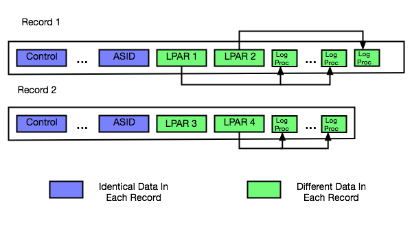
An LPAR’s Logical Partition section points to the related Logical processor sections – with a first section number and a count.

The following diagram illustrates this.

t70Sections.png

Here we have 2 records from the same interval and the same RMF instance:

  • The first record has 2 Logical Partition sections, each pointing to a number of Logical Processor sections.
  • The second record has the remaining 2 Logical Partitions section for the machine. The first one (LPAR3) is deactivated, having no Logical Processor sections. The second one (LPAR4) has Logical Processor sections (and is therefore active).

Around 300 – 350 Logical Processor sections are enough to fill up a 32KB SMF record. And that’s when you get a second one.[3]

This Requires Care

Here are some things to note:

  • When processing these sections it’s very useful that all the Logical Processor sections for an LPAR are in the same record as the corresponding Logical Partition section.
  • Every 70–1 has counts of the machine’s characterised processors (the ones you bought).
  • Every 70–1 has other sections, related to this LPAR’s definition and CPU Utilisation and Address Space queues. These are all present in each record for the RMF / interval combination.
  • Every 70–1 has the pool names, in a set of 6 CPU Identification sections.

Because the CPU utilisation and address space queue information is in all the 70–1 records we were double-counting important things [4] – when we had 2 70–1’s per interval. I fixed this by only using the first record’s copy of these sections.

How Does This Come To Be?

As I said above, the 70–1 contains Logical Processor sections even for offline processors. If you have lot of LPARs, each with say 32 logical processors defined and with 25 offline, you get lots of 32-section groups.

It’s not hard to get to more than 300 Logical Processor sections for a machine, then.

And scenarios where LPARs have lots of defined processors is very common:

  • IRD’s Logical Processor Management function varied engines on and off line.
  • Bringing online an offline processor is much easier than having to define additional ones.
  • Hiperdispatch parks and unparks Vertical Low processors. They’re still online when parked.

There are probably other scenarios I’m not intimately familiar with.

An Aside On Duplicate 70–1 Data

A discussion I had this week with a colleague highlighted that not many people know the following:

Suppose you have a machine with 2 LPARs (SYSA and SYSB), each running RMF.

Suppose you broke up their 70–1 records and stored the Logical Partition and Logical Processor sections as rows in 2 performance database tables.

You will get two sets of rows in each table, seemingly near identical. This is because when RMF in SYSA and RMF in SYSB cut 70–1 records they retrieve the same data independently from PR/SM.

In our code, when laying out the LPARs, we pick one z/OS RMF system for each machine and only report on the LPARs from its 70–1s. It might be stating the obvious but you should do the same.

We also report on each processor pool separately, noting that z/OS LPARs are often in two pools – GCP Pool and zIIP Pool.

In Conclusion

Almost everything I’ve talked about in this post relates to logical processors. Once you add in physical processors the 70–1 record gets to be even more complex.

It’s highly valuable data so process it carefully.

And most customers don’t have to worry about multiple 70–1 records per interval per RMF. You can easily use ERBSCAN and ERBSHOW against an SMF data set in ISPF 3.4 to see if you do.

But generally, offline processors are harmless. Indeed operationally useful.


  1. Correct me if I’m wrong, please. I suspect someone has a war story or two.  ↩

  2. Actually, in each case it’s been only two – but the problem generalises to more than two (as does our code solution).  ↩

  3. And potentially a third, etc.  ↩

  4. For example, the Capture Ratio was just short of 50% – because the 72–3 records weren’t double counted.  ↩

And Latency Once More

(Originally posted 2015-11-06.)

This is about the third time I’ve written about this, and it probably won’t be the last. 🙂 [1]

I was presenting to customers about the Coupling Facility Path Latency statistics I’ve previously spoken of when one of them told me of the following incident. I’m sure he won’t mind me sharing it without you, so long as I don’t identify the source.

The customer has two zEC12 machines, with Internal Coupling Facilities (ICFs) in each, and with z/OS LPARs in each machine, using Infiniband links and Internal Coupling links to these ICFs. [2]

The customer believed they had two groups of four Infiniband paths between one z/OS image and a remote CF. These groups of paths take routes said to be [3] 5km and 8km long.

One day they looked at an RMF Coupling Facility Activity postprocessor report and saw the new path data information, new with OA37826 and CFLEVEL 18. That was a nice surprise.

What wasn’t a nice surprise was the report indicating three paths at 8km and five paths at 5km. This was not what they expected.

Their initial suspicion was that the routing was wrong and the instrumentation right. But it proved otherwise:

  • First, by getting an independent measurement of the path lengths, they discovered that all the paths were of the correct length.
  • Second, by moving paths between adapters, they isolated the problem to a specific adapter.

So, the upshot was that the adapter card was reporting the incorrect distance. The card has, fairly obviously, been replaced and everything is fine now.[4]

There’s no suggestion there was anything else wrong with the card, but it’s good it was replaced. An interesting question is whether incorrect latency measurements could cause poor routing decisions, but I certainly can’t comment on that publicly.

Another question I can’t answer is whether the latency measurement suddenly went bad; All we know is that when the customer looked at the Coupling Facility Activity report for the first time it had the wrong number in it.

While I don’t propose to write reporting that assumes dynamically changing CF Path Latency values I do think it’s worthwhile to look occasionally at this data. I always do when I get customer data – and most customers have OA37826 applied and are at CFLEVEL 18 or higher.

So please do look at this every so often, including right now, as a useful verification exercise.


I’m now keeping a list of my blog posts on Coupling Facility links in a separate file. Here’s what it looks like so far:


  1. I’m learning you can never tell when the well will run dry with technology, and CF Path Latency is certainly a case of this.  ↩

  2. This is so common a configuration I’d call it an architectural pattern if I were pretending to be an architect (which I sometimes do). 🙂  ↩

  3. Pardon my skepticism on this topic; Long-term readers will know it’s justified.  ↩

  4. Hopefully nobody is mad at me for mentioning a card went bad. We all know hardware can fail and that’s why we design configurations and procedures to cope with it.  ↩

The CPU That You Do

(Originally posted 2015-10-31.)

It’s difficult to write about a live situation for two reasons:

  • You don’t want to spoil the surprise.
  • You mustn’t expose the customer.

Actually, make that three reasons:

  • You don’t know how it’s actually going to turn out. 🙂

So why am I writing at all?

Well, the big engagement my team are involved in exemplifies the method for tuning CPU down, with a twist or two of its own. It’s the outline of that method I want to share with you.

At its simplest it’s very simple indeed:

Take The Large CPU Numbers And Make Them Smaller

But in this case (as in so many others) it’s not quite so simple. There are two complicating factors, one of which is universal, the other only sometimes present.

  1. Which metric of CPU matters?
  2. How do you handle multiple machines with, usually, diverse processor configurations?

The Relevant CPU Metric

For most customers the relevant metric is Peak Rolling 4-Hour Average. In our case it happens to be total CPU seconds.[1]

For the Peak Rolling 4-Hour Average (R4HA) one of the options is to depress the peaks, perhaps by displacing work in time.[2]

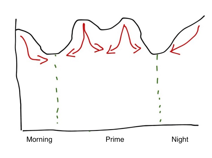
As an example consider the following (typical) pattern:

It has overnight batch intensiveness and two day time peaks. The red arrows show how you might try to displace work – as well as actually reducing the CPU consumed.

If you’re paying based on CPU seconds the area under the curve is what matters and the displacement option isn’t a good one. So you have to rely on reducing CPU seconds by tuning.

Actually, you could reduce the CPU load by shooing work away.[3] But I don’t think you generally want to.

Multiple Machines

Multiple machines pose a problem in that they often have diverse configurations and engine speeds. For the purposes of this exercise I’ve examined the Service Units Per Second and used the ratio across the LPARs to derive the relative engine speed.

The emphasis is deliberate in the previous sentence because, when you read on, the inaccuracy this introduces is irrelevant to the exercise: Deciding where to expend effort doesn’t need much accuracy.

It turns out the SU/Sec numbers varied by up to 10% across the whole estate – so I treated them all as the same. For this study it’s a nice simplification and I’m confident we have found the big handfuls of CPU.

Take The Big Numbers And Make Them Smaller

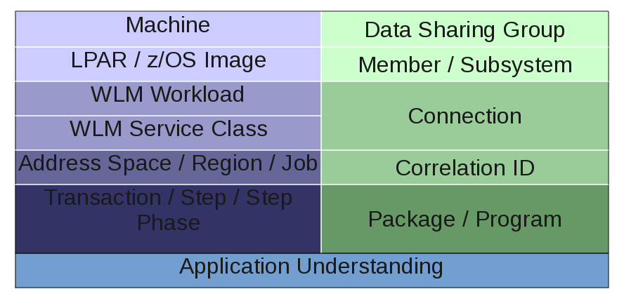
This is, of course, a recursive process – and it’s classic problem decomposition. This diagram summarises it.

I’ve divided the diagram into two hierarchies [4] that more or less meet towards the bottom:

  • On the right side we have DB2.
  • On the left side we have “System” and similar stuff.

By side I don’t mean to imply that in a competitive sense, just literally sides of the diagram and as a label to aid division of labour.

System Side

The sequence of Machine then LPAR then Workload then Service Class then Address Space then… is entirely obvious and sensible. And you’d use such data as:

  • SMF 70 – for the top layers.
  • SMF 72 – for Workload and Service Class (Period) (and Report Class).
  • SMF 30 – for address spaces, jobs and steps.

DB2 Side

In fact this side is generally handled by my DB2 colleague but, having done this in the past, I know:

  • Data Sharing Group / Member / Subsystem start with Statistics Trace.
  • The rest use Accounting Trace.

Actually, in this study I did look at DB2 Accounting Trace for two specific purposes:

  • For DDF to get detailed information on which external applications were driving mainframe CPU when accessing DB2.
  • For Batch to understand a little more about job steps’ use of CPU, for example whether Class 1 (“total”) or Class 2 (“in DB2”).

But my DB2 colleague looked at the myriad ways the subsystems could be tuned to reduce CPU. He raised an interesting point: If the DB2 subsystem is tuned wholesale doesn’t that mean the System-side CPU picture will change? Yes it does, but I think the balance of risk that large chunks of CPU will suddenly become unworthy of tuning because of DB2 subsystem tuning is small. (So work should proceed in parallel on both sides of the diagram.)

Application Understanding

This is where the magic happens:

By bringing together the System-side and DB2-side decompositions you should have quite a precise view of the moving parts that need tuning.

It’s time to wield the scalpel, now the body scanner has told you where to make the cuts.


So the above is sketchy, right? But it is a methodology as it’s systematic and yes I do have tools to implement it.

Do I have all the tools I could want? [5] Actually the sheer scale of this engagement has led me to believe one could build better tools – based off our current tools – that could make this go much quicker. Getting to build them any time soon is a matter of priorities.


  1. In fact there are off-shift discounts and others related to zIIP, but I won’t go into detail about these here.  ↩

  2. The most displaceable work is Batch (or Batch-like).  ↩

  3. And there are plenty of ways of doing this.  ↩

  4. There are similar hierarchies for eg CICS and MQ but I’m simplifying here. (This study isn’t big on CICS or MQ and I’m reusing a graphic from the actual study.)  ↩

  5. What a silly question! 🙂 One never has all the tools one wants. 🙂  ↩

Slide Over A Bit More – Responsive Design

(Originally posted 2015-10-06.)

I’ve played some more since I wrote Slide Over A Bit, most notably from the perspective of developing a web app that acts as a Slide View widget. This post addresses some of the issues. In particular:

  • Offline web apps, a feature of HTML 5.
  • Responsive design – writing a web app that works well in Slide View mode while still looking OK in Full Screen mode.
  • Remote hosting.

I wrote a better version of my “wrap pasted text in quotes” widget to try things out – and because I want one. It looks like this:

It might not be the prettiest widget in the world but producing it required quite a bit of experimentation. Without the experimentation it would be impossibly small.

Offline Web Apps

To make a web page load quickly and from anywhere is good.

How can you make a web page load without a network connection? Well, it has to have content that doesn’t require a server update. One that is javascript plus a few fields and doesn’t need fresh data from a server is a good candidate. All of that is static and can be loaded from the browser’s cache. A widget is ideal – unless it actually needs data from somewhere.

Plenty of material on the internet exists that describes how to write an offline app, for example Offline Web Applications – Dive Into HTML5. I won’t repeat the material here but it needs your web page to point to a cache manifest file. Every time you change the web page’s contents you need to change the cache manifest file – perhaps by updating a timestamp. Frankly I couldn’t get Safari to recognise the cache manifest file had changed. Perhaps this was because I was developing in Pythonista with the web server code I showed in Slide Over A Bit.

Responsive Design

This is the meat of this post. Consider the case of some very simple HTML:

<html>
  <body>
    <h1>It works!</h1>
  </body>
</html>

If you serve it to Full Screen Mobile Safari it looks like this:

but if you view it in Slide Over Mobile Safari it looks like this:

What has happened is the page is scaled down. My widget is unusable with this scaling down – or it would be if I didn’t do something about it.

There are two main ways to arrange elements on a web page:

  • Using Javascript
  • Using Cascading Style Sheets (CSS)

In both cases we need a trigger to cause different rendering when in Full Screen and in Slide Over. My first attempts were to use the page width – but this fails as Safari reports the same width in each mode.

The breakthrough came when I realised (and later proved) the height is different in the two modes.

Javascript

On my iPad Air window.innerHeight is 2021 when a page is displayed in Safari in Slide Over and under 700 when Full Screen.

You could use this to lay out the page differently in each case.

CSS

In CSS a simple media query will do the trick. Wrapping the CSS Slide Over mode in the following worked for me:

@media all and (min-height: 2021px){
  ...
}

Actually lower values than 2021 worked. And this was in landscape, on an iPad Air. In portrait, or on a different kind of iPad, it will be different. Experiment with window.innerHeight in Javascript to see what works for the configurations you intend to support.

In my code I specified:

font-size: 40px;

and this made the text big enough (just about).

I also specified:

button {
  width: 300px;
  height: 300px;
  background-color: LightBlue;
  border-radius: 150px;
}

to make those nice round blue buttons.

If you know CSS you’ll get the general idea.

For Full Screen you’d probably use max-height instead of min-height – in the same style sheet.

Remote Hosting

I uploaded my single HTML file to Dropbox. It works fine – but in “cheapo” basic mode the file has to be downloaded before being executed, and I don’t see how to get the page to refer effectively to the cache manifest file needed for offline use.

Here is the HTML:

<!doctype html>
<html manifest="cache.manifest">
<style>
@media all and (min-height: 2021px){

    * {
      font-size: 40px;
    }

    textarea {
      height: 500px;
      width: 800px;
    }

    button {
      width: 300px;
      height: 300px;
      background-color: LightBlue;
      border-radius: 150px;
}
</style>
<br/>
<p>
Paste in text and press a button to format it.
<p>
<textarea rows='5' cols='30' id="myText">
</textarea>
<br/>
<br/>
<button onclick="singleQuotes()">Single Quotes</button>
<span>&nbsp;&nbsp;&nbsp;&nbsp;&nbsp;&nbsp;&nbsp;</span>
<button onclick="doubleQuotes()">Double Quotes</button>
<br/>
<script>
textbox=document.getElementById("myText")

function wrap(prefix,suffix) {
  textbox.value=prefix+textbox.value.trim()+suffix
}

function prepareToCut(node){
  node.focus()
  node.setSelectionRange(0,9999)
}

function singleQuotes() {
  wrap("'","'")
  prepareToCut(textbox)
}

function doubleQuotes() {
  wrap('"','"')
  prepareToCut(textbox)
}
</script>
</html>

To a real web developer this is probably basic and incomplete – but I hope it raises and begins to solve one key issue: How to make web pages look good in Mobile Safari in both Slide Over and Full Screen. The former is particularly important to make Slide Over “widgets” easy to write.

Now, I’m not a professional web developer and certainly not a CSS expert. So if you have anything to add please feel free to chip in.

The fun continues. 🙂

Slide Over A Bit

(Originally posted 2015-10-02.)

The last post hit both the “Mainframe” and “Performance” aspects of this blog. This one is firmly in the “Topics” category.[1]

You might’ve noticed a slew of announcements from Apple recently, and iOS 9 and OS X 10.11 “El Capitan” delivery. [2] I’d like to talk here about one feature of iOS 9 that is more useful than it appears at first sight: Slide Over on the iPad.[3]

What Slide Over Is

If you have a modern enough iPad or iPad Mini you can use Slide Over.[4]

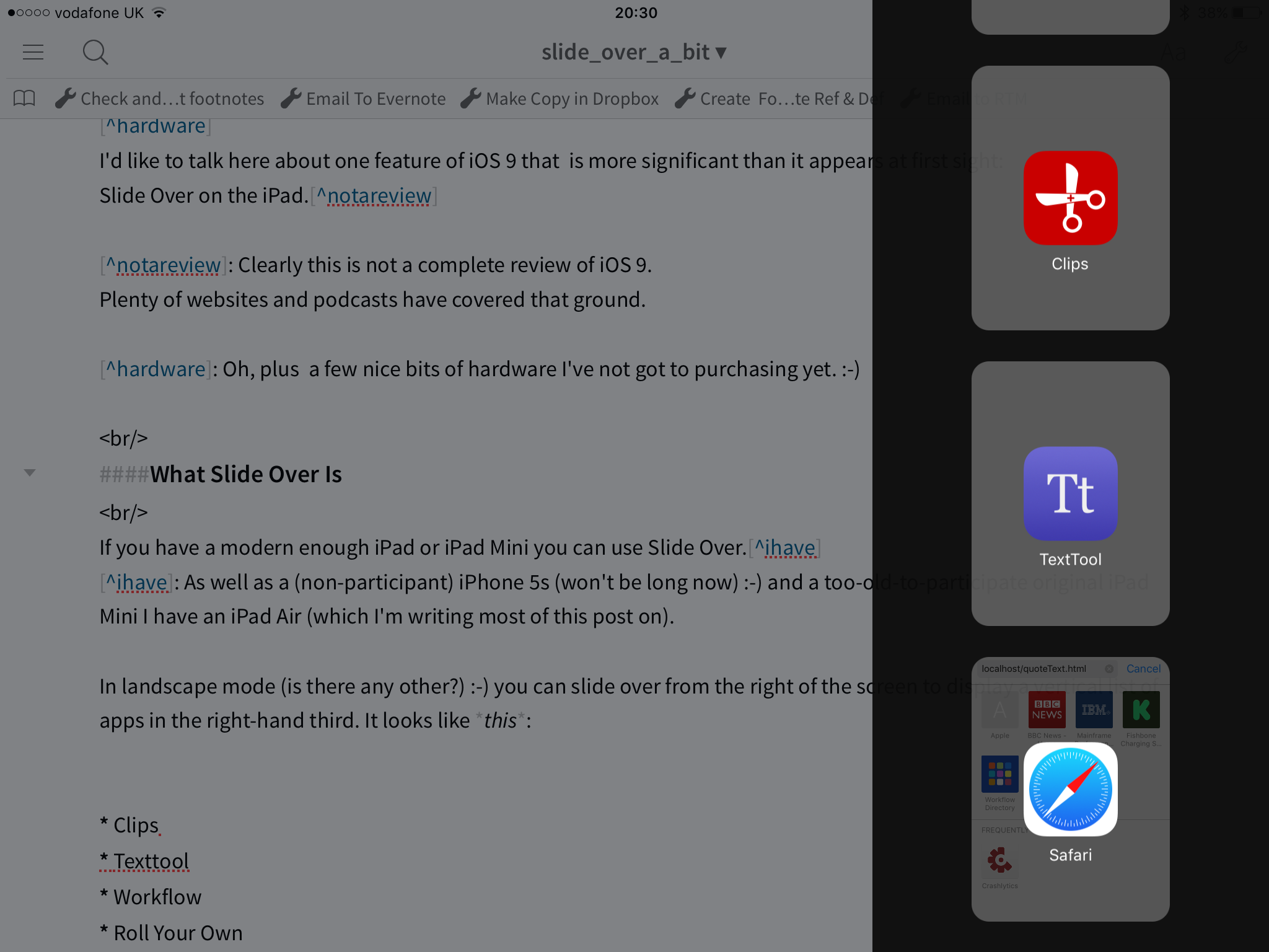
In landscape mode (is there any other?) 🙂 you can slide over from the right of the screen to display a vertical list of apps in the right-hand third. It looks like this:[5]

App developers have to explicitly support Slide Over and quite a few have. Apparently it’s not difficult.

You pick an app from the list and the original app (in the left two thirds of the screen) pauses. Tapping in this left area resumes the original app (full screen).

Why Am I Excited About This?

Well, apart from the novelty, there’s a nice use case – which becomes much slicker:

Suppose you’re writing and you want something done to a chunk of text. The first example I stumbled over was extracting some text from a BBC News website article and wrapping it in quotes. I wanted to tweet the text and a link.

The following workflow would suffice:

  1. Copy the text to the clipboard.
  2. Slide over and select a tool to paste into that wraps text with quotes.
  3. Copy the result back to the clipboard
  4. Paste into the tweet and post.

Actually I did a very similar thing to create the numbered list above – using the List function of Texttool:

In the above I chose the numbered list option you can see – and then pasted the result back in to Editorial.

Notice how Editorial is greyed out while Texttool is in full colour.

So mini apps (or widgets) that process text are a very good use of Slide Over.

Some Ways Of Getting Such Widgets

As I mentioned there are quite a few apps – some from Apple, many not – that show up in Slide View.

Here are some examples.

  • Clips – which keeps multiple items you’ve cut to the clipboard for ease of use.
  • Texttool – which does simple text transformations.
  • Workflow – which allows you to build workflows, as the name suggests.
  • Likewise Editorial and Drafts.
  • PCalc – a nice calculator.
  • Roll Your Own.

In several of these – Workflow, Texttool and Roll Your Own – I’ve succeeded in wrapping pasted in text in quotes.

Rolling My Own

One of the most flexible (and not that difficult) ways of building your own is using bookmarks in Safari to locally hosted web pages.

As an experiment I set up a simple webserver in Pythonista using (the possibly inadvisable) port 80:

# coding: utf-8
import SimpleHTTPServer
import SocketServer

port=80

handler=SimpleHTTPServer.SimpleHTTPRequestHandler

HTTPD=SocketServer.TCPServer(("",port),handler)

HTTPD.serve_forever()

(By the way I just used Texttool in Split View to indent the above code by 4 spaces to get it to format as code in Markdown.)

Anyhow, in the same Pythonista directory I created quoteText.html:

<!doctype html>
<html>
<script>
str=prompt("Throws double quotes round text.\n\nPaste in text.")
if(confirm("Double Quotes?")){
  prompt('','"'+str+'"')
}else{
  prompt('',"'"+str+"'")
}
</script>
</html>

In Safari I have this bookmarked and Safari can be used in Slide View with it.

In essence I’ve prototyped my own Slide Over text processor. This one wraps in single or double quotes any text you paste into a prompt.

As you can see it’s very simple.

Creating an HTML 5 web app from a remote webserver that stays permanently on the iPad is left as an exercise for the reader. (I’ve done something similar before but, having Pythonista, I didn’t need to for this example.)

It’s Not Quite Perfect

Slide Over is saving me time. But there are some things that could be better:

  • I find selecting apps a bit cumbersome: Pinning some, or text-based navigation would help.
  • I’d like it to be easier to roll my own.
  • I’d like to be able to go direct to bookmarked web pages there (perhaps pinned).
  • Cutting and pasting is a cumbersome method of transferring data – particularly if you forget to Cut and use Copy instead. 🙂

But overall I think the “side bar widget” use case for Slide Over is compelling.

I briefly mentioned OS X 10.11 El Capitan. At last it allows you to have two windows up – snapped to either side of the screen. I’m going to experiment with snapping stuff to the right side – in a similar vein. I don’t expect it to work as well. Perhaps the Today view is the analogue.

Fun, eh? 🙂


  1. Not that I really feel the need for legitimisation.  ↩

  2. Oh, plus a few nice bits of hardware I’ve not got to purchasing yet. 🙂  ↩

  3. Clearly this is not a complete review of iOS 9. Plenty of websites and podcasts have covered that ground.  ↩

  4. As well as a (non-participant) iPhone 5s (won’t be long now) 🙂 and a too-old-to-participate original iPad Mini I have an iPad Air (which I’m writing most of this post on).  ↩

  5. Notice how Safari has greyed-out content rendered, whereas Clips and Texttool don’t, because Safari is already running.  ↩

CICS and Batch DB2 Identifiers

(Originally posted 2015-09-30.)

DB2 Accounting Trace names are a(n endless) [1] source of fascination to me.

As many of you know, bridging the gap between DB2 and callers and the environment is permanently an imperative for me. These names might be cryptic but they can usually be related to non-DB2 concepts. As I’m about to explain this to colleagues at work I thought I might as well explain it to the world (or at least my readership). So here goes.

(Note: I explained this for IMS Batch in Finding The DB2 Accounting Trace Records For an IMS Batch Job Step but now I want to do it for non-IMS Batch and CICS.)[2]

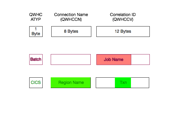
DB2 Accounting Trace (SMF 101) has three fields of particular interest, which behave differently depending on the type of working coming into DB2.

  • Connection Type (QWHCATYP) – a 1-byte integer
  • Connection Name (QWHCCN) – a 8-byte character string
  • Correlation ID (QWHCCV) – a 12-byte character string

Here’s a diagram, illustrating these 3 fields and how they behave for Batch (like) and CICS connection types.

Connection Type tells you which style of connection the SMF 101 refers to. For example TSO, BATCH, DB2CALL, CICS, DDF. [3]

Connection Name is interesting for CICS: It’s the CICS region name.

Correlation ID is interesting for CICS and for Batch, but each is differently treated:

  • For CICS the middle 4 bytes are the CICS Transaction ID.[4]
  • For Batch the first 8 bytes are the Job name.

By the way Connection Types “TSO”, “DB2 Call”,“Utility” and “Batch” are often Batch, regardless of what they look like. They just represent different ways of getting to into DB2 from a batch job step.

I think I’ll add a slide for this to my “DB2 Through My Eyes” Presentation.

Oh, and this is just Batch and CICS. DDF has even more information in the QMDA and QLAC sections. Perhaps I should write about that some time.


  1. 25 years so far, but who’s counting? 🙂  â†Đ

  2. I discussed the CICS DB2 Connection briefly in He Picks On CICS  â†Đ

  3. Constant-value symbols are defined in the mapping macro for each supported type. For example QWHCCICS.  â†Đ

  4. The first four are strings such as “POOL” and “ENTR”, telling you what kind of CICS / DB2 Connection thread this is. The last four are the commit number.  â†Đ

What’s The Latency Really?

(Originally posted 2015-08-19.)

In What’s The Latency, Kenneth? I talked about Coupling Facility Link distance and OA37826. The whole supposition was that you might want to know about really long links.

A recent situation showed me that short distances might be a different and interesting matter.

So what’s a microsecond or two amongst friends?

Well, 1Ξs represents 100m of distance and 2Ξs represents 200m. This is, of course, as the fibre-bound photon flies. 🙂

But consider that RMF (and CMF for that matter) records latency in integer microseconds. And that the lowest value we record is 1Ξs meaning “no distance”.

I would hazard that “1Ξs” really means “from zero metres to 150 metres or so” and that “2Ξs” really means “ from 150 metres or so to 250 metres or so”. I’ve added the “or so” because I don’t think the 10Ξs per kilometre number is accurate to many significant figures.

But why does this matter?

In this situation the customer currently has a pair of zEC12 machines showing 1Ξs and 2Ξs latencies – depending on the path. All the links are Infiniband 1X HCA3-O LR (as in “long range”) links.

They’d like to move to z13 with perhaps Integrated Coupling Adapter ICA-O SR (“short range”) links or even 12X HCA3-O SR links. Both of these have maximum distances of 150 metres. Both are designed to have better performance than 1X HCA3-O LR links.

You can see the problem right there: Will these technologies do the job?

The latency information isn’t accurate enough to tell us. But nobody said it would be.

But hardware planners aren’t stupid either; They probably would’ve used 12X if they could.

Oh well, time to get the tape measure out 🙂 and see if we can get to under 150m.

The Right Curves?

(Originally posted 2015-08-17.)

In true IBM fashion this post features graphs without scales. [1] My aim is to share a rhetorical device I used in a recent customer workshop. I hope you find it useful. [2]

The customer was worried about a piece of hardware whose responsiveness had deteriorated over the past year, but got better in recent days, coinciding with some tuning changes they’d made. This graph shows that:

I’ve abstracted to “rate” and “response” to avoid getting specific. Specificity isn’t helpful here. You’ll see that the rate also dropped roughly concurrently with the response.

So could the rate drop have caused the response improvement all by itself?

Or did the tuning efforts actually make a difference?

It’s very hard to tell so I posited a different way of graphing it. I drew on their whiteboard a graph similar to the following:

Instead of drawing a pair of curves of response and rate (or load) against calendar time line:

  1. Divide the timeline up into sections, with each section after the first being marked by a single tuning action.
  2. Plot each section as a fresh line on the same graph, with the x axis being load / rate and the y axis being response.

In the (sketched) example there are three curves:

  1. Baseline – before any tuning. (“Original”)
  2. With one tuning action. (“Tune 1”)
  3. With a second tuning action. (“Tune 2”)

If you can achieve a set of curves like this you can see the effect of tuning actions. In this case the first tuning action was clearly effective but the second had no effect (being essentially the same curve).

I think this is a handy technique, but there are a pair of issues that come readily to mind:

  1. These sections might “go stale” after a while. For example, other changes that you didn’t take into account might happen within the life of the curve. An application change nobody told you about [3] could affect performance.
  2. Getting enough data points could be tough. It’s tempting to go to 24 hours of 15-minute data points from, say, daily average data points. Care is required with this. Maybe restrict this to Prime Shift only, for example.

These issues need thinking about, but I don’t think they invalidate the idea. And more and more I’m plotting things like Response versus load / rate rather than against time. [4]


  1. Listen: You’re lucky to have axes. OK? 🙂  ↩

  2. As it’s such a sketchy 🙂 notion I decided to hand draw it, using a rather nice stylus, an iPad and a ruler. Yes, you can use a ruler but it might slip given the amount of plastic involved.  ↩

  3. As if that ever happens. 🙂  ↩

  4. Actually it’s as well as – as a view that understands time of day remains enormously helpful.  ↩

Tally Ho!

(Originally posted 2015-07-10.)

Numbers are key to what I do; They’re the basic data I use as evidence. Without them it’s often just supposition.

And nowhere is this truer than when trying to reduce bad[1] habits and reinforce good ones.

So a while back I invested a small amount of money in a very nice little app: Tally, a Simple, Eyes-Free Counter for iOS.

So this post is about why I like this app and also a request for an enhancement that I think would really make it more useful – at least to me.

What Is Tally?

I don’t mind sharing with you the three tallies I use[2]:

You’ll see here two unhelpful (perhaps) habits I’d like to indulge less in. Far more important, actually, is “Snacks” as there’s nothing wrong with my drinking.[3]

I also have a habit I’d like to do more off – “Floss”.

The above is a screen shot from the Tally app itself. You tap in the right place to bump a count (or Tally) up or down. You can, of course, clear tallies.

To make it easier to add to tallies, Agile Tortoise took advantage of the iOS 8 “Today” screen enhancements and created a Widget:

So this is nice.

But then came the Apple Watch and the app now sports a Watch counterpart:

This makes it even easier to add, for example, the pudding and the nice bottle of Proper Job I had with supper to the two relevant tallies: I just say “hey Siri open Tally” and I’m there.

One other thing I like – though I haven’t used this – is that Tally has its own x-callback-url scheme for automation. [4] This is unsurprising as Tally is developed by Greg Pierce who invented x-callback-url and uses it extensively in his Drafts app (which I also use).

At the moment I manually transfer the tallies – once a week – to a spreadsheet and clear them in the app. So I have some idea where I am with reducing or increasing them.

(I’ll probably back off and smooth them over 4-week periods, (not quite) also known as months. This kind of “squinting” might give me a better, smoothed, view.)

With the x-callback-url support I could probably automate this using the Workflow app and possibly Drafts. I’m not inclined to bother except, perhaps, as a learning exercise.

What Do I Want?

So in Theses on Feuerbach Karl Marx wrote: “Philosophers have hitherto only interpreted the world in various ways; the point is to change it.” So much of life is this way, and especially so for habits you’re trying to change.

So I could just [5] do less of the unhelpful and more of the helpful.

But it helps a lot if you understand when you do the things you’d like to less of. Snacking is a prime example of that.

So here’s what I propose: I’d like Tally – exposed through x-callback-url or similar – to keep a timestamp along with each increment or decrement of a Tally.

So I can see two immediate things here:

  • If my problem really is a mid-afternoon low I’d like to understand more about that and think about how to combat it.[6]
  • If I can push the snack that results back a 15 minutes every week I can probably make it collide with Supper [7] and disappear.

In both cases timestamps would really help here.

So I’ve been utterly honest about why I want timestamps with tally bumps – mainly to illustrate a real use case. I’ve no idea how Greg intended Tally to be used, nor how other people are using it. But it’s a nice little app that’s been well built and exploits much of the iOS and Apple Watch technology. I’d like to see it even more useful.

You might think I’ve been overly honest in this post. I actually find it helpful when other people admit to stuff where I can say “me too”. The human condition has a a lot of commonality.

And now my watch has just told me to stand up. So I guess it’s time to stop writing. 🙂 [8]


  1. Actually I don’t really like the moral tone of “bad” or “good”; I prefer more functional words like “useful” or “unhelpful”, particularly when it comes to food and dieting.  ↩

  2. But I won’t share the actual tally values. 🙂  ↩

  3. I’ve no idea how much my doctor drinks. 🙂 (In fact it’s a group practice so perhaps I should move the “s” from “drinks” to “doctor”.) 🙂  ↩

  4. A topic I discussed in Remember The Milk: Automatic For The People … – IBM  ↩

  5. A four-letter word if ever there was one. 🙂  ↩

  6. I also think I have a “late in the week” problem where willpower has been dissipated.  ↩

  7. or Dinner or High Tea, if you prefer. 🙂  ↩

  8. What a lame ending. 🙂  ↩

IMS Though My Eyes

(Originally posted 2015-06-22.)

As a matter of chance, over the past few months I've been involved in a number of situations where IMS has been an important component of the customers' infrastructure (and I'm about to be involved in another one).

Although I hope my customers don't think I think of them only as test data 🙂 it's been good to have their data move my story forward: Several nice pieces of analysis code have appeared, or been enhanced. 1

But this post isn't really trumpeting the enhancements I've made, so much as discussing how I now view IMS. It should help anyone who – as an outsider – is trying to understand IMS.2

So I'd like to look at how I detect IMS components in two categories:

Actually a third is really a hybrid of the two:

In fact what I call “Applications” some people might well call “System”; To me it's just a useful division.

System

There are three major IMS address spaces that I consider “System” – Control Region, DBRC and DL/I SAS (Separate Address Space).3

To detect these I look for a program name of “DFSMVRC0” and use the job name to distinguish between them, the endings being generally CTL, DBRC and SAS respectively.

For Data Sharing an IRLM address space is necessary – with program name “DXRRLM00” – but it's difficult to tell the difference between and IMS one and a DB2 one. Possibly naming conventions help here.4

The address space doing all the I/O is the Control Region; I see this in both SMF 30 and 42 Subtype 6.

I can see the Virtual Storage Allocated for 24- and 31-bit (and both can be a big deal sometimes). Likewise 64-bit, though that tends to be rather small for IMS.

The SMF 30 Usage Data Section confirms this is IMS and tells me the version. Note IMS Version 11 says “V1R1” but I believe it's been corrected in subsequent versions. 5

Unlike DB2, however, The Usage Data Section for IMS doesn't encode the subsystem name. 6

Applications

IMS applications are reasonably easy to detect, even if they're from e.g. CICS.7

So detecting an Application address space that talks to IMS is easy, one of two ways:

  • It has IMS in the Usage Data Section.
  • It has a program name of “DFSRRC00”.

Both are definitive. But after that it gets more difficult:

You can't necessarily easily tell a Batch Message Processor (BMP) batch job from a Message Processing Region (MPR). The “necessarily” refers to the fact that while conventionally an MPR has a Proc Step of REGION that's just JCL and, I guess, could be changed.

My code uses this but also looks for “JES” or “BMP” or “BAT” in a number of attributes – WLM Workload, Service Class and Report Class. As long-running address spaces can be started as started tasks or jobs even “J”/“JOB”8 vs “S”/“STC” isn't definitive for job IDs.

But mostly my code gets it right.

Recently I've been creating Gantt charts of when (groups of identically-named) MPRs stop and start. That's quite interesting as you see whether there are times when no MPRs with a given name are up, or whether there is a gap between when a set comes down and gets restarted.

I'm able to observe a number of interesting things about MPRs and BMPs, such as which DB2 and MQ subsystems they talk to, I/O despite the data being owned by the System address spaces, and virtual storage. On the topic of virtual storage in one customer I've just spotted a group of MPRs with very similar names, and the same Service Class and Report Class. You'd think they were cloned regions but it appears they're not, not least because their virtual storage allocations are very different.9

Batch DL/I

Batch DL/I is kind of a hybrid between the “Applications” and “System” categories above. A DL/I Batch job acts as a stand-alone IMS instance, for example managing its own buffers, I/O etc.

From a batch tuning perspective this is much easier to handle, precisely because of the above. I can see virtual storage and I/O to individual data sets and so can form a view of tuning actions and the nature of dependencies.

Conclusion

So, I think we can get quite a long way in identifying and observing aspects of the behaviour of IMS componentry. But, as usual, you really need to talk to your IMS specialists to go deeper. And this blog post barely scratches the surface of how you can look at IMS with non-IMS instrumentation.

And, in case you hadn't noticed, IMS has gained new capabilities – in terms of application styles, if nothing else. And that is one specific reason why I'm looking forward to the next IMS client engagement; I already know they have Java in their dependent regions.

So a “Part Deux” 🙂 seems likely some time. Actually this is pretty inevitable as I'm always learning (and keen to share.)


  1. I like to return the favour by discussing the relevant new insights with them. If you've been my client you'll know I like to be pretty explicit about this. (And sometimes this looks like and is a test of my analysis.) 

  2. Much like I did with DB2 Through My Eyes – Dublin, May 2015 for DB2. 

  3. Long ago the DL/I SAS was optional – to provide 24-Bit Virtual Storage Constraint Relief (VSCR) – but I don't know if it still is and I haven't seen an IMS installation without for a long time. At the beginning of my mainframe career I did Virtual Storage (including IMS). 

  4. IMS Coupling Facility structures are quite easy to detect but again tying them back to IMS subsystems is difficult. 

  5. But you should see the other guy. 🙂 One of the other major software vendors has garbage in the Version field. Another doesn't use the Usage Data Section at all. 

  6. This is true for all: System, Applications and Batch DL/I. 

  7. Here the Usage Data Section in SMF 30 tells you that IMS is connected to, but again not which IMS. 

  8. For 5-digit job numbers a job ID is of the form “JOBnnnnn” whereas for 7-digit it's “Jnnnnnnn”. 

  9. It's worrying that one of these 8 regions has a 31-bit virtual storage allocation of 1066MB, which is more than 80% of the limit. The rest aren't even close to this.