(Originally posted 2016-02-14.)
I wish I’d started counting DB2 subsystems before.
A recent study saw 43 DB2 subsystems, in 13 Data Sharing groups (and a few in none), across a large number of z/OS systems.
And if I try to remember other studies these numbers have been typical of them (but this is not a typical set of numbers).
Two thoughts entered my head:
- How on earth do you get to these sorts of numbers, and is it a blessing or a nuisance?
- How can you depict your DB2 estate?
This post is about the latter. I might come back to the former.
I want to share a technique I used that you might want to emulate. At any rate it generates diagrams I think you’ll find easy on the eye.
My Motivation
I’m always looking at new ways of depicting things for two reasons:
- Because I spend way too long generating “orientation” information about customers. I’m lazy, or impatient, or an efficiency-seeker if you prefer. 🙂
- Because I think there are fresh insights to be had.
As I hinted, I think customer mainframe estates have become more and more complex. So the need for better tooling has become acute.
Source Material
To capture your DB2 estate you need, unsurprisingly, to use SMF 30 Interval records. I’ve written about this many times. But here are a couple of specifics:
- I look for job names ending with “IRLM” to represent the DB2 subsystem.[1]. This I plug into a query against the SMF 74–2 XCF data and retrieve the group name, throwing away any beginning with “IXCLO”. This gives me a “group name” which I can use to find others in the same group. [2]
- To establish which CICS regions talk to which DB2 subsystem I use the DB2 SMF 30 Usage Data Section – for address spaces with program name “DFHSIP”.
If you read the footnotes you’ll see this isn’t 100% ideal but it certainly gets you a lot of the CICS / DB2 topology; To me it’s architecturally useful stuff. The question is how to depict this network.
New Tooling
I’ve used mind maps before and one of my favourite tools for creating and manipulating them is iThoughts. There’s an iOS version and a Mac OS X version.
Yes, other tools are available but there’s a specific feature I really like that makes this the tool I’m going with: Comma-Separated Value (CSV) import.[3]
CSV is nice because:
- It’s plain text and my REXX code can readily generate it.
- You can pull it into a spreadsheet and edit it before saving it and pulling it into iThoughts.
One other feature I like of iThoughts is the ability to Filter on a text string. Actually you can do a Global Replace which I found useful in sanitising the screen shots for this blog post.[4]
As with most mind mapping tools I can move nodes and subtrees around very easily. I can also add notes such as when the CICS region or DB2 subsystem started.
Some Fragments
So here are a couple of fragments of mind maps my tool has been taught to generate the CSV for. The screenshots are indeed from iThoughts running on Mac OS X.
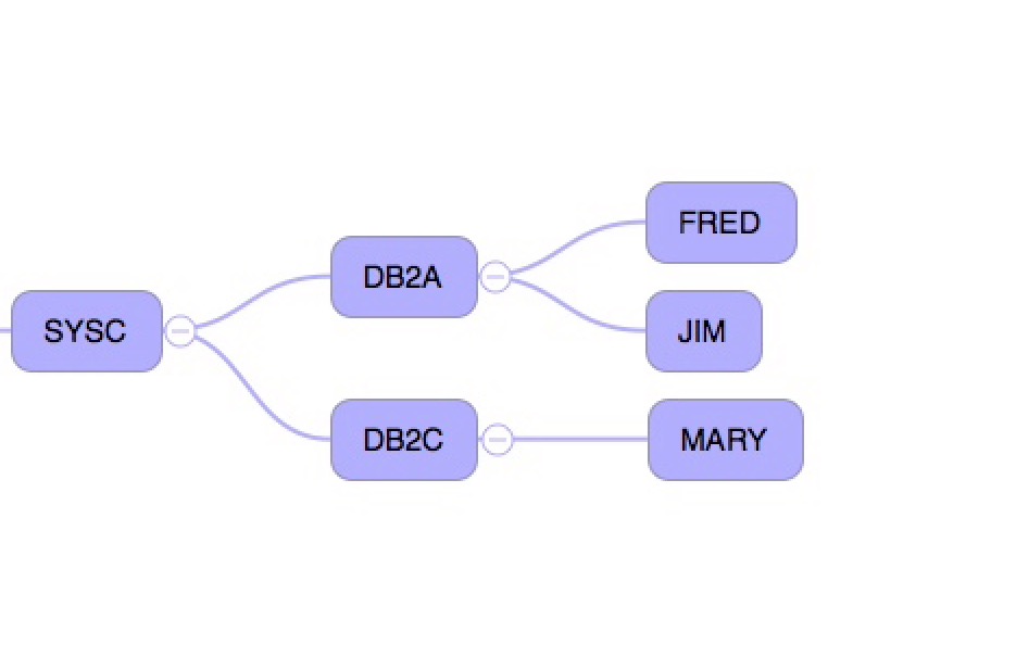
First, a shot of some DB2 subsystems – one set in a Data Sharing group, another not.
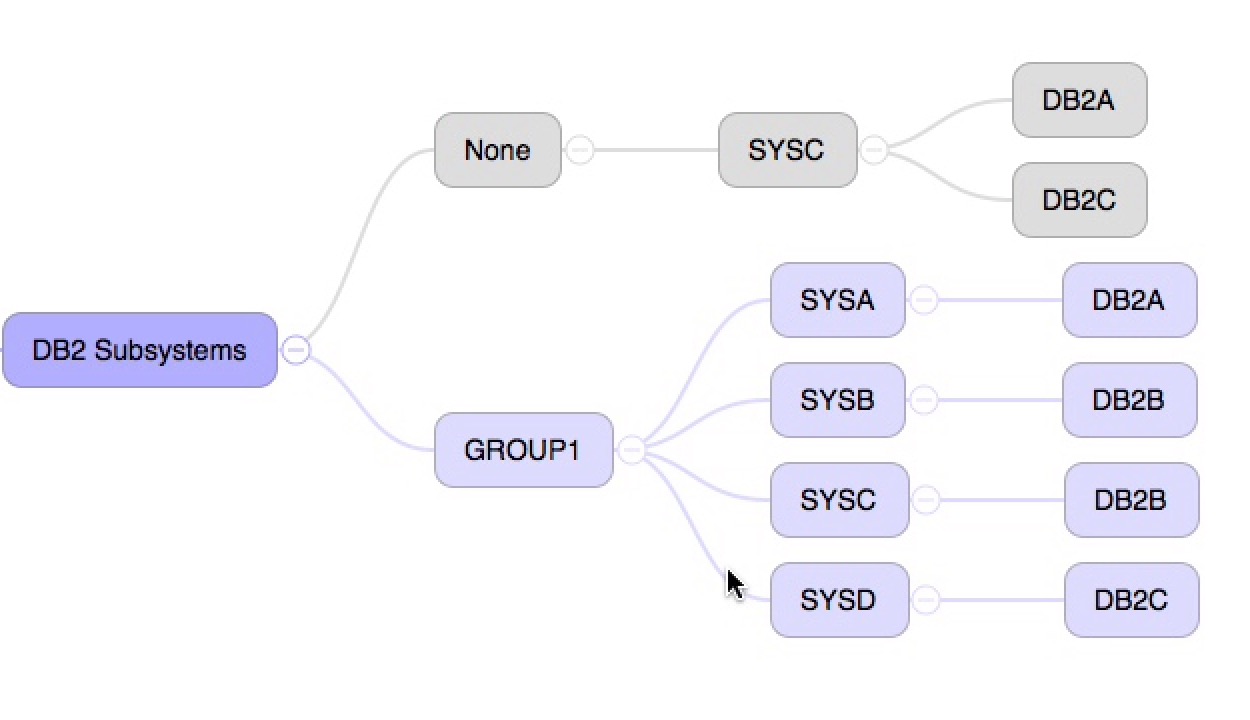
The grey colour was actually specified in the CSV file my code creates. It’s to draw attention to the fact the subsystems in that colour aren’t in a DB2 Data Sharing group. One day I could colour code the Data Sharing groups.
And now a shot of some CICS regions attaching to two DB2 subsystems in the same system:
Conclusion
The two screenshots above are quite pretty and very close to automatic now:
- My code generates the CSV file automatically
- I still have to download it and throw it into iThoughts
That isn’t really burdensome.
The nice thing is I have a mind map or two I can rearrange and edit. And there are some more nice tricks like the ability to have my code generate notes for each node and have iThoughts import them at the same time as the actual topology data.
So if I get bored I can see ways to enhance this.
So, I’m sure you could do this with other mind mapping tools. The point of this post, however, is to encourage you to experiment with this kind of depiction. Have fun!
-
The IRLM address space might not have the same characters before the “IRLM” as e.g. the DBM1 address space begins with. ↩
-
This is the IRLM XCF group, not the DB2 Data Sharing Group. The latter is not available unless you do something clever with SMF 74–4 Coupling Facility data. (And I haven’t got there yet.) ↩
-
Just as there are other Mind Map tools there are other text-file based formats, such as Freemind and OPML. ↩
-
It might interest you to know I’m using the Duet iOS app to provide a second screen and using iOS’ built-in screen shot capability to capture sections of the map. ↩